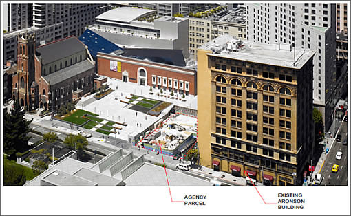
On Wednesday, San Francisco’s Architectural Review Committee will review and comment on the proposed rehabilitation and integration of the Aronson Building at 706 Mission into the 550-foot-tall tower slated to rise on the 25,000 square foot parcel next door.
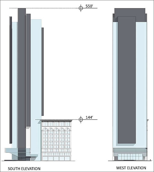
As proposed, the 47-story tower being designed by Mexican architect Enrique Norten and Glenn Rescalvo of San Francisco’s Handel Architects will contain up to 215 condos over a three-floor Mexican Museum and ground floor retail/restaurant space.
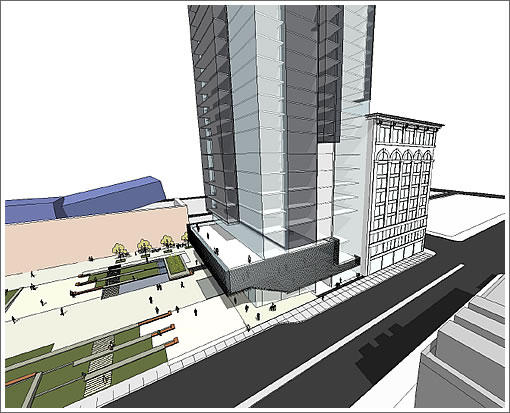
While simply conceptual elevations at this point, we’re digging the direction the tower design is headed. And with respect to the proposed rehabilitation of the existing Aronson building, we’re big fans of the proposed redesign for the building’s north façade.
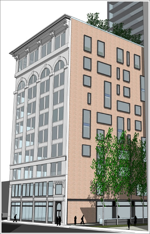
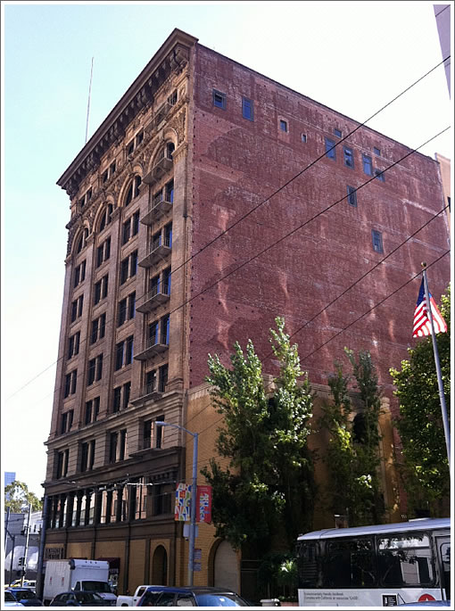
As said north (and east) façade of 706 Mission currently appears:
The premise for the open area, treeeless design in front the the Jewish Contemporary Museum was to open the area to light and to lighten this dark part of town. This is just another ugly, oversize building that will sit empty for years like the ones two blocks north.
It’s got a plaza to its south and another open area to the south across Mission. It will continue to get plenty of light after mid morning once this building is constructed.
Couldn’t they just tear down the butt ugly Marriott and put it there instead?
For reference, 550′ is taller than the Mariott, the 4 Seasons, and the St Regis towers. This will be the tallest building in the immediate vicinity.
the architect’s name is Enrique Norten, not Norton.
[Editor’s Note: Since corrected, cheers.]
I think 550 suites this parcel well. SF could really use some height variation to break up that boring 400 foot plateau we are stuck with now.
@mcm: The plaza will continue to get plenty of light and direct sunshine, since it faces due south.
The new building will be a welcome addition to the area, and will not block sun into the adjacent plaza.
The Sarah Palin Cultural Museum has a greater chance of being built here than this place.
The only way anything having to do with this place is going to block any sunlight is if the architect unrolls the plans in the plaza before he shreds them.
215 condos! Maybe the developer can find someone in Miami who will finance the project.
Too much gloom and doom tipster.
Think more long term.
Holy Sheet, that thing is tall; while I am fine with the basic design, I think the height of it makes it look very awkward in that space.
More tall buildings are good. This fits well with the existing height down Mission Street just to the east. Build it!
Mission in this part of town runs NE-SW, so it seems likely that this building truly would not ever shade the plaza. The design seems jarring to me, but I would prefer to see it within the neighborhood massing before really passing judgement.
I am 100% certain, however, that I hate the northern fenestration. 🙂
can you say “condo prices coming down”? Hahahahaha. Henry Norton, the architect, however, has created a beautiful building.
Interesting proposition with design, height, etc.
the adjacent brick and stone building would definitely benefit from the new retrofit and support of the high-rise. I likeit.. Would be interesting to see it get built.
could alter Four Season’s View Corridor to the East St. Regis’ to the North West.
With the collapse in condo prices and the high cost of building this project surely doesn’t pencil out.
Whatever game the developer is playing, this is almost certain not to be built.
Is this the same Gil that called Oakland the natural terminus of the HSR and the economic center of the bay area?
Yeahhhh, I dont see why some people get off on SF fantasy failings.
Its not free to go through the process of proposing a high rise in SF.
If it’s not about the design, then it’s about how “it will never be built”, “the market will NEVER come back”, “it doesn’t pencil out”, etc. Obviously, developers still have faith in SF’s market or, as stated above, they wouldn’t be wasting their time and money on proposals. My guess is they are trying to time it’s completion for an upswing in the market. Proposal and approvals will probably be another year or so, with construction lasting another 2, which would put it’s completion around late 2014/early 2015. I’m guessing/hoping the market will have stabilized by then.
“My guess is they are trying to time it’s [sic] completion for an upswing in the market.”
If they are, they’re smart. Many developers do the opposite. Think Two Rincon Hill.
I’m not convinced that the negative impacts on the plaza can be mitigated. Just by the very height of the building light is going to be significantly reduced. You can count me in the camp that 47 stories is far too much for this site.
Whats the difference between your average tea party member and a NIMBY in SF? Nothing: they both rely on their personal prejudices as if they were fact.
The planned building will be oriented roughly north south. To the east of the building are taller buildings which already block sun at certain times of the year. South east of the planned building is the transbay terminal area – which has multiple buildings planned at heights much larger than what exist now.
So yes long story short, this building will block out the sun from the plaza.
Carry on
Well if any location is going to “pencil out” in the next few years it will be this one. With 4 museums close by including SFMOMA, Yerba Buena and the St. Regis across the street, 4 Seasons behind and Downtown steps away, this is a fantastic location for a condo tower in SF.
This is definitely no urban pioneer building like Rincon Hill is in the middle of nowhere….
I’m not sure why proximity to multiple museums would be so important to residents. Most people think in terms of proximity to shopping, restaurants, schools, transit, playgrounds, etc. Still this is a good location.
Not happy about the Aronson Building’s remake.
Might as well tear it down if that’s their idea of preservation. Lose the detail, craftsmanship, history and it’s another one lost so developer’s can line their pockets. Great–so its original look gets recorded for the archives. “Look Mommy, that building was so beautiful; why did they do that to it?” “Well dear, it’s what they did in 2011.”
Have to say that the Page & Turnbull recommendations don’t jibe with the rendition illustrated in this article.
This is Millennium Partners’ next project if I remembered correctly. Great location for the right owners. These condos are gonna be huge. Do the math. The snap shots above are really mass models. You could see the architect’s intent to create shifting volumes and corner openings for almost every room possible, a feature somewhat present at the M.T. I do hope the team takes it to the next level with this building in terms of design ingenuity. There’s plenty of time.
“Great–so its original look gets recorded for the archives.”
Between the Bancroft, the Historical Society, and the California State Library, it’s already recorded:
http://content.cdlib.org/search?facet=type-tab&relation=calisphere.universityofcalifornia.edu&style=cui&keyword=aronson+building&x=0&y=0
You can also read about its experiences in the 1906 quake:
http://books.google.com/books?id=iwgVAAAAYAAJ&pg=PA103&lpg=PA103&dq=aronson+building+san+francisco+brick&source=bl&ots=dgyvAy09CC&sig=FROrXsToWM9An9Uh1GRa6QLpQ84&hl=en&ei=ae5KTaa5A5TQsAP83sCoCg&sa=X&oi=book_result&ct=result&resnum=2&ved=0CC8Q6AEwAQ#v=onepage&q&f=false