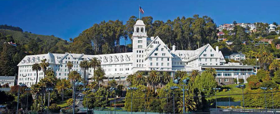
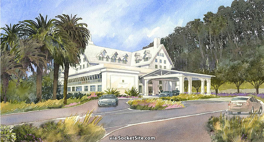
With the required Environmental Impact Report (EIR) for the proposed expansion of the landmark Claremont Hotel & Spa about to get underway, we now have the detailed renderings of the project to share.
As proposed, four of the hotel’s existing tennis courts would be moved to make way for a new pool, event lawn and 6,000 square feet of new facilities on the northwest side of the site.
To the south, the hotel’s non-historic porte cochere, which was added in 1982, would be redesigned and replaced.
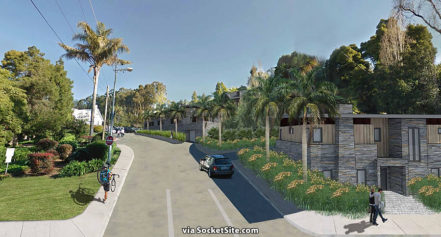
And down the drive which leads to the hotel, a 43-unit condominium building would be nestled into the hill over the hotel’s existing parking lot on the southeast portion of the site, with two single-family homes built just below, adjacent to the Tunnel road entry to the property.


Why doesn’t the expansion architecture match the existing hotel? Did they not show the existing design to the new architects?
Mimicry of the old, existing architectural style would be an inauthentic/pedestrian gesture. The original construction is from 1915. The most respectful thing a designer can do when adding to the context of one of these buildings is to observe in detail the authentic historic portion and let it be. The new construction should be contextually sensitive and exist in harmonious contrast to the buildings from an older era.
Or, mimicry of the existing architecture would help enhance the overall feel of visiting a classic “Grand Dame” hotel. I personally despise the notion that additions need to be wantonly distinct from the original. I’d much rather have an overall historic feel preserved, than create jarring contrasts.
The US Dept. of the Interior and any credible historic preservationist would disagree, and for good reason.
“Designs that seek to contrast with the existing context, simply for the sake of being different, however, are unlikely to be compatible and are discouraged”
That being said, I’m not sure which part of the expansion the OP is referring to: if it’s the porte cochere, and the hotel entrance in general, then the existing is a remodeling dating from the 1930’s onward, so some question arises as what should be copied.
OTOH, if RR is referring to the SFH’s shown in the 3rd rendering , then they’re just ugly…and the drawing is amateurish, w/ the perspective inconsistent b/w the house(s) and the uphill view.
Actually views on that are changing, in large part because it’s becoming apparent that adding contrasting additions changes the character of neighborhoods and detracts from the original building. And I speak directly from experience; we renovated and added to a “historic” (built in 1930!) home in Phoenix. We wanted to use recycled casements in the addition, so from the street the home looked coherent and matched the feel of the entire historic neighborhood… but the city’s historic preservation office insisted that the addition be ‘distinct’ and not use casements. The result was an ugly and jarring addition which detracted from the point of creating a historic district in the first place – and Phoenix and other cities are beginning to re-think the notion of requiring such separateness.
Because this isn’t Colonial Williamsburg, or Seaside, Florida. I strongly agree with Drew, and think that the only thing potentially jarring here would be an attempt to affect a “historical” context where there isn’t one, and to deny the era of building in which we live (for which it seems there is great insecurity).
For me, part of the charm of living in this neighborhood, and the Bay Area as a whole, are the great formal, material, temporal, and stylistic idiosyncrasies that find harmony with one another. While I am not entirely a fan of what I see in the proposed renderings (that’s just my personal sensibility), I respect the architect’s, and the Claremont’s, desire to allow these eras to coexist. Let’s hope the new work is as sensibly articulated and well-constructed as the old.
This building once had a clear architectural style and the effect was majestic and beautiful. The 1982 addition is horrible. Many voices back then made the same annoying statements about it not “mimicking” or “mocking” the original architecture and that the addition needed to reflect the times. Well, in a very short period of time that addition became a wort that most visitors thought should be removed. Never forget how self-righteous and self-important the vast majority of architects are or how lowbrow clients can be. This building needs an addition worthy of the original architecture and nothing less.
I don’t think the addition needs to mimic the original, but the proposed design is butt ugly and I predict won’t stand the test of time.
Tear down the ugly old hotel.
The odd thing about this awful architectural image is that it does not offer anything. You can decide to fit in with the existing style (sloped roofs, etc.) or not. But you know there’s a fight ahead–the Safeway was bloody and no good end. AND the property owners in this area are even more wealthy and willing to protect the neighborhood value. PLUS the Claremont itself just invested a barrel in renovations. So the design needs to be persuasive and it’s not. That’s weird. Get better architects who can rise to the occasion. Nothing in these folks’ portfolio suggests they can.
The curious thing is that most of the neighbors, of course, live in Berkeley – the hotel sitting w/i a jog in the line b/w the two cities…I’m curious what involvement the Berkeley City Council will try to have in this b/c even though their constituents will be most affected by the proposal, I’m not sure they (the council) have any input into it.
I agree that the Safeway is an abomination. The new architecture should fit gracefully between the existing housing around it and the Claremont. It can look different, but it needs to complement and have a thoughtful quality constructed appearance. This shouldn’t be Fairmount parceling the property off to make a quick buck.
The new Safeway is an abomination? Pu-leze!
The bar for abominations must be pretty low these days…
The Eastbay has higher standards
🙂
(Though personally I think the design was a good compromise b/w the 1-1/2 story taxpayers that predominate in that area of College and the classic arch design that many Safeway’s had…including the one this replaced)
Taxpayers? Are you f*cking kidding me?
Taxpayer = a temporary building that yields rent sufficient only to pay the taxes on the property on which it stands.
A hotel is the highest best use of land.
The Fairmont Hotel proposed turning the tower into condos right before the 2008 bubble burst.
This scares me.
Here are the actual plans. The artist rendering does not show the 4 story 43 unit building they are intending.
UPDATE: Cloud Hanging over Claremont Hotel Project Could Soon Be Cleared Up