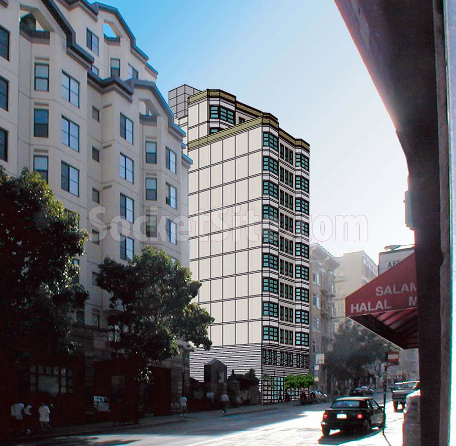
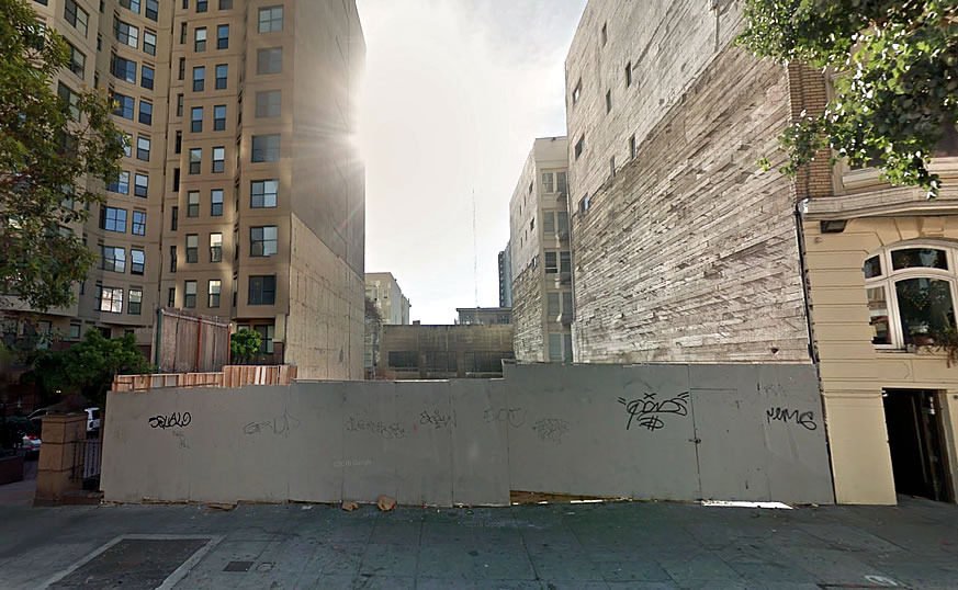
Approved for a 13-story building with 41 condos to rise up to 130 feet in height on the central Tenderloin site back in 2004, the subsequently condemned three-story office building which had sat at 651 Geary Street since 1912 was finally demolished in 2013, at which point the required approvals for the parcel’s redevelopment had expired.
The plans for the site were resurrected two years ago and have since been refined to include 52 condos over 700 square feet of retail space and the entrance to the building’s 26-car garage fronting Geary.
On Thursday, July 7, the 651 Geary Street project is slated to be re-approved by San Francisco’s Planning Commission.
And if approved, Success Development, which acquired the site in 2010, will have three years to get started on the project, the building permits for which have yet to be requested, or risk losing the entitlements anew.


It’s like when AMC Van Ness submitted plans for the peach box look facing east. If Sue Bierman was still around (she was the only city official to speak up back then) she’d tell them to do a tad more with the virtually blank wall facing the motor court below. Good chance the motor court will still be a motor court in 10-20 years, aka, the blind facade on the eastern side could be better. Too, in the old days at least, property line glazing, additionally, was possible if structural glass. And what’s with the gray roof box?
The gray box might be a mechanical room (elevators, A/C, etc), but not sure why it’s so large and exaggerated. Perhaps an enclosed deck?
The gray box does indeed represent the mechanical space for the elevator penthouse which would rise an additional 20 feet above the 130-foot height to the building’s roof.
I wonder why they selected gray as a rooftop accent color; possibly they thought it’d blend into the oft inclement skies, in which case perhaps a lighter shade would work better. Yet really the whole exterior needs to be more 3d, and even if it’s just a blank wall facing east, whomever could do something more appealing than this.
I hope they keep the blank wall so that in the future, more housing can be built in the adjacent lot without the 651 Geary residents whining about “views” and filing endless appeals.
SF struggles to think long term….
There is no adjacent lot, the Geary Courtyard (639 Geary) is immediately adjacent…meaning if this is built that’s it for the block.
This seems to be moving at a snail’s pace, even for SF.
Deny, redesign, and rethink the facades and concept…. PLEASE!
come on we can do better architecturally?
someone find out the investor/designers name and number and submit a formal complaint based on design nausea….
It looks to be a sketch-up and not a detailed rendering, so I would not worry too much that the final project will look exactly like the drawing. This is real life, not Lego Land.
That said, unless a building is in a historic district with strict architectural controls, it is really not the place for the city to delve too deeply into a building’s design. Regulate height, massing, zoning, public amenities, and perhaps the streetscape, and that is about it. City planners and the Planning Commission have to much on their plates and their mission is not really to play arm-chair designers.
Some buildings that get built will be pretty, most will be boring, a few might even be somewhat unattractive to some people, but that is life in the big city. If you want to live in a museum, move to Venice.
reject it based on parking. geary, especially that block, should have no parking ingresses. that street has already been sliced up mid-block to the point that it’s unpleasant to walk.
Is Success Development known for building out its entitlements? They had this approved in 2004 and let the 3 year window run-out. The downturn did not really hit until 2008.
Won’t be surprised if, after re-entitlement, this is put up for sale.
UPDATE: Re-Approved Development in Play, Save Its Penthouse Unit