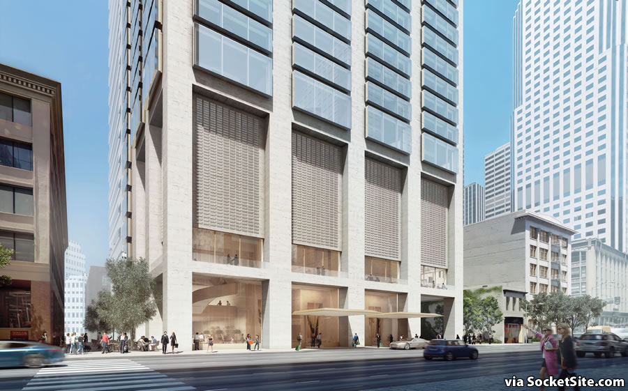
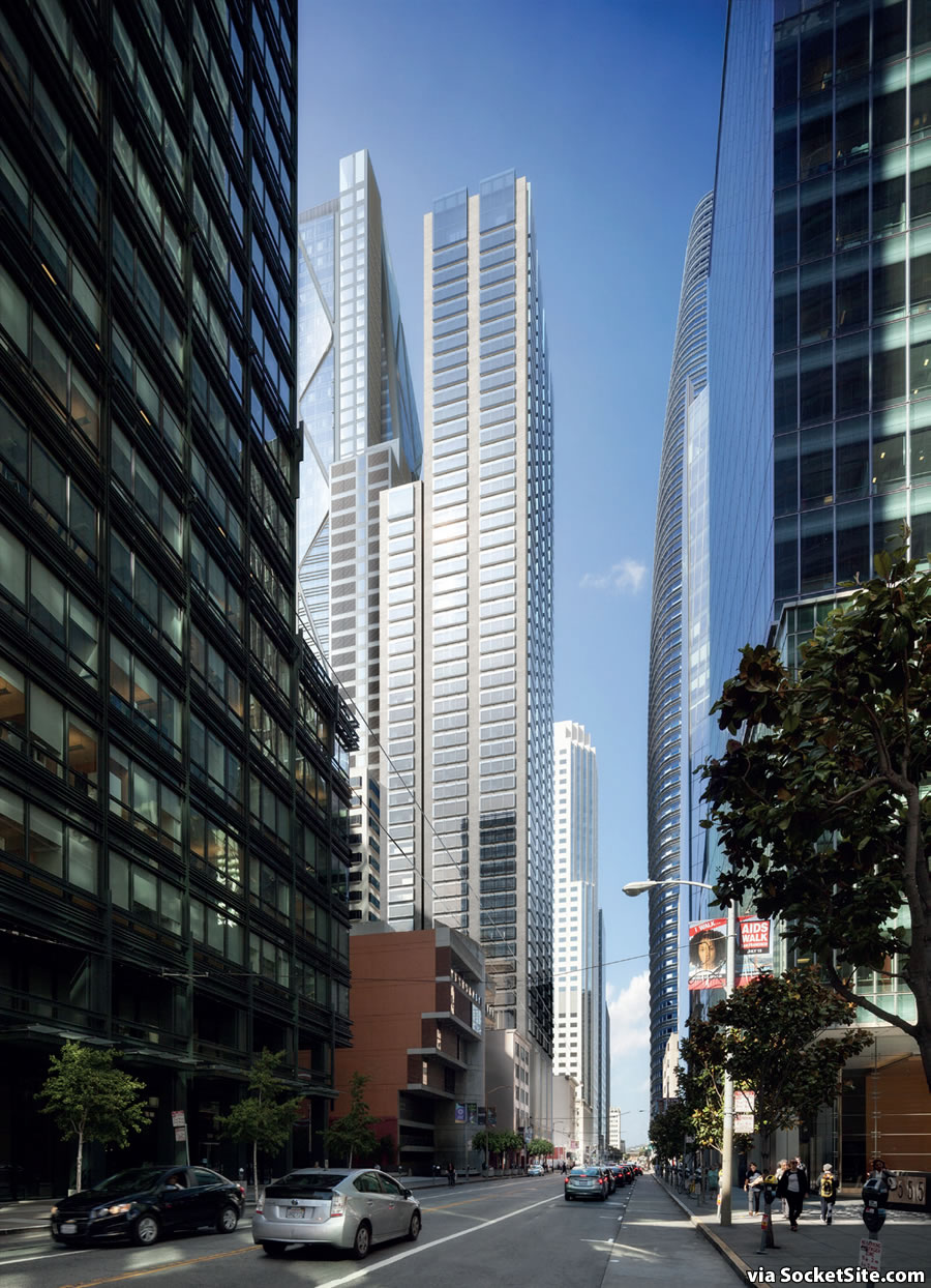
From a distance, the proposed 54-story tower to rise at 518 Mission Street, the shorter of the two Oceanwide Center towers being designed by Foster + Partners and Heller Manus, might look rather plain.
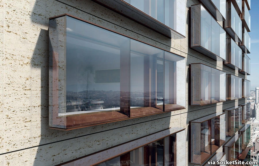
But the closer you get, the more detail is revealed, including the tower’s oversized window vitrines which float in front of a natural stone façade.
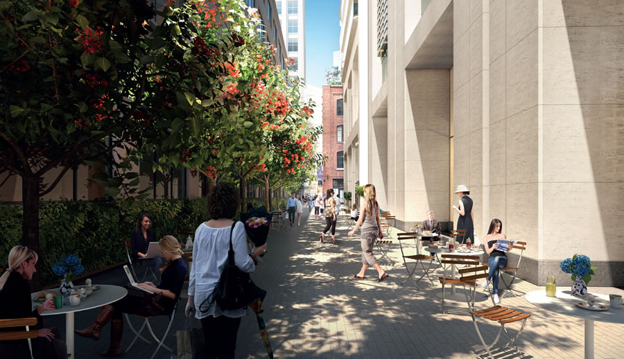
If approved, the Mission Street Tower will yield 156 condominiums (including a single 9,100-square-foot penthouse on the top floor over a 156-room hotel and 2,000 square feet of ground-floor restaurant space fronting Ecker Street which would become a pedestrian alley.
And once again, the Oceanwide team is planning to break ground this November.


ecker’s already a pedestrian alley. the trick with this will be the parking ingress off mission. it’s a real shame they didn’t do it from stevenson only (or in a dream world, nothing at all).
Luv both towers, can’t wait to see in 2020!
drooooling….
Looks cool. However, there is a reason windows are traditionally inset from a building face. Buildings like this look striking because they defy mother nature’s laws of hydrodynamics. This thing better have really, really well though out (and executed) waterproofing.
My first thought as well.
plus – pigeon condos!
Except the wind will be blowing a billion miles an hour, Ms. Pidgey and her condo are gonna get blown away like a 11 yr old at a bieber concert….
This looks like one market, but at least its more broken up, skinnier and taller. Mission St is going to be amazing in that area!
Funny, I thought it looked a lot like the PG&E tower w/ prominent exterior columns and supersized 2nd floor. I guess we should start calling it the Rorschach Bldg.
It does not appear that the Foster-designed, taller tower will have any of the blank features which initially alarmed “Frisco” in an earlier thread. It takes some doing including going to the link provided by “eflat” to get a good understanding, but it’s clear the building will be much more complex than appears to be the case.
The western facade appears quite flat with various motifs while the eastern elevation convex with the diamond pattern carried throughout.
Overall, I very much like the entire complex though I remain skeptical of how comfortable will be the planned open public spaces beneath the buildings exposed to the elements.
Yes, I was glad to be corrected.
Mission St., in general, from the Bay to 5th St. is really looking great, more so than Market St. which looks rundown in comparison.
Market st is a historical gem. It’s ok to look a bit beat up in parts. It’s the main drag.
I would be disappointed to not see steam coming outta sewer vents, graffiti in spots, heavy congestion (primarily the trolley cars, bicyclists and peds), some old classic remnant buildings and shoe shiners with their carts, a lot of pigeons, street performers, a pedestrian madhouse (Piccadilly style?) at 4th and market by old navy? Some hobos (you all understand the hobo problem here is largely due to our marvelous climate right?), some true art and more creative less corporate America action around 5th into the tenderloin… That’s the point of market. I wish they’d bring back the chess boards and semi flea market around the Powell / civic Bart area, like in the old days.
Mission on the other hand, in this stretch, ya , make it huge mega tech and modern.
I’m lovin seeing this city grow up.
Yeah it sucks that they removed the chess tables from market street. It was because drug dealers would sometimes hang out among the crowd there…so instead of dealing with the dealers directly, the city kicked everyone out and destroyed a neighborhood institution that was loved by many locals and tourists. And where did the drug dealers go? They just moved down the block.
Yep. I miss the Chess players. It was free entertainment for neighborhood residents. The players had been there 20+ years. Playing the game brought people from all walks of life together.
It is shameful how SF City govt is all too willing to sacrifice the needs of law abiding residents in favor of criminals.
Parts of downtown are turning into shiny high rises surrounded by tents full of homeless drug addicts. Doesn’t make any sense.
I’m assuming you must have meant from BEALE Street and wondering if you didn’t extend your approval one more block to the east to Main Street because of the horrific surface parking lot covering nearly half the block fronting onto Mission behind the Federal Reserve building.
I couldn’t believe when it was constructed that way to begin with and am incredulous it remains the case these 33 years later since the “new” building opened. What a terrible missed opportunity as an absolutely beautiful plaza could so perfectly grace that sun-splashed NE corner welcoming all to tarry and enjoy their surroundings. It’s not as though the logistical purpose of the lot could not be met and even exceeded in volume by a multilevel subterranean structure constructed below it.
.While I agree that there is much promise in the developments coming to Mission below 1st, the neighborhood will never meet its full potential until that disastrous bit of planning is rectified.
I always found that parking lot quite the head scratcher as well….
I’m glad to see more realistic renderings of salesforce tower. The design is very conservative…Hoping that it looks cool when it’s actually finished.
Reminds me of Continental Place, a 1980s condo tower in Seattle.
The pigeons will like it, too.
Not if a falcon pair can be “talked into” nesting on top of one off those projecting windows (and G*d help the homeowner who disturbs them).
The popout windows will be date stamped 2016. This a third generation recycle of an idea that was modest to begin with. Yes, they have significant wind and water issues, the outside of the building will be dirt streaked, and they have modest stylistic quality to begin with.
There is a reason windows have been desigined other ways for hundreds of years, especially last 60 years in hi rises.
Summary:
Copy cat , derivative – past its time already
Leakers
Litigation Magnet
The rest of the building appears to have nothing to offer aesthetically. When the rendering is plain and ugly its a bad sign — its really, really easy to make a rendering look good– its much harder to make an actual building look good.
Agreed, the extruded windows amount to a stylistic gimmick on a completely standard template of a late-modernist boxy tower.
I was thinking the same thing re: this place being a litigation magnet. However, since Oceanwide is a Chinese company, I wouldn’t expect them to play by the rules (or even participate) once the building is sold and litigation hits.
Let’s be honest, they’ll just get value engineered out, anyway. I wouldn’t worry about it.
What’s up with Socketsite trying to push this design? It’s basic at best and will look very boring unless you’re looking at the windows from 20 stories up close up.
Travertine didn’t fare so well at 50 Fremont. All the pores that make it distinctive had to be filled in.
We all knew that masonry and stone would eventually return in the recent sea of glass towers. But, yeah, there’ll be a sh*t-load of pigeons. Yep…
Heller Manus? If it’s from them and it looks sophisticated, they had someone else design it. Hope they resist “value engineering” the architectural concept.
For all the talk about pigeons infesting the protruding window tops – what about adding those vertical tinsel-like anti-pigeon needles on top. What would the impact be to the budget?
Foster is lead architect on both towers. We are collaborating architects, through all phases. It’s been a great relationship.
Jeffrey Heller
Is that so?
Still looks like a third generation recycle of an idea that was only modest to begin with. And the exterior wall will be a mess physically after a couple of years. He is good, but even a Lord doesnt always get it right.
Maybe trying to make the corner tower look better by going to sleep on this one? An embarassment.
Not intimidated by the Norman-name here.
Bitter comments about HM are inappropriate; it’s the design here that is so terribly lacking.
Its refreshing to see a tall building in this city that doesn’t resort to jagged shapes, curves or other devices to keep it from being something other than a bland glass tower.