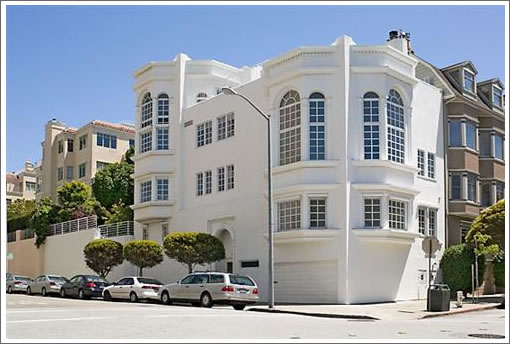
Listed for $9,250,000 in June 2007 but then withdrawn that November. Listed In May 2008 but then withdrawn that November. Listed for $7,980,000 in February 2009 but then withdrawn three weeks ago.

Listed for $7,980,000 once again a week ago, it’s now six official days on the market (and all MLS based stats and market reports) for 1089 Chestnut in 2010. The “sensational modernistic Neo-Classical” reference lives on.
∙ Listing: 1089 Chestnut (7/7) – $7,980,000 [MLS]
∙ Sometimes It’s Simply The Description (1089 Chestnut) [SocketSite]

Why does SocketSite always post the rarest of properties? I mean seriously properties for $2M +, are nice to look out, but nobody who reads this site would actually be able to afford one.
How about more posts of properties that people would actually be able to purchase, or topics on how there is a lack of inventory for 2/2 condos in the city (and the ones that are available are for significantly more than prices in September/October of 2009)?
[Editor’s Note: Here’s a hint: The Average SocketSite Reader (Is Anything But). But even for posts that feature properties that are well beyond the means of most, there should be a nugget for all in terms of food for thought (be it about design, the market, or emerging trends).
And while editorial suggestions for the site are always welcome and encouraged, we do ask that you send them our way for consideration (tips@socketsite.com).
Now back to the property and topics at hand. And as always, thank you for plugging in.]
Hate the exterior windows. Awful. Right out of an Alamo mansionette….
i, for one, appreciate the real estate porn.
but agree that more coverage of entry-level (1&2 br) listings would be appreciated.
and please keep banging the drum on the sleazy MLS tactics! more sunshine is what this industry desperately needs.
Wow, the Pella windows salesperson made a killing on this project.
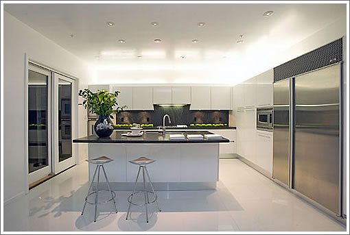
I love the strange combination of sparse staging and the extra wide angle photography that makes most of the building look vacant. And who doesn’t want a subzero fridge wide enough to drive a car into ?
Nice place, but my only beef is the B grade Temple of Bathing. A proper Temple of Bathing has the bathtub placed dead center, altar-like, so your numerous servants can have plenty of room to perambulate about swiftly and unobtrusively responding to your needs.
This master bath puts the tub in a corner, tract home-like, and in a location that makes it hard for a servant to even toss you a towel.
Totally agree about the windows: absolutely the wrong style of window for that house..the grids are very “colonial, cottage”…with some of the spectacular views, why ruin it with a bunch of grids..looks like an amateur (or the contractor) picked those.
next: way too may downlights…looks like they have been breeding like rabbits..recessed lighting is not the ONLY way to light spaces.
very, very poor choice of lighting for the bathrooms; I mean: downlights over the sink? ever try to shave or put on make up with that kind of lighting? creates harsh shadows, period. so wrong. dimmable lighting on BOTH sides of a mirror is the appropriate lighting for a bath.
The above items may be small to some people, but they point out what happens when unskilled people get involved in design, even when spending a LOT of money. money does not equate skill or talent.
For a house of this value, lighting and window styles (to mention two examples) should be absolutely correct.
“next: way too may downlights…looks like they have been breeding like rabbits..recessed lighting is not the ONLY way to light spaces.”
noearch — aren’t these typically a consequence of Title 24 requiring 50% of wattage to be fluorescent/LED? I assume you’re just suggesting that people aren’t being creative enough in their light designs in order to have 50% incandescents. What do you typically suggest?
I always assumed that’s why this place, highlighted by the editor, had so many can lights:
https://socketsite.com/archives/2009/11/1805_broadway_a_quick_and_grand_or_perhaps_prominent_re.html
I totally agree with noearch about the level of perfection expected at this price point. One can only guess that there are enough buyers in this range who either don’t know or don’t care about design to keep these white elephants marching down the transaction trail.
As for the title 24 requirements, there are enough LED choices available now to produce just about any sort of illumination that incandescents can provide. Those LED units aren’t yet a very good value (poor reliablity) though that will improve over the next few years.
I might find that staging to be very appealing if I was interested in living in a modern art museum.
What’s the deal with those dishes stacked on the dining table?
Regarding the recessed downlights: Title-24 does of course have strict requirements for lighting in all rooms of the house, however:
1. recessed downlights are the “no brainer” solution many builders or designers opt for, without really thinking thru the room function, location, light levels, and aesthetics.
2. why no elegant hanging light over the dining table? big mistake. notice how harsh the room is.
3. no hanging light over the breakfast area.same thought.
4. As I previously said, the bath lighting is hideous and wrong, wrong, wrong.
Good lighting is NOT just about popping as many holes in the ceiling as possible.
Alternative light sources are available in pretty much all form factors, so efficiency can’t be the cause of this fad. The down lights in ceiling cans craze is being driven more by perceptions of style and desirability.
Indirect lighting bounced off of ceiling elements and integrated with daylight yields the best results. Usually only really good architects or experienced builders can pull that off and it needs to be part of the design up front because the design and placement of ceiling features and windows become critical. It is much easier to simply jam some mechanicals in the ceiling.
What really ruins the effect is how there is almost always one somewhere which is burned out or dim or blinking or off color or something. Getting them replaced is never easy and in this case probably means hiring a contractor to do the work.
To me, the kitchen, with the white-on-white, ambient lighting, and wide angle shot, looks as if it were straight from 2001: A Space Odyssey.
I think I might be a bit creeped out in there at night, expecting the microwave to be all “I’m sorry, Dave. I’m afraid I can’t do that.”
Title 24 doesn’t require the bath be a 50% wattage flourescent, it requires a motion sensor. The kitchen needs the 50% and LED doesn’t help much because the equation is done in watts not lumen, so the very low wattage of LED vs. an incandescent fixture makes you have a ton of LED. Flourescent is better for this becuase it is less efficient, it’s a poorly written code.
For $8 million, that place sure is boring. After looking at every picture, I don’t remember anything I just looked at. Well, except the cheesy-ness of the unnecessary arch on top of the windows.
If it truly is a 7/7, there is a whole lot of house that isn’t included in the photos.
Title 24 doesn’t require the bath be a 50% wattage flourescent, it requires a motion sensor.
You’re both right. Title 24 specifies a motion sensor can be used as an alternative to the required “high-efficacy fixture” (aka fluorescent).
the equation is done in watts not lumen
Wow, that is so obviously poorly crafted. How come it hasn’t been amended yet to patch that? It’s obviously an error rather than a decision, right? I can’t imagine this hasn’t been raised by now.
WORK TRIANGLE!!!!! AAAAARRRRGGGGGHHHHH!
is it impossible for luxury homes to have a functional work triangle?
what is this obsession with monstrous islands that just sit in the middle getting in the way of everything?
they sure do like their white. It’s very 80’s fabulous in that place. 1 inch trim. can lights. white white white.
overall, it needs a lot of work to make liveable.
But I’m keeping the modern art that’s on the dining table. It looks like it’s titled “Tossed Dishes.” Is it one of the nouveau garage artists? It reminds me of the art that Edina Monsoon had in her home. Absolutely Fabulous!
Ex-SFer,
Usually I am with you on the triangle but that does not seem bad. It’s not a huge kitchen, you can’t make a penninsula with the doors there, and there is counter space behind the frig before the sink.
What it so bad about this one?
“As for the title 24 requirements, there are enough LED choices available now to produce just about any sort of illumination that incandescents can provide.”
sparky-b already mentioned the biggest problem with the general regulation for kitchens. It was indeed somewhat poor drafting to make this based on wattage. I think they were trying to strongly discourage incandescents in favor of fluorescents, but you need tons of LEDs to offset incandescents, so Title 24 also strongly discourages LEDs. I imagine this will probably need to be fixed as LEDs get better.
The other issue is that people often just put twice as many lights in the kitchen as necessary to meet the code and just don’t use the CFLs. And since CFLs can be 1/4 the wattage, that’s a lot of CFLs, hence a lot of cans if you’re doing lazy light design, as noearch said.
Yes, for that amount of money the kitchen is VERY small, and very poorly laid out..it’s simply not functional. I’m not obsessed with the “work triangle” idea in every kitchen, but this one really fails: meager amount of counters and upper cabinets, terrible lighting..and that fridge location. another disaster by an untalented designer.
But, again on this one. Let’s assume the kitchen had to be here and the doors had to be there. Other than that they should not have full panties to the side of the microwave and have additional counter there, what would you do? How do you see that triangle working different? What would move?
There are two kitchens, right? I’m not hallucinating?
sparky, if the kitchen is small, then the triangle might not be that bad. it might just be that the picture is stretched a bit making it look like a long haul from fridge to stove.
the way I saw the picture (perhaps erroneously) is that you have in essence a galley kitchen with the Fridge around the island and out of the work space. it’s important mainly for those who cook.
anyway, I saw how big the house was and just assumed it had a big kitchen, and I think my eyes scaled this wrong.
oops!
(darn, there goes my perfection in posting)
🙂
sheepish grin.
“…it might just be that the picture is stretched a bit”
Well that is an understatement. Unless subzero makes a fridge the size of a garage, the photo is waaaaaaaaaaay stretched.
To capture a small room in a photo, you’ve got to use a rather wide angle lens. The wider the lens angle, the greater the distortion. That distortion looks kind of funny so people often correct for the distortion using their computer. (In the old days it took some pretty expensive and difficult to use equipment to do the same. Now it is easy and cheap).
A side effect of correcting wide angle distortion is that the image gets stretched, especially the edges of the image. I have a feeling that listing agents are pleased with this side effect since it makes the space look bigger than it is. In fact some are so pleased that every once and a while I see gratuitous use of wider than needed lenses to reap the benefit of the seemingly expanded space. I’ll try to call that out the next time that shows up on a listing here on SS.
This crowd probably isn’t big on being complimented, but the comments on this web site (and this particular house) are an education in real estate and a daily dose of comedic skill.
Just what I always wanted – a view of the Fontana Towers, LOL.
I guess the soccer ball is there to show how huge the room is. It was cute the first time I saw it. A bit much when it showed up for the third time in a photo.
Is it me or are some of the photos on MLS repeats?
A good example of what Milkshake is talking about is visible in the SocketSite post about the house used in Twins, 2552 Hyde:
https://socketsite.com/archives/2009/12/a_rather_junior_russian_hill_sale_for_2552_hyde.html
Check out the first picture and the third picture and see how wide the windows are. Then look at the middle (MLS) picture, and see how it looks different. Pretty obvious depiction of the phenomenon.
MoD you never fail to crack me up.
This house is bad, bad, bad. For $400k in Valley Home it would just be a tacky McMansion. I don’t know what to call this thing plopped down in the middle of Russian Hill. I try not to be overly negative but it is hard to have anything nice to say about this place. I guess I like the blue carpet.
It is in a great location.
Maybe they can tear it down and start all over with a real architect.
Ex-Sfer,
I am with you on that, if the Frig is out of the kitchen it’s no good. Otherwise it’s not too bad, I guess the oven would be better placed with the micro, or just have a range.
Noticed this place was back with a facelift.