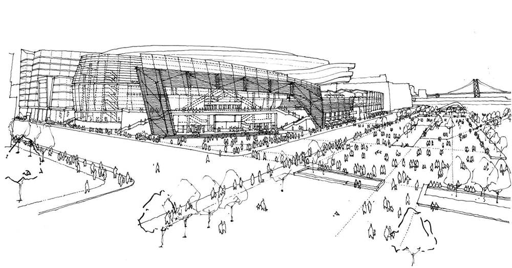
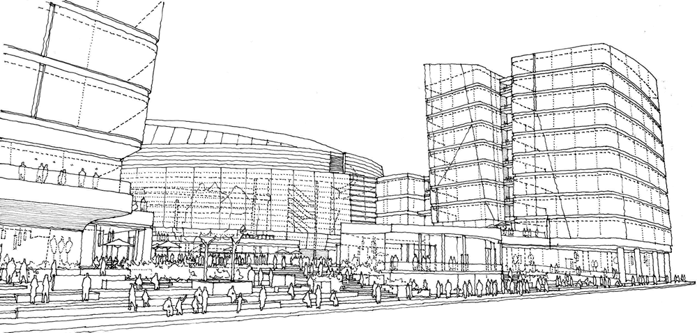
The sketches for the Golden State Warriors proposed Arena project in Mission Bay provide a few more perspectives on the development’s concept design, highlighting a Bayfront Terrace over the Market Hall on the northeast corner of the site, as sketched above, and the arena’s Southeast Plaza at Terry Francois and 16th Street, as sketched below.
And they provide a rough idea of how the development might appear to a pedestrian along Third Street, with the two office buildings in the forefront and the project’s Main Plaza and arena behind:
Stay tuned for the renderings.


A lot of people just complained left and right about the design But I think its not a bad option given the desired completion date, AND , the need for it to comply with existing zoning so the project does not get delayed any further
It only looks like a toilet (as all the local TV stations have reported), if you are flying over it. OMGosh! Who cares? Obviously, I don’t.
It does not comply with existing zoning. It will require all sorts of variances.
Nice looking, but the final product will NOT look like the drawings.
A final building NEVER looks like the drawings. These are very conceptual sketches showing basic form, massing, suggestion of details and fenestration. This is the normal process of evolution for every project.
I hope the games aren’t one “flush” after another. And I trust this doesn’t mean the Warriors are “going down the drain.”
I think the biggest code variance would be a toilet that big…..especially in the midst of a drought!
I for one cannot wait to see the Splash Brothers draining tres balls at the Big Loo.
There’s a story about the “toilet bowl” and socket site on espn.com
And it ended up (ha!) with a Keith Olbermann “Worst Person in the World” treatment…
Well the toilet meme’s gone international – they’re seriously going to have to do something to address this.