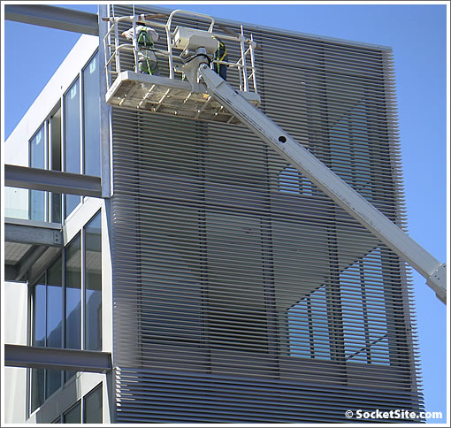
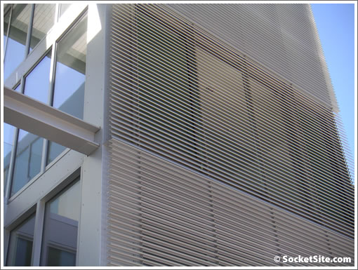
A reader notices the individually operated (unit-by-unit that is) aluminum louvers being installed on the south face of 1234 Howard (and notes floor plans on the updated property website). And in the interests of our readers (okay, and of ourselves), we immediately dispatched a photographer.
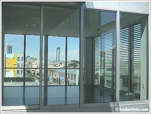
And of course, a few more photos from the inside (a week before the rumored sneak peeks for a select few):
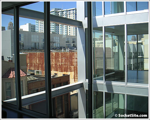
UPDATE: According to sfnewdevelopments: two (2) studios in the mid $400’s (one BMR); eight (8) “one-bedrooms” in the mid $600’s (one BMR); and six “two-bedrooms” around $800K to $900K. Oh, and “there were originally eight 2BR units but Mr. Saitowitz himself will be living in 2 of them.” Let’s just say we’re not too surprised (notice the walkway connecting the top two south facing units) and it doesn’t suck to be Saitowitz.
∙ New Stanley Saitowitz/Natoma Architects Condos: 1234 Howard [SocketSite]

Nice job! Why can’t the towers in this city have design as sophisticated as this structure? I still would like to see a firm like Saitowitz/Natoma do a tower.
The architect is very clever to hide the large amount of circulation space by not rendering out the walls of the bedrooms on the floor plans. Still, it’s a nice project.
[Editor’s Note: No missing walls on the floor plans. No kidding.]
So you enter the homes through the bedrooms? That’s just plain weird.
where is the closet in the 1bdrm units
Those things are going to be a pain to keep clean.
Any pricing info?
Cool looking building but the floor plans are strange. I would not want all my guests to walk past or through my bedroom to get into the main living space. All the glass would be cool for a house in the forest but not the city where it’s more like an aquarium.
I realize a huge sacrifice was made with the decision to add the bathroom doors. No doubt a junior designer quit in disgust at the dilution of a brilliant clear diagram.
“living without borders”?!? At least they didn’t take it so far as to leave out the walls around the bathroom…
http://sfnewdevelopments.com/
Found some more nifty pictures and pricing here.
I think this building and the units themselves are outstanding. The automated louvers are genius. In a building like this, the poor design decisions residents make on window coverings are too often a blight. Solving for uniformity, privacy and light is very cool.
Tough Crowd. My way of looking at this building is that it is creative, a little different, does not overpower the neighborhood, and offers floorplans for people who would like to be a bit inventive. When people used to live in “real” lofts they did not even have a defined kitchen in some residences (let alone bedrooms).
What would you all rather have? More Soma Grand type projects (a.k.a. Soma Bland)? Or overpowering 70 story glass office buildings that are actually condo towers in disguise?
I would rather see more projects like 1234 Howard, and as was mentioned before, they get special bonus points for not giving the project a “brand” name similar to a beverage or perfume.
From the newdevelopments link: “Two studio unit in the mid 400’s (one is a BMR). Eight 1BR units will be around 880 sf and start in the mid 600’s (one is a BMR). Six 2BR units will be around 1250 sf and start at around 800k and top out in the lower 900’s. There were originally eight 2BR units but Mr. Saitowitz himself will be living in 2 of them.”
“The architect is very clever to hide the large amount of circulation space by not rendering out the walls of the bedrooms on the floor plans. Still, it’s a nice project.”
It’s another conspiracy! Why does everybody on this site think developers and architects are out to get us?
“It’s another conspiracy! Why does everybody on this site think developers and architects are out to get us?”
So much drama…Take a pen and draw a long line enclosing the bedroom spaces starting at the entry to the side of openings, and see what that does to your eyes. My comment of the architect being clever by not rendering out the walls applies to the reality as well (and it was more of a compliment than pointing out a flaw). By taking away the walls it made the long circulation halls visually disappear, even though that large amount of space distributed to circulation is still there. It’s a rather smart and creative way of dealing with the challenges that come with site against requirements of the program.
Interesting and definitely a big step up from the standard bland condo design (saw the exterior blinds yesterday – brilliant) but the first thought when seeing the interior photos was that all of that glass is not going to insulate the street sound nearly as well as a typical wall – might be pretty loud in these things.
Funny, those fancy louvers have been standard issue on buildings in Europe for years, both our apartment and office building in Germany had them. I’d like to see more US buildings incorporate them, as I’m sure it would cut down on cooling costs on sunny days.
I was inside the building last month, and the lack of bedroom walls was certainly jarring. It’s most definitely not a project for everyone, but for people into super Minalism it’s a dream. The amount of light and air the units get made me feel like I would be living on a patio. I loved the closet/dressing area. What I found uncomfortable, however, was the bathroom in the 2-bedroom. The two toilets for the two bathrooms were separated not by a wall but by frosted glass.
There’s a LOT of frosted glass throughout the building, which should make this an interesting building at night.
Most perplexing was the bathroom in the studio. It wasn’t finished when I saw it, but I swear the shower faces a floor to ceiling window that looks out on the street! Presumably there’s some sort of blind action to provide privacy.
All that glass is an exhibitionist’s nirvana. Seriously, cool concept with the aluminum shades. I like seeing all these new concepts in SF.
Reality check: the two floor plans on their web site are studio apartments with locations for either one or two beds. You can call it a “one bedroom canvas” or “two bedroom canvas”, if “canvas” means “but not really”. It’s nice to see something different from the standard offerings, but don’t tell me these aren’t studio apartments.
C’mon, this isn’t a studio apartment. A studio apartment wouldn’t have a second bedroom closet, nor would it have a dining area. Oh wait, these don’t have them either. Hmmm, good point…
At least they didn’t call some tiny living room a living/dining room where the dining room table is practically on top of the living room furniture. Instead it’s just “Screw you, no eating area at all!” Gotta love the “this space is too cool for anything liveable” attitude! Wonder if people will buy into it?
how little do i have to make for a household of 3 to get into a bmr?
“how little do i have to make for a household of 3 to get into a bmr?”
http://www.sfgov.org/site/moh_page.asp?id=48083
Interesting read. Thanks for the link. What a wonderful program for folks that qualify. How did that FBI agent get in the middle of a resold BMR and not get notifications from the City and Title Companies?
Crazy!
“The architect is very clever to hide the large amount of circulation space by not rendering out the walls of the bedrooms on the floor plans.”
Blah…sounds like your original comment was referring to the architect not RENDERING the walls in the floor plans as being clever. BUT, fair enough. Nice save.
personally I think our city would be more effective charging fees to develop practical housing rather than forcing BMR in developments like this.
[Removed by Editor]
[Editor’s Note: And we’re not trying to single you out “blahhh,” but let’s all get back to the discussion of 1234 Howard (and try to avoid getting derailed by/with the personal attacks).]
Coolest. Pigeon squeezing device. EVER.
What would kill me about living in one of these is the total lack of sound isolation. Even with a 2 bedspace unit, if you have guests spend the night everyone’s going to hear everyone else’s slightest noises. If you have a pet there’s no room to put it in for the night to keep it from jumping on your face. Having a roommate is totally out of the question, and I reckon it’ll challenge many marriages as well. ;^) (e.g. when the TV’s on, everyone in the entire unit will have to listen to it.)
gdog,
it’s called a loft, and not for everyone. i did that to my 3 bedroom, 2 bath over here in south beach and love it. it’s a 1369 sq foot 1 bedroom now with floor to ceiling wrap around views of the bay bridge, bay and ball park.
not for everyone though, fo sho!
also in “central” soma, near-ish by (clementina/5th), another small (10 units? 15? doesn’t seem like it could be more) new building is taking shape. my eye wants to see more of these smaller, designed buildings in the area — as opposed to more soma grands — but a big developer just bought the huge parking lot on 5th/folsom and the lot across the way (on clementina, home of bill graham presents). monstrosity to come . . . .
“I reckon it’ll challenge many marriages as well.”
funny you should say that. I have some friends who got a divorced after living in a loft style condo… part of the reason was the inability to escape one another… and the problem of travelling noise. (as example, one would go to bed and the other had to be SILENT, couldn’t even type on the computer due to key-tapping noise)
after their divorce, they got remarried to each other again (long story) and moved out of the Bay Area into a house with walls (in Cleveland of all places!) and both of them blame the divorce on the loft!
FWIW: they were married for 6-7 years in “traditional” condo w/o problem, then lived in the loft for 2 years and divorced, then hooked up again 2 years after the divorce, and now have been together and remarried again for 4 years
Saitowitz has used this type of layout before, but in units that were entered from the LR, which worked much better because there was a comfortable progression from public to private space, even though everything was essentially open.
These units suffer from having the entrance at the private end so you move from private to public. And that feels odd. The compensation is the super fabulous living room. Some will love it. Many won’t. But Saitowitz has always appealed to a niche market anyway.
ex-sfer, i bet your friends end up divorced again. i love the blame the loft concept though. very creative. i’ve always thought that you should never marry someone you can’t share a sink or closet with. if you want it to last, you have to get your own of course.
not to bust your balls ex-sf, but was this one of your wealthier friends?
😉
James:
I share your sentiment. I think it is only a matter of time until their Ohio house is also not enough space for them!
and yes, they are high income, both in banking industry.
I had just never heard of the loft-marriage connection until their divorce, and then never again until GDog’s comment!
no ball busting felt at all! 🙂
“my eye wants to see more of these smaller, designed buildings in the area — as opposed to more soma grands — but a big developer just bought the huge parking lot on 5th/folsom and the lot across the way (on clementina, home of bill graham presents). monstrosity to come . . . .”
That 5th and Folsom lot was bought by AGI capital, the same lady developer who bought and then partnered w/ TMG to put up the Soma Grand, funny enough. They should be having a community meeting next week if you want to hear what they’re planning. I’m hoping for not another Soma Grand.
Love how there are so many who jump on the lack of bedroom walls — the architect and developer’s implication is clear, this is a blank canvas for the owners to drop in elements: curtains, or sliding glass or solid panels, or sheetrock, or rammed earth bricks… you get the idea. Btw, the “one-bedroom”‘s closet is clearly beyond the bathroom on the left.
I like the purity of the designs but if I bought one would certainly at least curtain off the bedrooms from the main circulation. Anyway, it is a very sharp building design, with, to my eye, novel and inspired indoor-outdoor connections (very appropriate for Northern California), and it is a refreshing change from the bad stucco boxes that most new developments of this scale (not to mention the scale of the execrable SOMA Grand) are nowadays.
Forgot to say (after being kind to the design), agree with the above poster — how the heck do you clean both the windows behind the louvers as well as the louvers? In the Saitowitz development next to his original building/studio on Natoma, the louvers there did not look removable for window cleaning when I toured during the AIA house tour. Oh well … maybe 1234 Howard’s louvers can allow for window cleaning, but it is not clear from studying the pictures how that might work.
Window cleaning schmindow schmeaning — now this’s what i’m talkin’ ’bout — some friggin DESIGN for friggin multi-unit architecture in this friggin city, for once! (at least since Saitowitz’s earlier Yerba Buena Lofts dropped).
And that TMG/AGI joint mentioned above at Folsom & 5th is scary to even think about if it comes close to matching the shear craptastic banality of the Soma Bland — yet on a WAY bigger scale in this case.
How would these roll in an earthquake, I wonder? Would all the glass pop out?
I wanted to love it I really did.
Design is sexy and enticing. Execution is crap.
1.The openings in the floors for the islands were cut to large – so they stuffed in weatherstripping.
2.The dark bamboo floors show all of the light color nailings.
3. The sliding door to the ‘master bath’ (only bath in 1bd, larger bath in 2bd) is crooked – read the tile shows more and more to the right as you close the door.
4. There is no drain in the master bath floor. It is a tub with a shower coming out of the ceiling. The spout for the tub is right under the shower head — you need to straddle the spout (bruised knees anyone?) and when you are under the shower head water is going all over…
5. BMR studio glass shower (no louvers here kids) faces Howard. Whoohoo!!
I loved the design of bathroom #2 (only in the 2bd unit) It was an oblong room with a sink/wc and the showerhead from the ceiling (with floor drain) very euro.
Definitely major points for having ANY design intention at all. So much in the City is just yuck-o.
Hmpf.
The design was definitely cool. I have to agree with Zibby on the points listed.
A. Scary studio looks like they had some left over space in the building and decided to put two walls up and call it a studio.
B. Was it just me, or the studio was the only place in the building that was missing pocket doors for the bathroom which took up a lot of space. Also had a pretty useless closet.
C. Studio shower facing a glass wall looking onto the Howard. scary.
D. Two bd’s 2nd bedroom is more the size of a den, not to mention the 2nd bath (Euro style bath with shower above sink literally right at your feet. Could probably fit a comfortable futon in that section of the house.
E. Below the studio units in the building are the entrances to the garage which I assume your floor to be shaking everytime someone comes home.
F. There was an annoying beep everytime someone opened a door. DOn’t know what that was.
I also wanted to mention, I tried to wander up to the 5th floor, where the architect combined two 2 bds to make one living space. it looked very cool ,I think it was 5a + b…and it looks like where there usually is a living space was a huge bathroom with an either open ceiling or glass ceiling as a lot of light was shining in. Very nice. Wish he opened it up to show.