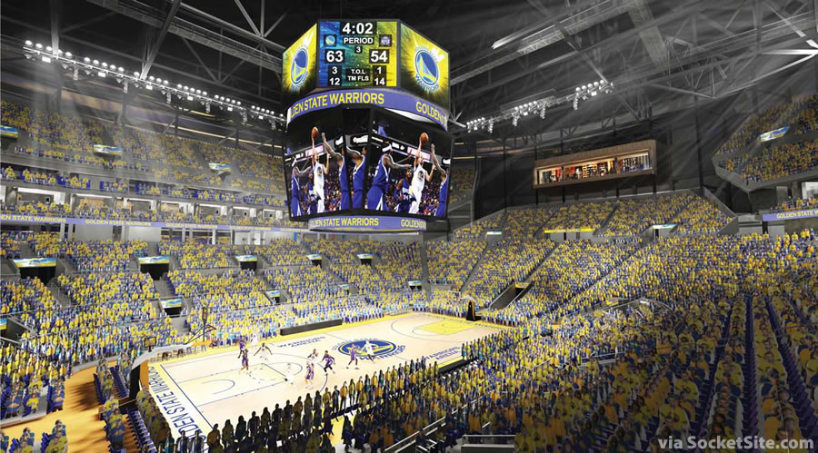
The design for the interior of the Warriors proposed Mission Bay Arena has been refined since we provided the first peek inside, with a new central scoreboard and more intimate Sky Club. And we now have a cross section of the arena to share as well:
San Francisco real estate tips, trends and the local scoop: "Plug In" to SocketSite™

The design for the interior of the Warriors proposed Mission Bay Arena has been refined since we provided the first peek inside, with a new central scoreboard and more intimate Sky Club. And we now have a cross section of the arena to share as well:
The interior of every pro basketball venue looks exactly like that.
Exactly, they must have a template where they just swap out team colors and logos.
They all look the same because after you maximize seating and minimize proximity around a fixed-size basketball court, there’s not too many ways to do it.
Maybe they could put the entire court on a slowly rotating disk so that everyone’s view changes throughout the game. THAT would be cool, if of course a bit impractical.
Right – yawn.
You can effectively the pretty much the same thing for every football stadium. Why baseball’s the greatest game. The actual field brings to play its architecture.
the subtleties of arenas are what makes them different and better. tough to tell what it will feel like from this. it does kind of resemble the Barclay’s center arena, and that one was well done.
seems like at least they could do something different with the ceiling / beams. Why does every arena have to have such a dark, looming feel to it? In this day and age, with new, light structural materials and LED lighting and translucent panels, it seems like there are a lot of possibilities available to designers.
my guess is that they need the ceiling exposed to more easily accommodate other uses of the arena. For example, lighting rigs for music events.
Something tells me they were going for the industrial look…
or, the traditional fieldhouse look
I doubt the floor will ever say “Golden State” on it.
… not particularly exciting. A bowl full of people. But that’s the utilitarian nature of the arena. This isn’t Snohetta any more, is it? I might have expected something at least somewhat interesting from them.
find the person in the crowd that is NOT wearing yellow.
What a surprise. It looks remarkably like a basketball arena.
No more big window looking out?
that would be in the concourse area, outside the actual arena space. think about it.
Hopefully it is built to last and with foresight. I cannot believe they are already talking about building a new Shark Tank. What a ridiculous waste of taxpayers’ money.
Owner of the Sharks just came out last week and said he’s very happy with their arena. besides a few minor improvements at the Shark Tank he’s not looking to build anything new.
Is any thought put into future use as an Olympic venue for other sports or is this layout useful enough as is?
Great! Totally generic design! Goes perfectly with the Niners generic new stadium!
It figures, the Bay Area pro sports venues are some of the worst of recent sports architecture…
Um…..AT&T Park much? It’s considered one of the best in all of MLB.
Cross section shows the basketball court about 10’+ below street level….
Are they going to have pumps going 24/7 to keep the ground water / high bay tides out?
The water table is lower than 10′ here.
I dunno – the ponds currently on the property are always full of water – and it certainly is not rainwater this year. :).
The ponds look to be a lot less than 10 feet down and they seem to move up and down with the tides.
The arena parcel is immediately adjacent to the Bay and that land is all soft landfill…..
Obligatory “what about the BMR” seating comment.
Wow they said the new Warriors arena would be smaller. But its bigger. Looks like Hoston rockets model, denver, or OKC.