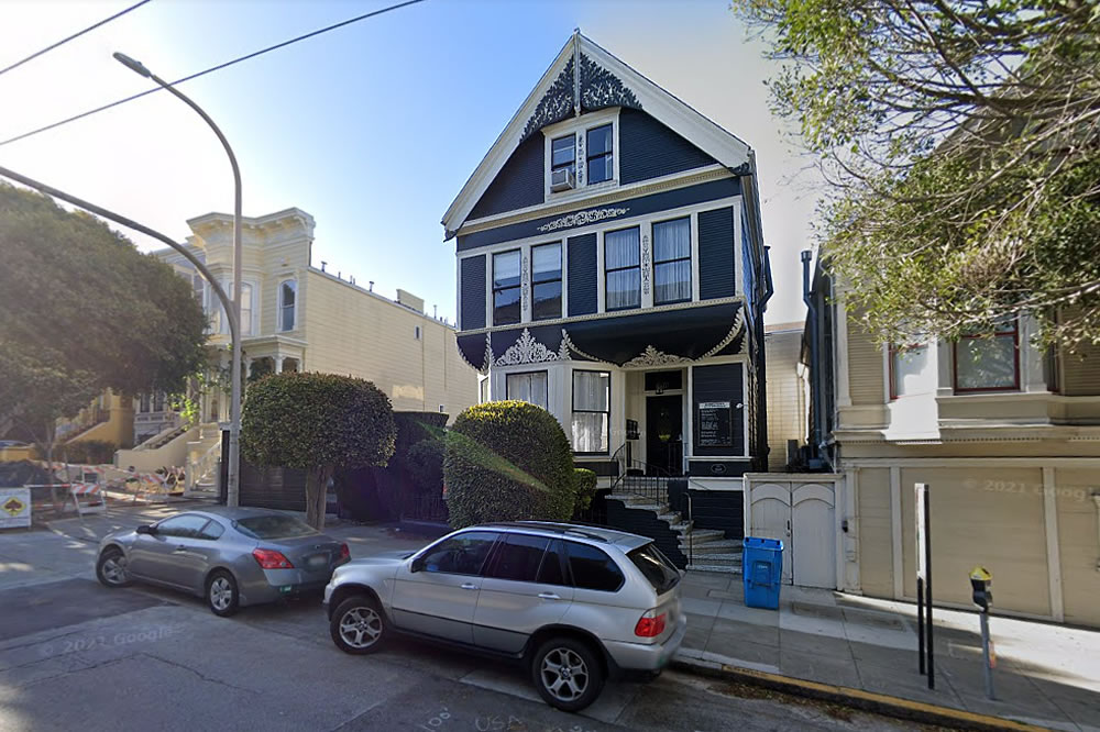
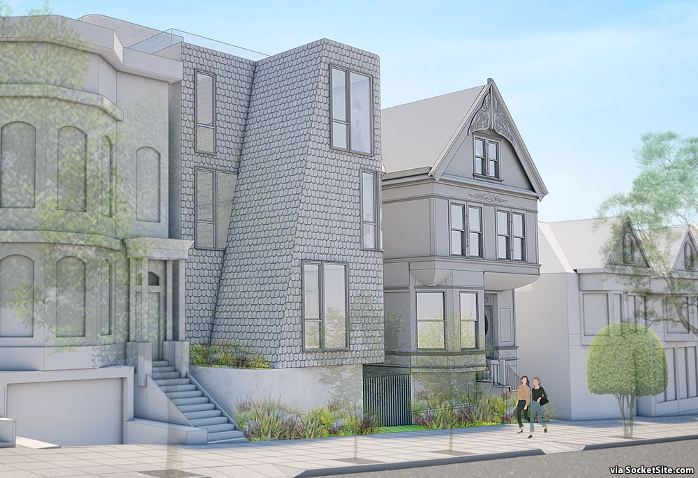
Legally converted from a residential building into psychiatrist offices back in the 70s, plans to re-convert the 3,500-square-foot Pac Heights building at 2477 Washington Street back into two residences, with a 448-square-foot, one-bedroom and one-car garage on the ground floor and a 2,195-square-foot, four-bedroom home above, have been drawn. And as designed by Jensen Architects, a new two-unit building would be constructed where the existing two-car garage and office addition were built on the 2471-2477 Washington Street lot as well.
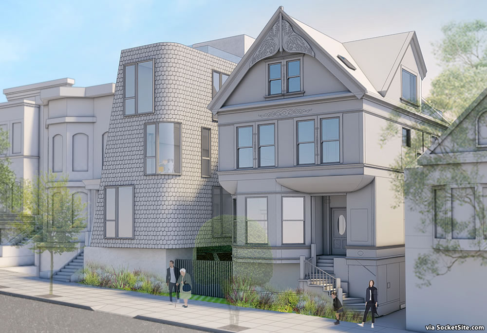
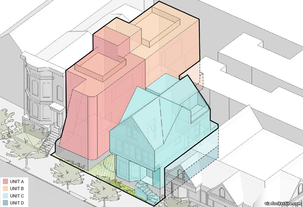
The new 40-foot-tall building would yield a 1,954-square-foot, three-bedroom condo; a 2,661-square-foot, four-bedroom condo; two roof decks; and a ground floor garage for two cars, with a landscaped mews between the two buildings and a turntable for access to the development’s three parking spots.
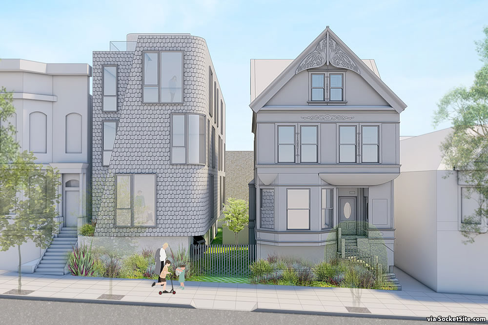
And yes, an existing street tree would need to be removed to make way for the relocated, smaller curb cut but a new “site-appropriate” street tree would be planted in front of the current garage.
Well: no bay windows…some will be pleased.
Ha! I really regret how tight SF has been around modernist infill. The stuff people rightfully hate is that which is out of scale (something that curiously never happens in Specific Whites, as we always called it.)
No. Just no! What are people thinking?
This is great as a modern riff on the traditional Bay Area shingle style, even with the lack of bay windows. It’s also a very creative way of reconciling the difference in setbacks between the buildings on each side. The fact that they are opting for a duplex instead of an extra large SFH makes me love this project even more.
Except it doesn’t – at least visually. The neighbors technically have the same minimal setback, but only becuase of their bays (and, on the right, the 2nd floor). From the sidewalk the current buildings allow at least some minimal overall setback, as well as varied / textured facade. The new building seems like a 3-story wall right on the sidewalk; to me it’s very visually off-putting.
I think it could do with a taper toward the top, making it more of a truncated pyramid than a rectangular prism. But that’s a matter of taste. I’m excited to see 2 residences emerging where 1 currently sits.
Aren’t 4 residences emerging where 0 currently sits?
Looks like a nice addition to the neighborhood. Just 3 blocks from Chez Doubt.
Ah, I misread.
I’m pretty into it. Weirdo modern homes next to Victorians just makes them pop that much more.
I like the modern addition a lot. Especially how each side matches the front setback of its neighbor. Cute.
The modern building is elegant & enchanting. Superbly rifting between its two neighbors.
It’s different. I like it. One nice tweak would be putting cornices or other treatments at the roofline to play off the adjacent buildings’ defined rooflines.
Where is the front door? It’s clumsy and uninviting.
The side-by-side entrances to the new duplex units are adjacent to the garage, along the mews.
I agree. Without a front entrance, seems like poor planning to me. You want at least the appearance that they’re plugged in to the community and not closed off with entrances down a mew.
The lack of even an emergency exit to the street from the garage seems odd.
I, for one, am not amewsed….
Why would this residence be required to have any more exits than any other house built? It had two by side entrances on the mews and rear doors out in to the backyard, so two ways in and out, just like any other house. And, there are these things called windows, again just like any other house. As for taste, to each their own, but I don’t see any safety issue.
Why? Because leaving by the front door could well put you facing a conflagration if the old house next door were burning. I don’t think it’s critical, just “odd” given how easy it would be to add.
quite a gingerbread opportunity
Thats is one of the more startlingly ugly new buildings I have seen a long while. Its clumsy, lacks finesse of any kind. Can’t really see what the idea of the building is. Wow.
Elegant? Enchanting? In what world does this building look like anything but an eyesore 50 years down the road? Stuck between two classic SF buildings will be a building that looks like it has fish scales with an odd angle to it.
Units A & B are just terrible. Please redesign this gingerbread nightmare.
I couldn’t decide at first, but the more I look at the addition the more I like it. Has a modern Scandinavian feel, which appeals to me.
It has potential but I would change a few things:
1. The edges for the entire building should be rounded for consistency.
2. A side door entrance for this location does not work, & in San Francisco, is a security risk.
3. The shingle finish is tacky; stucco or engineered brick would be better.
4. The window that is cut at an angle should be removed; (It would work better in Potrero or SOMA but not here.)
5. Some very minimal treatment at the top of the facade would also finish out the design nicely.
I hope it gets built & the core design is kept in tact.
Wow! Nice!
UPDATE: Plans for a Pac Heights Reversion and Addition Proceed