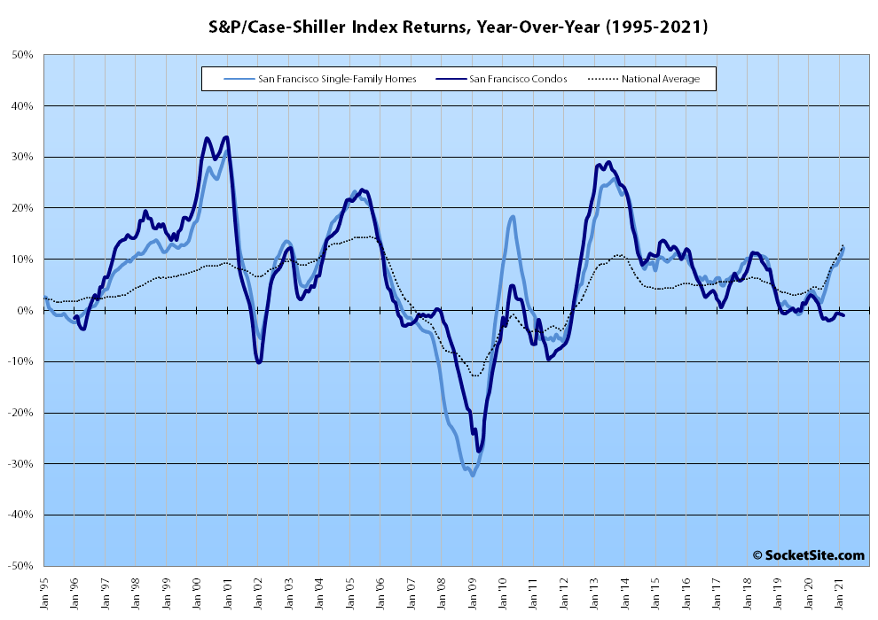
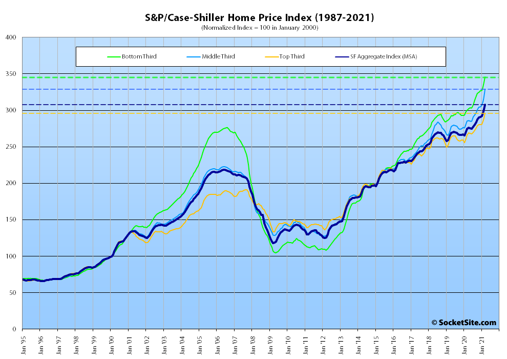
Having ticked up 2.1 percent in February, the S&P CoreLogic Case-Shiller Index for single-family home values within the San Francisco Metropolitan Area – which includes the East Bay, North Bay and Peninsula – climbed another 3.2 percent in March. And as such, the Bay Area index is up 12.2 percent on a year-over-year basis, which is the largest year-over-year gain for the index since mid-2014, while the national home price index is up 13.2 percent, year-over-year.
At a more granular level, the index for the least expensive third of the Bay Area market climbed 3.2 percent in March and is now up 15.4 percent versus the same time last year; the index for the middle tier of the market climbed 4.3 percent for a 15.2 percent year-over-year gain; and the index for the top third of the market increased by 3.1 percent and is up 11.0 percent, year-over-year.
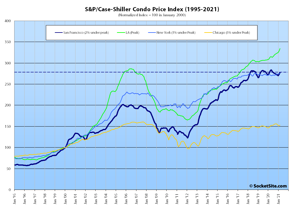
While the index for Bay Area condo values, which remains a leading indicator for the market at a whole, ticked up 1.5 percent from February to March, it’s now down 0.9 percent on a year-over-year basis and 2.1 percent below peak (versus year-over-year gains of 6.6 percent, 2.3 percent and 1.0 percent in Los Angeles, Chicago and New York respectively).
And nationally, Phoenix still leads the way in terms of indexed home price gains (up 20.0 percent on a year-over-year basis), followed by San Diego (up 19.1 percent) and Seattle (up 18.3 percent).
Our standard SocketSite S&P/Case-Shiller footnote: The S&P/Case-Shiller home price indices include San Francisco, San Mateo, Marin, Contra Costa and Alameda in the “San Francisco” index (i.e., greater MSA) and are imperfect in factoring out changes in property values due to improvements versus appreciation (although they try their best).
With such large increases why does this site seem to only select to showcase properties that take a loss?
We don’t “cherry pick” the sales we feature on the site nor do we go looking for sales that result in a loss. In fact, we typically won’t feature a sale if we know its outcome prior to it being placed in our “apple” cart. And in the rare case that we do know the outcome prior, we’ll note it in the copy.
But your question is on point. With “such large increases” in the index, why are there so many apples-to-apples sales in San Francisco that result in a result in a loss and so few sales that yield the indexed Bay Area gains?
I’m afraid that apple picking suffers from the same statistical problems as cherry picking. You admit you aren’t randomly sampling and the data is very thin so your results are biased and even you don’t know by how much. Despite the larger area covered, Case Shiller has a published methodology that has been vetted by competent statisticians. A properly designed index of the Bay Area may be a better guide to SF than a collection of anecdotes from an opinionated source.
“I’m afraid that apple picking suffers from the same statistical problems as cherry picking.”
But you can’t even pick cherries if there aren’t any cherries to pick. If your hypothesis/allegation is that the editor is cherry picking resales to make the SF city market look bad, you should think about if this is even possible. There has been quite a run of 2015 era priced SF city apples featured here. Talking to people trying to leave the city it seems like its really a sellers market in much of the rest of the Bay Area (and even further out). Frankly, many of these people would kill to get in at 2015 pricing in their target areas. These are just anecdotes, but nevertheless since sales prices are public if 2015 era priced resales exist in the wider BA ready to be cherry picked, anyone should be able to find them.
I think back to the last hot SF market in 2007 and I really don’t recall that 2001 era priced sales were occurring contemporaneously with the typical 2007 priced sale.
I agree that non-random sampling can paint a distorted picture, but you can’t distort beyond what’s in the sales data. And you could look at hot markets now or hot SF markets in the past to see how much variation in resale pricing even exists.
Your link proved the point. You highlight reductions and select short holds and houses above $4m. Meanwhile starter houses are going above $2m. Love the pictures and comments but your constant posts showing that everything is reduced and a loss will be quite a wakeup call for anyone thinking they are going to get a average house without overbidding.
Actually, the majority (60 percent) of single-family homes that sold in San Francisco over the past six months were purchased for under $2 million.
At the same time, plugged-in readers would know that roughly 22 percent of all active listings have been reduced at least once (which is two (2) percentage points higher than at the same time last year but a bit below “everything”), the average list price per square foot is down around 4 percent on a year-over-year basis, and that “overbidding” is a function of pricing.
And in terms of “wakeup calls,” the average sale price per square foot has actually dropped over the past six months in San Francisco, and that’s for both condos and single-family homes.
All of which brings us back to your original query, with “such large increases” in the Bay Area index, why are there so many apples-to-apples sales in San Francisco that result in a result in a loss and so few sales that yield the indexed Bay Area gains?
“why are there so many apples-to-apples sales in San Francisco that result in a result in a loss and so few sales that yield the indexed Bay Area gains?”
If you’re asking why your numbers don’t match Case Shiller, the most likely answer is that your numbers are wrong. It’s very believable that the MSA exclusive of SF proper is appreciating faster. But to establish that you would do an apples-to-apples comparison of the same methodology in two places. Of course there’s a difference between the CS index for the MSA on one hand and your half-assed methodology for SF on the other.
That’s certainly one way to rationalize the discrepancy. But unfortunately, at least for the whingers, the price per square foot data contradicts your hypothesis (while supporting ours).
Like I said, I have no trouble believing your conclusion. Your cherished apple-picking methodology still looks like garbage to this observer.
You’ve spent plenty of time schooling commenters about the flaws with price per square foot data, it’s amusing to see you leaning on it for support now. But at least it’s the same metric in both areas.
Price per square foot data, which we’ll frequently reference, isn’t inherently flawed. It’s the misapplication of the metric upon which we’ll rail (as we’re prone to do when people misinterpret, misrepresent or simply don’t seem to understand the strengths and flaws of the Case-Shiller index).
you know, i get the notion that just looking at the sales price doesnt tell you how much housing values have gained bc people invest in updating their homes. But from a buyers perspective, it doesnt really matter.
If you are looking for a home a year ago, and are looking for a home right now, and the median sale price has risen from year to year, essentially, you still have to spend more to get a house. Just bc the house has been updated, doesnt mean the buyer has to pay any less per se. So for any single home perspective that has been updated it doesnt mean that home has increased in value by the bought and sold price, but it does mean that a buyer has to pay on avg more each year they are looking to buy a house.