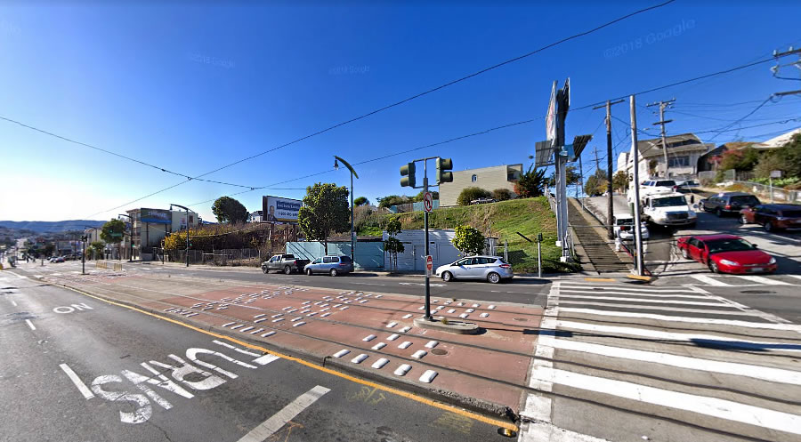
Plans to raze the dilapidated storage shed which currently spans four underdeveloped Bayview parcels on the corner of 3rd Street and Thornton Avenue have been drafted.
As envisioned, the four parcels (5210-5216 3rd Street) would be merged. The corner billboard would be demolished. And a modern five-story development would technically rise up to 40 feet in height, or 50 feet as measured from 3rd Street, upon the slopped site.
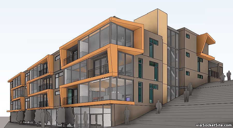
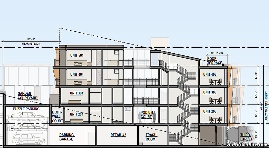
As designed by Mavrik Studio, the development would yield 21 apartments, a mix of 6 one-bedrooms and 15 twos, with two retail spaces totaling 3,500 square feet fronting 3rd Street, stacked parking for 26 cars, and a 3,100 square foot rooftop terrace for residents.
We’ll keep you posted and plugged-in.
Another unremarkable modern design with the quasi orange highlights. This area is close to the Bay and has good weather. A Mediterranean style building would have worked so much better here and added a much needed bit of variety to SF’s streetscape.
Because a Mediterranean style building has an inherent connection to good weather it should be built in a place that has no connection to Mediterranean architecture? I’ll take the modern theology any day over your reasoning.
It was a suggestion. There are other styles as well. The monotonous modern box (with orange stripes and a setback or two) is sterile and uninviting. As to Mediterranean, it is interesting to note that at one time SF was compared to a Mediterranean village clinging to the hills. The white and low slung buildings rising above the Bay looked enchanting. Check out old SF photos to get an idea.
A handsome building in its own right.
Well California is in a Mediterranean climates…
Honest question: is there an architect on this site who can explain why orange is the dominant colour of choice? Is it only in SF?
+1 Seems like blue/green would better reflect the Bay environs. What is with the orange?!
I think it’s an influence of the general renewed interest in mid-century modern design. Orange was fairly popular in the 1950’s for facias and front doors. Think Eichler. Vintage photography from that era is usually black and white so we don’t often see in the images.
Puzzle Parking? SF has plenty of stackers, but is this the first Puzzle Parking system proposed?
This DOESN’T mean I can finally unload my “CandyLand” set? Darn. After some searching I finally deduced this is a system that moves cars both horizontally and vertically, and while that sounds great in theory, I’d be nervous about the possibility of something going wrong
Apart from the over-provision of parking for a location next to the ‘T’ line it seems low impact, a welcome change from the usual development.
I’m still working on promoting my new name for this color, Revit Orange™: “When you can’t think of anything else, choose Revit Orange”!
I work in a Diller Scofidio Renfro (he’s the one) building with a lot of orange details. I saw the color code: “Obstinate Orange.” I think the name was so enchanting to him he couldn’t resist.
Otherwise, it could be a pigment thing. Maybe these orange coatings just hold up really well.
I suppose I t is intended to add visual interest and a little “punch” to the designs of these multi-unit buildings, but it has become an awfully tired cliche. It’s not even International Orange like the Golden Gate, which might make some sense as a reference. I do like “Obstinate Orange” as another option as well!
What are the stairs about in the rendering? Is that a quadrupling in size of the public stair sidewalk on Thornton? If so, that’s nice.
Four stories seems low for right on the T, especially compared to the towers coming to Candlestick and Executive Park further away from rail. I guess height may not seem necessary when there are so many underutilized parcels on Third, but it won’t be that way forever. It would be nice to see at least 7-8 stories to create that comfortable sense of enclosure – the “urban room” idea.
Fortuitous for this to be filed right after the SFMTA ended switchbacks on the T, which will greatly improve transit here.
This reminds me I want to stop by Cafe Envy around the corner one of these days. I’ve heard it’s excellent.
Color of autumn is ignoring the monotony when you have multiple buildings designed and colored in the same way… see ocean ave….second issue is the need to link and loop transit lines so that the T goes to cargo way India basin and up Geneva harney as well as head downtown on another route like Cesar Chavez or bayshore to portrero and to south van ness.
As an architect in high-rise and multi-family buildings for over 15 years, I am always amused at the “armchair designers” we have critiquing every building that is proposed here. I am always dismissing those types as ignorant. They are the type that would buy a car due to its ‘sleek styling’ and never for reliability. I challenge any of these falsely guided chumps to merely sketch something better. I can’t wait to see it. Also, please sketch up a better design for the Salesforce tower while you’re at it, there seems to be a big backlash on that. In the design world, we live by the phrase: Form follows function. Look into it. Don’t forget to post your sketch of a ‘waaayyy better building’ .
OK, architect Mike, I have a question or two of you as a professional about high-rise/multi-family housing.
You speak of form following function, but how functional are the new 2 bedroom/2bath apartments in these multi-million dollar apartments, with the guest bath across the apartment from the associated guest bedroom. Bathrooms in smaller apartments also open into kitchen areas…..really? Also, I saw a 1bedroom apartment on the MIRA/SF website, and there appears to be one 4-5′ wardrobe in the bedroom as the only closet in the apartment. Also doorways to master bedrooms, or master closets, that intrude into the normal walk-space.
I’m just curious on your take as a professional, as to the thinking behind space design in 2019?
I have questions too!
In this building, what function drives the form of the floor-to-ceiling windows?
What function is served by the tiny little balconies? When I look at buildings of this type that are already built, these spaces are mostly used for storage. Is that right?
I looked into it Mike.
Form Follows Fiasco by Peter Blake. Skillfully blending documentation and illustrations, and gradually sharpening polemic and humor, Blake calmly explodes the fantasies of modern dogma that most architects once accepted. Such truisms as ‘form follows function’, ‘the open plan,’ and ‘purity of design’ are exposed as volatile ideas. The intricately planned, artistically designed components of the Ideal City have divided urban areas into tidy ghettos of culture, education, business, residence…even pornography…alienating individuals and threatening not only the economic futures of our cities, but civilized aspects of life in the West as well.
Tom Wolfe was a snide prat, but From Our House to Bauhaus with its view of sacred temples of architectural Dogma are very funny.
Also, it may be a crazy paleocon magazine, but American Conservative has a very good urbanism column (if one can ignore some of the racist commentators) with an essay this very week puncturing the pretensions of “Mike”.
Form follows function… if you enjoy hugging support columns in your living rooms and bedrooms.
The Salesforce tower has been judged by the “masses”, the proletariat. Enough said on that. As to architecture and sterile modern architecture in particular, one need look no further than the new urbanism and the renewed interest in classical/neo-classical architecture to realize much of modern architecture has been found wanting. By the folks who count – those who live and work in these buildings.
Do you think the predominant design styles taking place in Seattle are good architecture? If so, why?
Eliminate the parking (the building is directly adjacent to the T-Third Muni Metro Line) to create more space for dwelling units.
For mole people?
No silly.
They’re currently proposing to excavate the rear yard to accommodate parking stackers — in lieu of the stackers, leave the rear yard open and they’ll have the requisite exposure for additional dwelling units instead.
So they will be “hole people” looking at a 25 foot retaining wall.
Plus the 20 foot high property line wall of the adjacent house = 45 foot high wall.
We seem to be relying too much on the T-line which like the L and J and M do not really service the areas as they do not loop and link across platforms to make the system more flexible and transitional for future growth. The T-line should evolve with more off-shoots to take people out of cars and onto public transit. To ignore this means we have a parking lot in front of this building worsening daily.
“Loop and link across platforms”? What does that mean? Can’t understand this comment at all.
So the building will be facing roughly southeast; this means that it will be getting quite a bit of indirect sun which is good, but there is also going to be a decent amount of direct sun from sunrise to noon at most times of the year as well. So it might make sense if those orange fins were projecting over the windows to block more direct sun closer to the middle of the day from streaming into those units, right? Except that the windows are pushed out to meet that element of the design; the projections are just used to articulate the bays, not as practical solar shades, which also explains why they alternate sides- if any thought was being given to the location they would all be facing the same direction, but as it is they are just a “fun” design element and serve no practical function. Which I am not opposed to, but it certainly opens the design up to criticism as it’s not exactly a solid example of form following function, is it?
Very excited about this. Hoping the NIMBYs don’t kill it.
I live in the Bayview, and I hope this gets built. I do wonder why the architect can’t look to San Francisco’s rich past for inspiration. This building could be anywhere.
I will leave the commentary on architectural design elements to those so inclined, but i would ask “Is more refined and innovative architecture” a bigger lure for people to move to the Bayview over proximity to freeways/public transportation and walkable spaces? I live in the Bayview, matter of fact live on Underwood Ave. which runs right into this property along Third St. and have seen this property sit as an eyesore for the past 35+ years if not longer, and which was even worse before the City demolished the dilapidated home and sheds that once occupied the vacant parcel next to it.
It may be shortsighted but i want to see housing and commercial built on the MANY vacant/abandoned parcels along the Bayview Third Street corridor, for a future of residents and shops and vibrancy that Third Street and Bayview have rarely if ever known (at least not since the days of the active Naval Yard). To know the Bayview is often to have a glimpse of what could be and rarely what is. The community is strong, people know/speak to each other and tend to look out for their neighbors but outside of that the things that are available to enjoy in the place you live, are limited. Every day i drive down Third Street to vacant storefronts and wonder what having a vibrant corridor would be like, so i welcome this development and whatever color it may be so long as it brings residents who want to be on their small balconies and part of the community.
I understand there is a complete school of thought and study to design, form and function, but can’t lose sight of that this is clearly not meant to be an iconic building and since the Bayview is a hodgepodge of designs seems a waste to get bogged down in trying to find some innovative way to blend design especially if doing so adds to cost. In this case, and in this location, i think function is likely the greater part of the design scope with an eye to a few additional design details as more than ideal. Let the grand designs be reserved for Candlestick, Hunters Point, Central Waterfront areas that are blank canvases and can be shaped by innovation, and imagination.