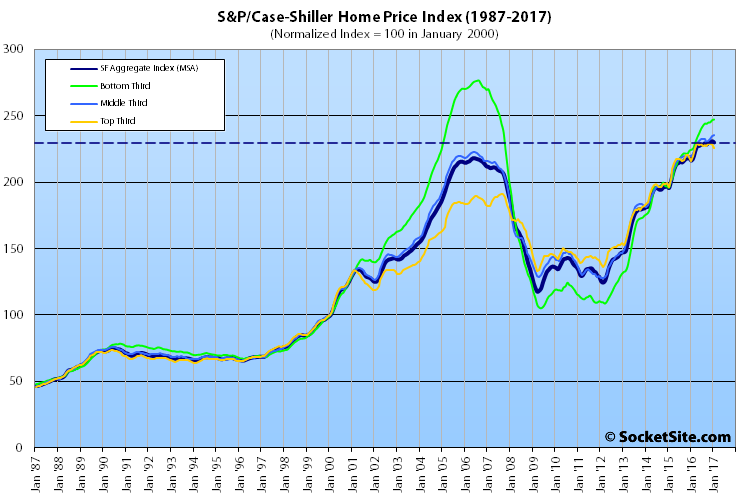
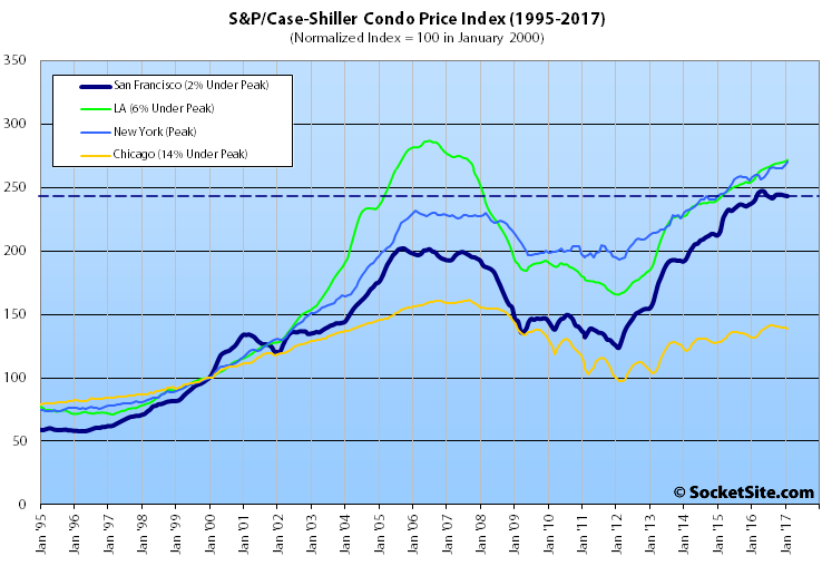
Having inched up at the end of last year, the S&P CoreLogic Case-Shiller Index for single-family home values within the San Francisco Metropolitan Area – which includes the East Bay, North Bay and Peninsula – slipped 0.4 percent in January while the national index ticked up 0.2 percent for a 31-month year-over-year high. The condo index for San Francisco slipped as well.
And in fact, the only five metropolitan areas to register a single-family decline in January were San Francisco, Minneapolis (-0.6 percent), Detroit (-0.4 percent), Cleveland (-0.5 percent) and Atlanta (-0.2 percent).
That being said, the aggregate index for single-family Bay Area homes remains 6.3 percent higher on a year-over-year basis, which is down from a 10.6 percent year-over-year gain at the same time last year and an average of 7.0 percent over the past twelve months.
And while the index for the bottom third of the Bay Area market ticked up 0.2 percent in January, and the middle third gained 0.3 percent, for year-over-year gains of 10.1 percent and 7.1 percent respectively, the index for the top third of the market dropped 1.2 percent but remains 4.6 percent higher on a year-over-year basis and 18.0 percent above its 2007-era peak. The index for the bottom third of the market is still 10.6 percent below its peak in 2006.
The index for Bay Area condo values slipped another 0.2 percent in January but remains 2.3 percent higher versus the same time last year, the smallest year-over-year gain since 2012, and 20.4 percent above its previous cycle peak in October 2005.
And for the eleventh month in a row, Seattle, Portland and Denver have reported the highest year-over-year gains in the index for single-family homes, up 11.3 percent, 9.7 percent and 9.2 percent respectively with month-over-month gains of 0.6 percent, 0.1 percent, and 0.5 percent.
Our standard SocketSite S&P/Case-Shiller footnote: The S&P/Case-Shiller home price indices include San Francisco, San Mateo, Marin, Contra Costa and Alameda in the “San Francisco” index (i.e., greater MSA) and are imperfect in factoring out changes in property values due to improvements versus appreciation (although they try their best).


I find this confusing. Approximately what is the “top third” of the market?
I live on the mid-Peninsula and everything in this area (Burlingame/Millbrae/San Mateo north of highway 92) is still multiple offers, well over asking, etc. But this is in the $1 million – $2 million range. I assume the “top third” is higher than that?
The East Bay (where I’m looking) also seems to be skyrocketing, with any decent home in Berkeley or nice Oakland neighborhoods going 20-30% over asking.
So where exactly is the market softening, apart from condos in SF?
Notice the conflation of “multiple offers” and “over asking” with the perception that the market is skyrocketing.
The RE industry is well aware of the outsized importance that perceived momentum has on buyer psychology. Under-listing homes ensures “over asking” outcomes to create the perception of momentum, buying into a hot or skyrocketing market.
But momentum is double edged sword and what helps on the upslope hurts on the downslope.
True, but prices are genuinely increasing in the areas I mention. Millbrae is now averaging over $900/sf, Burlingame over $1000/sf. Those prices aren’t decreasing, not are prices in the East Bay. So, again, where exactly are they?
First off, the case shiller numbers are only 0.4% down. And it seems a reasonable conjecture that less desirable areas and homes get hit first when the market turns. So if the average is -0.4% and you assume Millbrae is above average, then you wouldn’t expect to be seeing heavy losses in Millbrae and the like.
Also I’d more call them curiosities than gold standards, as parksidemike mentions below, but a quick check on Zillow does show a distinct flattening in their estimate of Millbrae home values (Look at the slope change before and after late 2015) I’m not sure where Redifn has hidden their per-city estimates, but I do see that have Millbrae’s median sale psf at $828.
Supply is also low, so median is jumpy.
I live in San Mateo now. I watch these areas closely. I think many of these multiple bid things are low bidders, btw.
Generally, I am sure the market will soften much more. But I’d (we’d) buy right now if I could, because why wait 1,3,5 years for an unknown decline, and pay rent in the meantime? We are staying.
OTOH, renting is great if you are not sure you’re staying. I still hear nutballs say things like, “we’ll buy, but sell in a couple of years when we leave….” Recipe for significant losses.
looks like we are sitting in a similar position to Q1 2006 on the graph. next 5 years wont be great, but should bounce again after. 10 yr time horizon still looking good. 5 year, not so much
Only difference is that back then housing across the country went into a slump. This time the next 5 – 10 years looks like boom times RE-wise not just for Seattle, Portland and Denver, but other markets such as Nashville, Orlando, Jacksonville and more.
A 5 – 10 year breather for Bay Area housing prices as some other metro areas play catch-up. A very healthy re-balancing of prices may be taking place.
The only way home prices nationwide will continue to rise as incomes remain flat is a return to scandalous lending practices (I would say loose lending, but we’re already there now). When people in Orlando pay 50% of their income to housing, SF style, the entire national economy will implode due to lack of consumer spending.
US real personal income has been rising for years, 8% 2015+2016, per BEA stats (FRED graph at namelink). The US economy appears stronger and more stable than the US polity.
Take a look at the graph and compare real income today to 1999 and 2007.
sure, the graph/data shows real income in 2017 is 19% higher than in 2007 and 50% higher than in 1999, comparing the Januaries of each year. All signs of rising incomes, not flat nor remaining flat. Really, this data disagrees with your thesis.
You need to look at income vs expenses. Can’t see your graph link but perhaps you are not looking at the CPI adjusted numbers, and the CPI understates real inflation. Also worth nothing that household income includes government assistance, money from 401k etc. Ask 100 people on the street if they feel that income has kept pace with essential living expenses like housing, food, and healthcare since 2009; ask them if they are spending a smaller or greater percentage of their income on housing. Here is some data.
Also look at income growth vs GDP, why the big discrepancy, something is fishy. “One of the reasons that most people may perceive themselves as being worse-off even though average GDP is increasing is because they are indeed worse-off”. -Joseph Stiglitz
FRED also has the disposable income and expenditures data. None of them support your thesis. Your data link is for 2014, well, the recovery has continued and we have had real growth in incomes since then. Gallup’s U.S. Economic Confidence Index is also positive and has been for a while.
The one that supports my thesis is the only that matters, which you have not addressed- real income CPI adjusted.
In fact, all you landlords had better hope that this trend reverses soon. Because as the bottom 80% get squeezed harder and harder, the rent control movement is gaining lots of momentum in cities where it never existed before.
Alternatively, we could be at Q1 1990 — which would mean sliding sideways for 8 years. At any rate, VCs would need a reason start dropping $10billion a year on Market Street to kick off another upturn. We’re living off of OPM at this point…
I read this blog once in awhile. Though I’m just a homeowner, not real estate professional, I find the comments interesting in terms of knowing somewhat what is going on in SF real estate.
I own a 3 Bedroom, 2 Bath, 1860 sq ft house in the Avenues in SF. I’ve done periodic avg estimates on my house, using 4 online services, like Zillow and Redfin, since 2014. Just taking 4 such estimates and simply dividing by 4 at different random pts in time. It was a median price house when I bought it in 1984 and seems to remain in that median price band ever since, through ups and downs.
I know these type of estimates are not well regarded by professional real estate investors, but for another (amateur) observation for what some on this blog have referred to as a flattening lately, I include the following observations on my house.
Estimate Date Avg Est Chg
08/15/2014 1,018,000
02/14/2015 1,049,000 2.96%
10/8/2015 1,274,000 17.66%
03/3/2016 1,336,835 4.70%
07/12/2016 1,378,021 2.99% Peak
10/9/2016 1,307,826 -5.37%
12/30/2016 1,319,674 0.90%
03/28/2017 1,297,448 -1.68%
Wow. Chicago. 0 Zero appreciation in 14 years.
California had the largest number of homeowners leaving for another state (outmigration) in 2016. And the second highest (behind NY) ration of owners moving out to owners moving in. And not just retirees, CA was 2nd in millennial outmigration ratio as well.
There was that poll of Bay Area millennials from last year (Socketsite ran it IIRC) showing a very large number planning on relocating out of the BA in the relatively near future for a host of quality of life reasons. CA being the second in millennial outmigration jives with that poll.