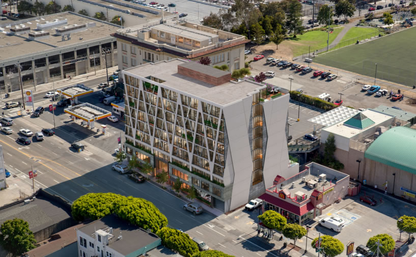
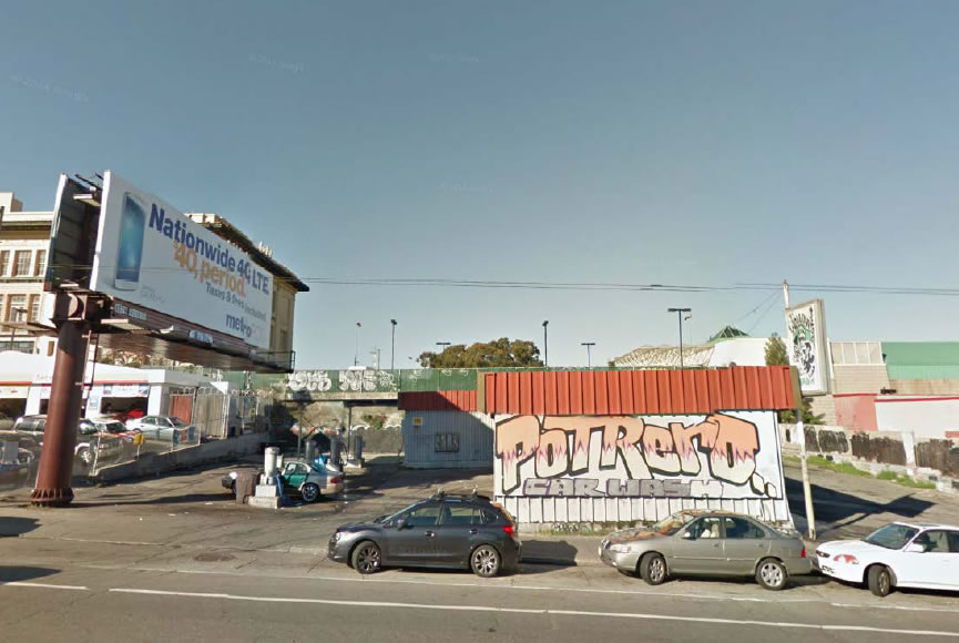
Plans for a modern nine-story building with 70 condos to rise at 346 Potrero Avenue are slated to be approved by San Francisco’s Planning Commission this afternoon. The development would replace the current car wash and billboard which are sandwiched between the Shell station and McDonald’s at the intersection of 16th Street.
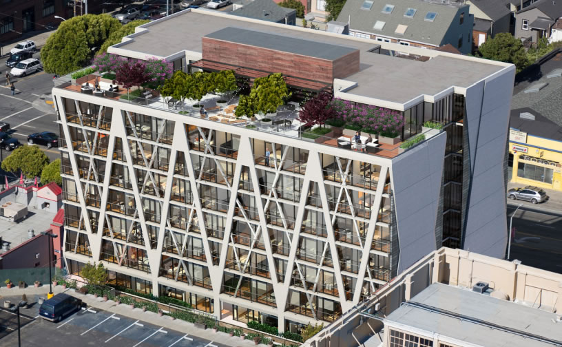
In addition to the condos, eleven of which would be Below Market Rate (BMR), Trumark Urban’s proposed project includes 1,600 square feet of retail space on the ground floor along Potrero, 43 parking spaces in an underground garage, and 5,000 square feet of open space at the rear and roof of the building, facing west.
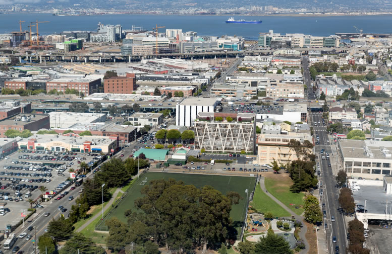
Designed by Handel Architects, the 85-foot-high building will cast some shadows upon the adjacent Franklin Square soccer field for about an hour in the morning before 10AM.
That being said, San Francisco’s Recreation and Park Commission has determined that the new shadow, which wouldn’t reach the children’s playground, would not be adverse to the use of the park, a finding which should be affirmed this afternoon and allow the development of 346 Potrero to proceed.


Quite convenient to the Bonhams auction house.
Project looks good with its mix of Retail & Residential , But I want to see the 2 corner lots redone also , though no idea how long the Mcdonalds lease has left , and Gas Stations are a pain to build over ,
BUT , anyone want to bet that 359 & 450 Potrero begins the process to rebuild in the next 2 years?
Linea was built over a gas station, seemed pretty hassle free.
This certainly would make a really crappy block a little less crappy. If the bulldozers “accidentally” flatten that McDonalds in the process I’m willing to look the other way.
Oops, didn’t mean to post that as a reply to CrockPot. Just a general comment.
The Linea took two years longer to the point they changed it from having BMR to not
They aren’t touching the gas station…on the car wash.
Fantastic looking building and long overdue development. Would love to see Potrero Ave really bloom with taller buildings and a lot more density.
Delish. 50 more please.
Don’t do it! Keep the ghetto wash open forever!
nice
One incongruous McD’s down, and another now rendered equally out of place and vulnerable. Excellent.
Wrong. The McD is staying in place.
this looks like a Howard Johnson
I like it. Has a structural expressionism look to it. Nice to see something that doesn’t look like it was built out of legos.
At least for quite a few years it won’t be a very pleasant place to live, on a noisy street with a McDonalds on one side, gas station on the other and a parking lot in back. And Handel’s projects often fail to live up to the renderings in their execution.
I still don’t understand how all of Nema’s guts and mech equipment are allowed to just sit out like that. Can’t they at least screen it?!
This project looks awesome, btw.
This building looks good to you guys? It looks like a Holiday Inn from the 70s to me.
That was also my first impression. Then I looked at the details and see a more contemporary feel.
I’m excited. I walk by this intersection every day on the way to work and it’s such a craphole. Not the worst area in the city, for sure, but definitely in need of some “life”. Nine stories is pretty high (tallest nearby building is Hamm’s at the same height) but that means a little more density.
A development like this could singlehandedly start transforming the neighborhood. Might we start seeing real walkable attractions soon?
Start transforming the neighborhood? I hope you’re not referring to the word that shall not be named (hint: it starts with a “g”).
I think it looks great and I’m glad to see balconies because too few units in SF have them.
Wow with the epically crazy 16th & Potrero transit stops all around, the view of bedlam from that “open space” on the roof (chortle) should keep our 911 operators busy. The Potrero Center has also been up zoned to 85 feet and its only a matter of time before that thing is redone as another bulky housing block.
Why are San Franciscans so opposed to shade? Skin cancer is real, people.
Reminds me of the old Verducci Hall at SF State. They took care of that eyesore – http://www.sfsu.edu/implosion/
Inspiration or rip-off? Actually, I hope it turns out this nicely.
http://www.pinterest.com/pin/341781059194193027/