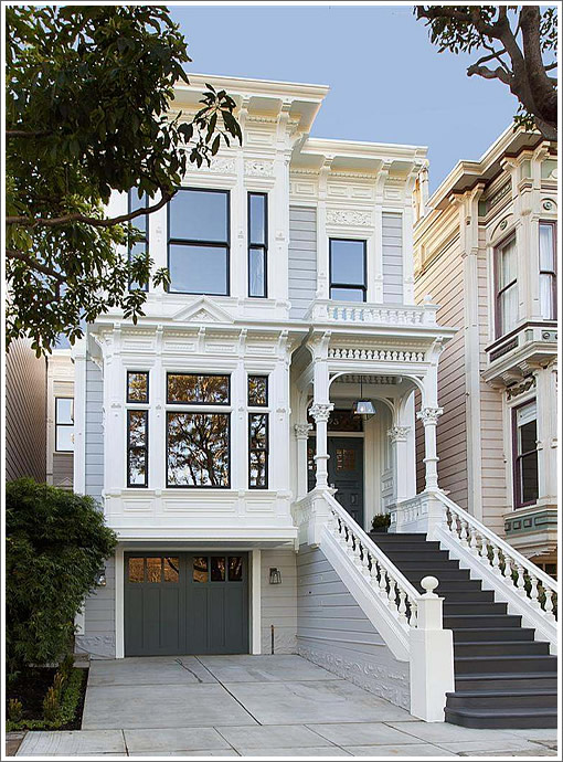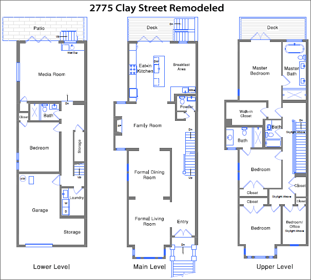
With a bit of original period detailing having survived its recent renovation, including the refinished banister connecting the main and upper floors, the remodeled Pacific Heights home at 2775 Clay Street is back on the market for $5,395,000 having sold in semi-original condition for $2,700,000 in December of 2012 (click floor plan to enlarge).

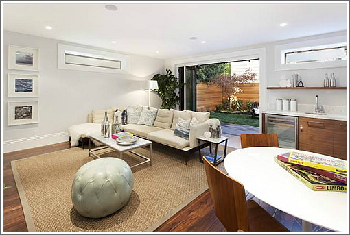
Purchased with a three-car garage and an unwarranted in-law, the garage has been downsized to tandem with a new bedroom, bathroom and media room on the ground floor:

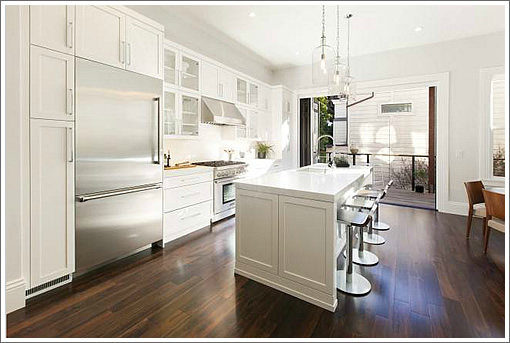
Above, there’s an all-new kitchen with a south facing NanaWall as well.

∙ Listing: 2775 Clay Street (5/4.5) – $5,395,000 [2775claystreet.com]
Wow, now the question is: Will this place sell at that price?
Can someone PLEASE tell me the trick of how you can build a combustable deck up to the property line? I see it over and over again and just can’t figure out the code exception here…
Very, very little inventory for that size/condition in D7. Most comps in the past year went quickly with multiple all-cash offers.
I felt they overpaid grossly when this sold (overbid 30%) and they did a pretty poor job on this remodel on the inside. The front looks fantastic but the interior space is still all chopped up and the rear facing view is not great.
Nice finishes inside but pretty simple/standard these days and some of it feels tacked on. It was 2840 sqft when is sold before and looks like maybe they added 500 on the basement? Call it 3400 sqft generously.
I’d be surprised to see this get above $5M and could go for much lower. This isn’t the kind of project that I would reward. But I do like that block of Clay on the park and Joshua is correct that there is pretty much zero inventory at that level right now. Never hurts to shoot for the moon. Good luck to all.
How much did this remodel cost the flipper?
Hmm, that “family room” is a terrible idea. They should have made that (part of) the dining room. This is the usual challenge with the old Victorian floor plans. I know a lot of the crown molding and wainscoting bigots on here like to complain about the “big room” trend, but the first thing I’d do after dropping $5.5M on this place is change that main level.
All-cash offers…enough said. Let’s move on to the next property.
How can that bannister on the upper floor walkway be up to code?
There are gaps large enough for a toddler to fall through.
Another grand victorian sacrificed to recessed lights and some misguided notion that white paint equals a unifying vision.
Onlooker – can you, or someone who constantly bemoans recessed lighting, explain why it is you hate it so much? And if so, can you give some examples of lighting that you’d prefer?
Some posters carry on in here about recessed can lighting as if someone had just defaced the Mona Lisa.
Hey, Fishchum, from an aesthetic point of view, they produce an even, and hence uninteresting illumination, unlike a nice, victorian combination of rosette and chandelier, maybe a sconce or two. From a practical point of view, most Victorian ceilings are 11+ feet (mine have 13 feet downstairs) Now, try to change the light bulbs…. but I suppose if you pay $5million plus you can keep a handyman on retainer.
Oh gawd – not another island-only sink. Kitchen will look great with a drying rack, soap, pots…etc. all chilling on the island.
Exbernaler – if you look at the floorplan, you will see that a seperate sink/dishwasher is located adjacent to the Breakfast Area – an awkward placement to be sure (although perhaps not as awkward as carrying the Thanksgiving turkey through the Family Room), but one that allows the island to serve as a prep sink and and allows the chef to tuck dirty dishes around the corner from Dining Room view.
So more bedrooms, less parking, pedestrian, at best, finishes: only in SF would this go into multiple cash offers.
Oh and flippin’ titanium white paint by the 5 gal bucket.
Timing is everything, and I thought they did a pretty good job with this one. Very surprised if it does not sell above asking…looking at offers Monday, I think.
Most mid to high end renovations are using LEDs to achieve their high efficiency light allowances in their recessed fixtures. Their operational lifetimes means the chance of ever replacing an assembly is effectively very low.
Your ideal lighting plan, however, will involve layers of lighting, including sconces, pendants and yes, lamps.
I do not understand why the trim was not continued throughout the main floor, and yet the spaces were left open.
I agree the choices are relatively safe — at this price point, perhaps the finishes are just for staging purposes. Like “GetOffThe Ivy” I also question the wisdom of sacrificing a side by side parking space.
This is a beautiful project.
I think the floorplan here was opened up thoughtfully. So many here seem to have the idea that opening up a space is an all-or-nothing proposition, and they were able to maintain distinct rooms with archways.
Is there a family room between the dining room and the kitchen? Sure, where it ought to be for the 95% of the time that’s better location. Anyway, doesn’t everyone except Norman Rockwell carve turkeys in the kitchen nowadays?
Questions:
Are those black painted handrails or just dark wood?
2 cars tandem parking inside, or 1 garage + 1 driveway space?
I don’t really know this neighborhood well enough to bet, but brand spanking new, family spacious, directly across from Alta Plaza? Seems that’s $5mm blue chip pretty easily, though $5.4mm/3400sf is quite a ppsf number.
Congratulations and good luck!
@GetOffThe Ivy: If this were in Brooklyn Heights it would start at $6.5. In Manhattan, add another $2M.
@onlooker: They preserved the streetscape– that’s all you need care about. I agree about recessed lighting. The old incandescent/halogen fixtures were ugly and used to excess, Here they’ve been fairly discreet, plus used LEDs instead.
@Gur: I suspect they remodeled the ground floor to make it acceptable to Plannning. Unlike other remodels– where Planning has encountered flack for not fully preserving the accessory unit, whether legal or not– this can stand alone as a separate apartment.
They should have kept side by side parking, instead of the laundry room. The washer/dryer should have been on the top floor instead.
To get the deck requires a fire barrier at the property line. Very standard to do.
@ Charles: “To get the deck requires a fire barrier at the property line. Very standard to do.” –
Understood but the second floor deck goes to the property line without anything to separate it from next door.
Sorry – make that the 3rd floor deck…