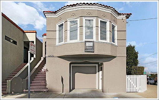
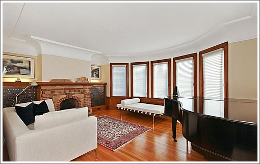
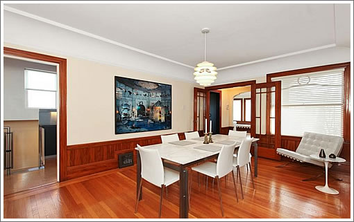
Behind the barrel-fronted facade at 2200 Mariposa Street, the original wood finishes in the living room and adjoining, but separate, formal dining room have been beautifully restored.
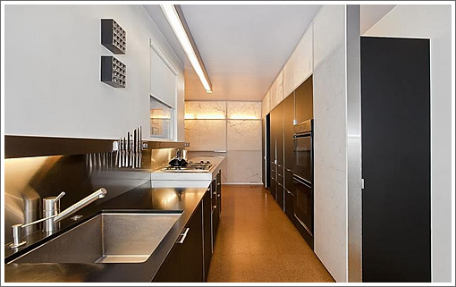
With a wall of black cabinetry, Alabaster accents, and sleek new counters, the modern kitchen might come as a surprise, either pleasant or not depending upon one’s taste and style.
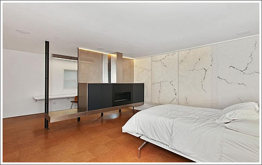
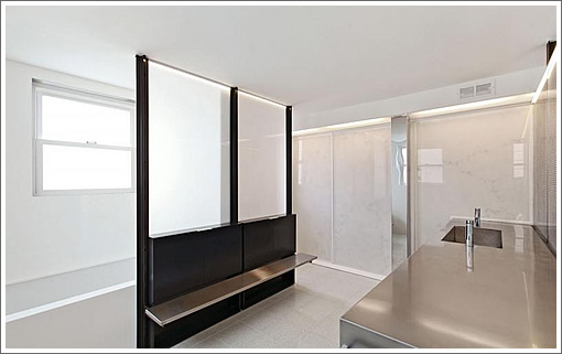
And while the three bedrooms on the main-level of the Potrero Hill home maintain some period details and trim as well, the new master suite on the lower-level follows the modern aesthetic:
∙ Listing: 2200 Mariposa (4/3) 2,175 sqft – $1,399,000 | Floor Plans [2200mariposa.com]
The presence of modern furniture in the traditional part of the house hints that maybe the owners’ tastes ran to modern, but they didn’t have the heart to destroy the traditional parts of the house. Very, uh, interesting result.
While I personally think this is too bipolar for my taste, maybe this will be the compromise for that couple with wildly diverging architectural/decor taste. Nice views.
Finally — a house with rooms 🙂
I really like this….the contrast of styles is actually interesting to me, and the kitchen is very intelligently done. Isn’t it cheap in today’s market, or is there something I’m not getting? BTW, that rear bedroom (#2 in the plan) is a typical feature in SF properties of this type, but with walk-through only access from bedroom 1 or 3 isn’t obviously isn’t really a bedroom. We have exactly this arrangement in our house and it makes a great office.
” Isn’t it cheap in today’s market, or is there something I’m not getting?”
I think because it’s fronting Hwy 101, and thus the pricing being lower.
I like the modern design insertions.
Kitchens and Bathrooms tend to be periodically remodeled through the life of a residential structure.
I haven’t seen “before” pictures for this house, but I can easily imagine the avocado appliances, orange formica and amber glass light fixtures that may have still been here from the equivalent major remodel of this kitchen in the 1970’s.
Just so that we are aware that no matter how much this redesign appeals to us today, at some future date it will read the same as “avocado appliances, orange formica and amber glass light fixtures” to that future generation.
Say whatever you want about the interior finishes – This house sits right across the street from 101. Forget opening your windows or spending time in that side yard. I could think of much better ways to spend $1.4M.
Yeah, it’s a bit schizophrenic. Maybe they ran out of money before they could modernize the living room. And speaking of money, this would be a half million more if it were in Potrero Hill proper. But this is on the wrong side of the 101 and awfully close to it at that. To post photos of 18th & Missouri in the gallery under “Neighborhood” borders on fraud.
Are you kidding?
What a goofy floor plan.
The garage level bedroom(s) and bath look like they were dropped in from outer space.
wow, the entire side of the home is across the street from Mariposa, with not even a sound baffling wall or very much greenery. (Thanks Google street view)
The modern finishes are very high end and well done, although I find that much stainless a bit clinical and cold (physically).
I actually like the modern furniture with the restored old finishes – I don’t think they “ran out of money”, I think they were respectful and intelligent.
However that stainless steel counter in the bathroom has got to go – and the old double-hung window doesn’t quite work there either…
(And BTW, John Farnham / Pacific Union – when I click on “floor plans”, I want to go, immediately, to the floor plans. Not be shunted through some goofy satellite view of San Francisco that requires yet more clicking. What is this, 2003?)
As one who always looks for the positive, I would note that this house is in easy walking distance to Bonhams and Butterfields.
Maybe it was done by two different designers/contractors…It could be used as a set for a new SF version of Rocky Horror Show.
First the old traditional inviting entrance of the living and dining rooms, then all the bad stuff happening in the rest of the house…it is a little scary actually and I think would be hard for anyone to live in even if furnished differently. That child’s bed with the plastic (or is it glass?) guardrail was particularly off-putting.
But at least they kept some rooms. There should have been a better melding of old and new for the kitchen, bath and new master bedroom. And I am sure they could have done that if someone had taken a breath before proceeding.
“What a goofy floor plan.”
Help me understand why this is a goofy floor plan. It’s actually practical with very usable spaces. The big drawback to this home as others have noted is the proximity to the freeway.
thanks for looking at a map for me…now I understand the pricing. God, I can’t believe I was thinking $1.3 million was CHEAP. Time to move….
Um … no. What is up with that stretched countertop in the kitchen? Why not wrap more counter space around the wall instead? It just looks weird.
Also agree with the psychology references of bipolar/schizophrenic. Looks like two different houses depending on the room you’re in.
And the master bedroom (I’m assuming) with the fireplace and associated bath. Does my straitjacket come with the house? Those rooms look completely institutional.
The lower-level rooms are a bit too antiseptic surgical theater for my taste, but hats off to them for not gutting and bastardizing the rest of the house like so many people do in SF. Well done.
I like the modern furniture in an intact historical setting. It’s very common in Europe.
And it’s so nice to see that San Francisco finally got a CSI franchise. The dissections in that new bath/spa are going to be great!