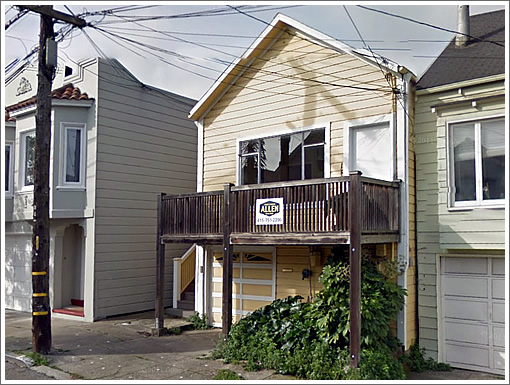
Having sold for $700,000 in 2005 as a one-bedroom with 760 square feet, as plugged-in people were aware, the single-family Bernal Heights home at 330 Banks Street was foreclosed upon in 2010, was listed for $499,900 in early 2011 and re-sold for $450,000 that May.
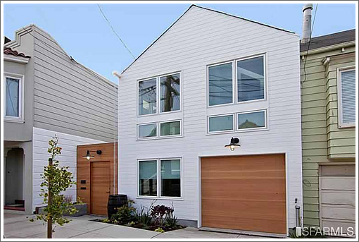
Having been completely remodeled, modernized, and now “fit for Dwell magazine,” 330 Banks is back on the market as a three-bedroom home of 1,253 square feet for $1,195,000:
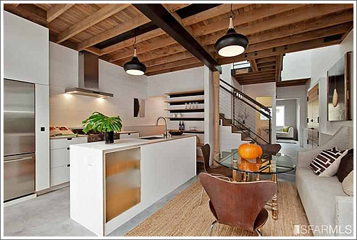
The rafters have been exposed, the heat is now radiant through concrete and cork floors, and there’s an excellent use of space (and light) throughout.
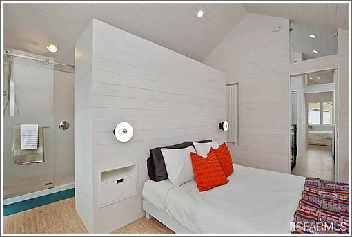
And behind.
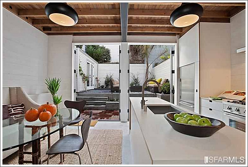
∙ Listing: 330 Banks Street (3/2.5) 1,253 sqft – $1,195,000 [via Redfin]
Man…so we’ve reached $1000/sf in Bernal Heights too. I have nothing particularly insightful to say here, just that this market is nuts. I’ve lived in BH for nearly a decade, and love it, but never thought it would reach these prices.
I’d be curious to hear what people think of this project and expected purchase price… per Redfin its over $900 psf.
Is the shower behind the bed such a good idea? It seems like it could get pretty damp and musty, especially in the winter when you open windows less.
doesn’t look like there’s a window in that bedroom…
A sure sign that the “Dwell look” is on the way out when listings explicitly call it out by name.
1700 sq. ft. lot? That’s rather tiny.
I wonder why they moved the garage door to the other side during the redesign.
I’m guessing $1.1 million, without having seen it in person.
A condo flat this size on Precita Park just sold for over $1.2 million, so the price is not out of line. I’m guessing it will go for over asking.
^To maximize the sideyard, and have a nicer entryway. Dwell look, dwellified, dwelltastic is BS, sick and tired of people referring to anything somewhat modern as “Dwell”. We should also start calling anything pre-78 “victorian”. Sf will only have two forms of architecture, dwell and vic
South of Courtland is so not worth nearly $1000 sq/ft. Much more ghetto. Plus Courtland is worthless compared to 24’th, Hayes, Chesnut, Union, etc, etc..
COURTLAND?! Dude, before you hate, learn how to spell. In addition, Cortland is not meant to be like 24th Street. That’s precisely what gives it charm and a village feel. This home will see for over asking in no time.
I’ve always preferred the south slope of Bernal. The area around Cortland has such a great feel.
“Courtland” is an older spelling, that can be found on this funny ancient map
This would make a great beach house. On a beach, of course.
These Dwellification flippers are ruining the aesthetic fabric of San Francisco neighborhoods. But I realize I’m in the minority, and with so many arrivistes bringing their preferences here along with their equity, I’m sure it’ll sell at asking or higher.
Which will motivate the next flipper to ruin the next home. Lather, rinse, repeat.
I’m not crazy about the flat facade. Is there a reason for this, or is it just an “aesthetic” choice?
I really like the remodel. I have no opinion on the pricing/location.
Beats a Richmond Special any day.
Brahma, why are you hating on flippers, do you think the place looked better before? Wether you like the style or not Flippers are improving the streets around the city
Am I missing something or is there really no family room in this place? You can’t call that tight little spot right in from the street entrance a family room. It’s a reading nook at best. I like how they did the entrance. I like the design in general. But a 3 bedroom with no real family room seems like a hard sell.
I certainly haven’t flipped.
But while I’m opinining. Fishchum wrote:
Well, I don’t know the flippers. That should be obvious.
And I haven’t looked at their internal projections or pro forms, but I’d bet that the flat facade is just cheaper to execute, and the flippers wanted to take the money they could have spent on that and decided to spend it on the interior.
+1, mikey woodz. Anyone who thinks the old version is preferable to the new version, or who thinks the old version had any redeemable value worth preserving, is smoking something better than what I got. I love what they’ve done, and would buy it in a heartbeat if I was in the market. As to price, we’ll find out, but based on a list of what has sold over the last few months, this is an easy sell. Check out Nevada and Jarboe, not nearly as nice, but a nice enough renovation. Went into contract very quickly, at about the same price point.
Looks great, but overpriced as usual.
tiny bedrooms, tiny living room, overpriced.
Three beds, two and a half baths over 1250sf? You’re not getting Kaufman-Broad-in-Tracy-sized room dimensions with that footprint. What did you expect?
This is a beautiful, thoughtful remodel. While it might not be the best call to label it ‘Dwell’ in the marketing materials, and the exterior is not amazing, the interior photos demonstrate to me a great deal of care went into the execution at the very least. I think this is what $950 per foot is supposed to look like.
AND OH NO IT HAS A BERTAZZONI RANGE JUST LIKE FUTURIST’S HOUSE!?!?!?!?!?
In contract over ask before Thanksgiving.
$17-20 billion valution range on the little bird.
Whoops, I meant 11 billion valuation, but who’s counting?
nice look … the layout is incredibly tight, especially that front stair and sitting room, and they made some questionable decisions regarding acoustics at the master (open bath and shower glass at the transom above the entrance), but I’d live here. Nice attention to detail generally not found in flips. Love the wood paneling inside but could have broken it up a bit for some relief. I would call this expensive, as everything else is in SF these days, but definitely not overpriced.
That living room is smaller than some closets posted on here.
What a convenience to have the shower right in the bedroom! Keeps the bedroom all nice and moist and misty.
Wonder if the toilet is in the bedroom too.
Special architectural attributes for people with $1.2 million to spend and no sense.
Yeah, you’ll feel like you’re in a world-renowned star architect Saitowitz crap condo.
Toured the place. Nice airy design. Nicely finished; like the stained wood planks. But the spaces are tiny. The kitchen has barely any counter space. The room up front is NOT a living room. No storage. And three bedrooms? You can’t put all those people in one single space. Overall design makes no sense.
I like the low budget nanawall between of the kitchen/DR space and the back patio. While not nearly as classy as a real nanawall those double french doors were certainly a lot cheaper. The real cost savings come from avoiding moving that center steel beam and the expensive reinforcement that would have been needed in its place.
I do not understand why the space above the fridge is closed off when it could have been used as cabinet space. You don’t want to waste space in a small kitchen.
MOD said: I do not understand why the space above the fridge is closed off when it could have been used as cabinet space.
Is it? In pics 10 & 11 you can see a seam down the center. It may be a flush cabinet. There is a shower above, so, I suppose there could be pipes — or a tankless water heater that vents to the outside?
You could be right EBGuy. Whether the space is used for plumbing or storage it would be worthwhile.
Listed on 10/24 and Pending on 11/4. I think soccermom sandbagged when she said on 10/28 “In contract over ask before Thanksgiving.” 🙂
Sold for $1.5m on 11/19/2013. I’m way under in my guess.
UPDATE: That Bernal Heights Dwell-ing Fetches $1,197 Per Square Foot