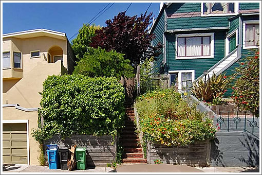
As we wrote about 680 Douglass back in October of 2011:
Purchased for $729,000 four months ago, the 610 square foot cottage at 680 Douglass over in Noe Valley sold for $1,195 per square foot!
Okay, so perhaps it wasn’t the cottage that was being valued as much as the lot. And next week, San Francisco’s Zoning Administrator will review a request to raise a three-story over garage single-family home on the front of the RH-2 zoned lot, twenty-two feet from the existing cottage…
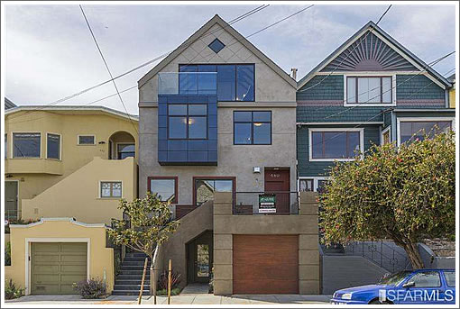
The cottage has since been renovated. And the new four-level Noe home has been built.
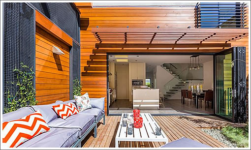
Between the two buildings a landscaped garden and deck was constructed and onto which the kitchen and dining room of the new house spills by way of an accordion glass wall:
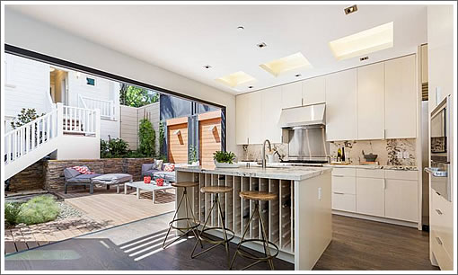
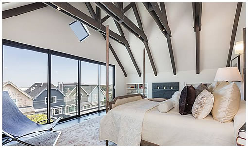
With a total of five bedrooms, five baths, and 3,600 square feet between the two, the new Noe home and cottage are now on the market and listed for $3,195,000 or $888 per square foot of total living space, including the master suite on the new house’s top floor.
∙ Listing: 680 Douglass (5/5) 3,600 sqft – $3,195,000 | Floor Plan [680douglass.com]
∙ The Stories Behind (Or Rather In Front Of) The Sale Of 680 Douglass [SocketSite]
Damn that front facade is ugly, looks straight out of the 80s.
The rest of it looks pretty nice though.
Very interesting refrigerator placement.
Love the flow. Love the house.
It would be interesting to know why they kept down the depth of the main house to keep the cottage. Did they have a choice or was it the best compromise? Did they have to align the back of the new house to the ones to the north?
I like the balance it created. All rooms have access to great natural light. I think it will sell for 3.4M.
I agree with lyqwyd: butt ugly. They should have decided on a style and been consistent, this looks like someone “remuddled” an existing home once, and then another person with drastically different tastes and a limited budget “remuddled” it again!
But if I had to bet I’d bet it will sell at asking, regardless.
Agree, the front is a disappointment. Here’s my take on how it went down:
Developer wants to build a modern contemporary home with unadorned finishes.
Planning dept. says, “If you’re going to build here, you need to respect the dominant peaked roof varied facade elements of the neighborhood.”
Residential Design Guidelines:
Page 9. Block has strong visual character. (You have to build a peaked roof.)
Page 13. Site has to respond to front setback
Page 29. Design the proportions to be compatible…
Page 43. “Design the placement and scale of architectural details to be compatible with the building and the surrounding area”
Basically, planners apply rules, and this is what you get when you want a contemporary house that has the same proportions etc. as the hundred-year-old neighbors. You get a design that meets the rules and disappoints pretty much everyone involved.
I like the big accordion doors at the back. Some buyer will pay for this deal (c’mon two houses in Noe?). I think after closing you paint the front facade more uniformly to lessen the blue bay window contrast.
Good buy at $729K. Congrats to the developers.
This is the same as the development next to the Painted Ladies, writ small.
“architectural details to be compatible with the
building and the surrounding area”
So they put in cheap metal crappy windows to be compatible with the aluminum replacement windows next door?
Not to be believed what passes.
I’ve seen similar properties/lots. Planning almost always requires that the cottage remains, esp if its pre-earthquake.
Visual pollution. This facade is awful…
I would *love* to hear from the developer/broker about whether soccermom’s account of the design is correct. If so, this issue belongs before the B.O.S. post-haste. This is one of the ugliest facades I have ever seen, and as a parody of the house next door it greatly undermines the architectural/historical interest of the older building.
There are design requirements, which generally speak to the larger elements, such as roof types, bay windows, location of entry. but it was definitely the developers choice to go with that stucco, block framed windows, and the weird detail elements on the garage and above the top floor windows, which to me are the elements that make the facade so bad.
It’s one thing if someone is building a home for themselves on a lot they own.
A developer, on the other hand, can just change their desire to build “a modern contemporary home with unadorned finishes”. What, is Dewll magazine paying developers for publishing stories about newly built homes or something?
A more fundamental problem with soccermom’s hypothesis is the home to the viewer’s left, right next door. Doesn’t look a “hundred years old” to me, certainly doesn’t have a “peaked roof”, we can honestly disagree about what constitutes a “varied facade”.
But planning has no qualms about NOT holding that a block “has strong visual character” if even a very small number of homes don’t share common characteristics.
I don’t know Noe Valley or this block, so maybe there are lots of homes like the one to the viewers right in on this street, but I’m highly skeptical the Residential Design Guidelines are to blame for this fiasco.
Cottage ruiners. I’m guessing something at least as lame is going in at 1320 Church.
The facade is not that bad. It really does reference the adjacent building and reads as a simplified pitched-roof house.
A standard modern builder house with a flat roof and horizontal slats if ipe across the front would look far worse.
Granted that a faithful recreation if a 1905 house would fit in even better,, but nobody wants smaller windows and high maintenance detailing anymore. This house is a good outcome.
The link from my nickname is the packet for a planning department hearing for this property. About halfway down, you see an earlier version of the façade. The final product was tweaked a little.
This facade is an excellent example of the flaws of a process driven rather than product driven planning system.
Current planning regulations cannot dictate quality of materials nor can they require anything as difficult to quantify as “design integrity”. So the result is another “least objectionable” building that contributes nothing to the visual environment in which it has been placed except to reinforce the ignorance that most people have of the visual environment and the environmental and technological forces which shape it.
San Francisco has numerous blocks having houses dating from a variety of time periods. As construction methods and functional requirements changed so too did the look of houses that were built. However the materials and details used in any particular house generally has an internal logic appropriate to the time at which it was built – gabled houses were built with lightweight wood stick framing, and cornices and eaves kept water away from the wood siding, used because of its availability and its ability to accommodate a certain amount of building movement. The smaller platform framed developer houses from the 40s and 50s could use stucco – the surfaces covered were generally small enough so that inherent requirements such as control joints did not have to become a design issue.
What is troubling to me is a design and planning process in which any building or block of buildings can be judged to not have a “strong visual character”. If it is visible, it has a character. Whether it is good or bad is the real issue, and I would suggest that planning guidelines be equally concerned over the details such as the over-scaled aluminum replacement windows in the adjacent house as the form, massing and materials of 680 Douglass, which amply demonstrates the flaws of a planning philosophy stuck with post-modern “references” which may have a logic on paper, but in actual application turn out to be the visual equivalent of nonsensical gibberish.
Only when San Francisco has guts to adopt a planning process more like London’s – strict about the what most would consider “minor” details, but able to grant exceptions based upon merit and logic will this city become a visually great city instead of one only marginally better than most other American cities.
This is almost a parody of what an ugly modern take on San Francisco architecture would look like. It is really ugly. Making it poop brown doesn’t improve things.
I wish it wouldn’t sell, so as to teach the architect and builder a lesson, but unfortunately it will. They could have made more money with a less unfortunate choice though.
pending….
Sold for $3.525. $330K, or +10% over asking. Facade wasn’t all that bad in person. Inside was very well done, perhaps the nicest of the recent high dollar deals in Noe.