From the architects behind the rebuilding of 467 Duncan up in Noe Valley:
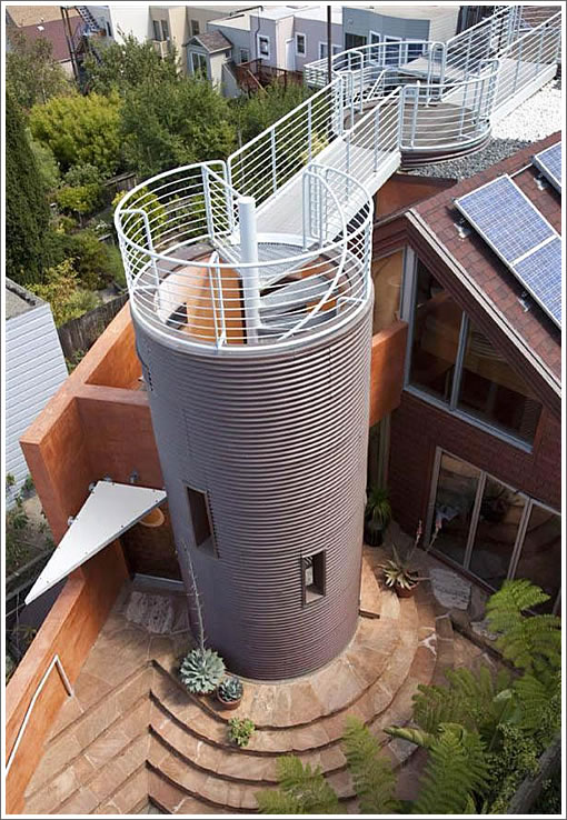
The Stiebeck Residence is a 3000 SF San Francisco residence. The home is situated in a hilltop location with distinct views of San Francisco’s picturesque skyline and surrounding neighborhood. The building can be characterized as using “San Francisco Formalism” to its creative approach. This approach combines the geometries and functions of neighborhood Victorians and the site’s original cedar shingle clad cottage.

Circular, rectangular and triangular forms that are seen in surrounding cylindrical bays, turrets, rooftop window watches and angled roof pitches are combined and reinterpreted in a way that responds to the scale and view corridors of the neighborhood.

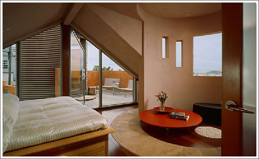
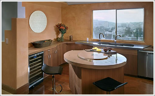
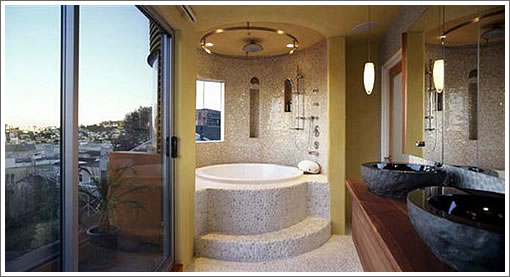
The building also responds to client’s deep appreciation for the use of natural materials with the exterior of the building using corrugated copper panels at the cylindrical bays, cedar shingles and hand troweled plaster and the interior’s use of Hickory and Brazilian Cherry floors, Travertine and pebbled stone foor inlays, concrete counter surfaces at the kitchen and various plaster treatments the wall surfaces.
Purchased as a two-bedroom cottage canvas for $644,500 in 2001, the rebuilding of 467 Duncan commenced in 2004, solar panels were added in 2005, and the modern Noe home is now back on the market and listed for $2,200,000 as a four bedroom with three baths.

∙ Listing: 467 Duncan (4/3) 2,847sqft – $2,200,000 [via Redfin]
∙ Logue Studio Design [loguestudiodesign.com]
Wow. Even the for sale sign is hard to like.
I wonder how they managed to get this built.
Here’s a basic interior design rule: make the “fixed” (i.e., hard or expensive to change) items neutral: solid-colored curtains, monotone furniture, bland tiles.
And make the “movable” items accent pieces: colorful throw pillows, African ceramics, cityscape shower curtains, paisley bedspread, lychee-scented candles.
This house obviously violates this rule. The fixed items are the accent pieces, and even if you like them today, over time, most of us get tired of accent pieces and want a fresh look.
It looks like the architect had such a ruined canvas to begin with, that the only solution (short of tearing it down), was overwhelming geometric patterns to distract one from the basic fact the house had (and still has) bad bones. It’s like food, if you start with bad ingredients, even the best chef won’t make a difference. And here, sadly, we didn’t have the best chef.
Although I must say, I think the cylindrical covering on the outside spiral staircase is nice, those things are such an eyesore. What’s it covered in, aluminum?
Wow. Simply, wow. I have never seen an interior as horrible as this. It’s a gut rehab.
I just hurled on my keyboard and my eye’s hurt.
I like it. Its funky. Although a bit to much for the typical Marin county socketsite commenter.
Whoa….architects must have been on acid when they came up with this.
Architecture of the period gone bad. What a waste.
I’ve lived in the neighborhood since before then and I don’t recall ever getting any kind of notification or anything like I get for just about everything else, so they certainly worked it somehow. I’ve always been fascinated by it, though.
wow, just wow.
love the photo on the architect’s website of two dudes, standing on different elevations of the skywalk, deep in conversation. i bet that happens all the time.
Wow, something about this just made me add “Forbidden Planet” to my Netflix queue.
Even the view is embarrassed to be looked at by this place
two dudes, standing on different elevations of the skywalk
Maybe one is trying to talk the other one down…
That’s almost worthy of an unHappyHipster entry.
I’ve always wanted a kitchen faucet next to my kitchen faucet.
Pier 1 called.
They want all their junk back.
Amazing comments. A huge amount of comments on SS are about how people don’t like or want “bland” architecture in our city. There is negative criticism to no end on the some of the more recent projects going up in SOMA, VanNess, and Upper Market.
And here we have one little, unique house in Noe Valley and everybody (well most everybody) freaks out and runs home scared, because it’s different and, well a bit unusual.
Hey people! It’s one little house: I like it, I’ve walked by it many times and it enlivens the somewhat bland street in this area.
The architects’ comments are simply embarrassing. Talkatecture at its best.
I lived in this house for six months when it was just a simple cottage, many, many moons ago. The best thing about it is the unobstructed views to the East and the air that comes into the house. Amazing and wonderful.
It got approved because it got a variance because neighbors liked the people that owned it at the time of the remodel. They were a very, very nice couple, of German and Japanese orgin who put out an American flag on September 11, 2001. Think about it. Historically amazing! And very moving and emotional given what a horrible day that was. That alone is impressive and should be enough to sell the house at the asking price. The street is not bland because it is one of the most interesting dead end streets in SF. A ture cul de sac! If you want quiet this is it!! Everyone in urban America should be able to live on a street this quiet. Truly.
Plus there are two other houses on the rear of the lot on the street which I think makes it unique. (At least for now, because God knows what is pending at one of the properties, but anyway).
Yeah, maybe it is only tin cans (look at the pictures of the facade and you will know what I am talking about) but when they did the remodel they sort of retained the historic integrity of the lot. They did not overbuild and squeeze out something on evey last bit of fransciscan so they could have five bedrooms, a wine cellar and a media room, as well as an au pair. Ok so they say four bedrooms, I don’t know how, but of course four bedrooms is the new three bedrooms in terms of marketability. And of course the thing has no garage, just a driveway. If you think about it most SF remodels dont’ have a garage, they have a parking space for one car because the historic garage has been turned into a bedroom, wine cellar, media room.
I could probably do without the roof deck, but then I think all roof decks are ridiculous in such a windy city as ours. It just adds to the price inflation. People use them no more than twice a year. But everyone loves them and wants them. They think!
Anyway, any of us would take this property if we could, just alone for that unobstructed view to the east and the lovely air that can enter through the windows. Oh and the tin cans are copper. I think.
Let’s not be so mean. It is only real estate.
And somebody had a vision that was different than the usual “let’s make a buck” and build something that looks like a fake NYC 1980’s loft updated with caesarstone. You know what I am talking ’bout?
Plus the American flag thing on 9/11. Thanks for listening. (or reading).
ooooooh myyyyyy.
reading the above post inspired me to check out the google street view of the property and the block.
reminds me of an abandoned, run-down, decaying, mad max movie set.
Yuck. This home cannot be “characterized as using San Francisco Formalism to its creative approach” and it’s insulting to everyone reading that, as well as the owners of the neighborhood Victorians, to suggest that it was.
Have some cojones and call things what they are, Logue Studio Design.
a more ambitious use of color and slicker, less organic detailing (get rid of the pebbled bathrooms and stone sinks) and this might look more like intention memphis design…which i think is it’s real root.
as is it’s an odd memphis/zen mash-up and appears very dated. but as construction started almost 15 years post memphis, i cannot imagine it ever read as current.
memphis is hot again in some circles, including web design and graphics. someone could make this work well short of gutting….but that buyer pool is small and specific. not for me (cannot image cleaning all those odd angles) but i hope it finds an admirer.
I want whatever they were smoking. Some strange sh*t.
have any of you ever wondered about if this project was even legal as there is a discrepancy in the square footage:
Public Records – 448 sq ft
Their claim – 2,847 sq ft
As this was something completed in 2004, it smells fishy.
I visited this house recently. It’s interesting.
This place is nice and cozy but just not enough lighting or space for me. I feel an attack of claustrophobia especially on the top level. If I was 6 feet tall or more, I would be concerned about hitting my head onto the ceiling when I wake up in the master bedroom. As for the two bedrooms on the lower level, I hope whoever sleeps on the outer bedroom enjoys traffic as the only entrance/exit is through that room. Think I’ve seen better in Noe Valley
We are currently filming our next production in different neighborhoods as my current project in the city featuring Cate Blanchett. Cate and I saw this interesting property under our radar screen, it was so unique and ugly in some areas that we had to call the dentist! We will be in different areas of the city filming, please sow your support!
The list price for 467 Duncan has been reduced by $250,000 (11 percent), now asking $1,950,000
The listing for 467 Duncan has been withdrawn from the MLS after 131 days on the market and a reduction to $1,950,000 without a reported sale.
Withdrawn from the MLS in December, the modern home at 467 Duncan has just been listed anew for $1,895,000 with an official “2” days on the market according to industry stats.
Dropped price to $1.8m.
Meanwhile, only 22 properties currently listed for sale in Noe Valley – less than 1 month of inventory.
They’re still looking for that special someone. The rub is that this rare person might or might not exist in our current spacetime continuum.