The seasonally adjusted annual pace of new single-family home sales in the U.S. rose to 343,000 in April, up 3.3 percent from a revised rate of 332,000 in March and 9.9 percent above the 312,000 pace recorded in April 2011.
Preliminary U.S. new home sales (versus pace) in April were estimated to be 33,000 (give or take 8 percent), up 1,000 sales from March, the third slowest March on record since 1963. April sales peaked in 2005 with 116,000 new homes sold.
In the West, the pace of new home sales was up 12.8 percent year-over-year to 88,000 in April, up 27.5 percent versus the month before.
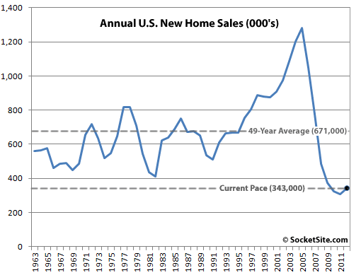
UPDATE: Annual new home sales in the U.S. have averaged 671,000 since 1963, peaking at 1,283,000 in 2005, bottoming at 306,000 last year.
∙ New Residential Sales: April 2012 [census.gov]
∙ New Residential Sales Since 1963 [census.gov]
This is good news, but to give some context in 2004 and 2005 the annual pace was 1.2 Million. Obviously, this was ‘peak’ volume.
I have read some estimates that a ‘normal’ level would be around 800k. So we still have a long climb to get back to healthy market.
[Editor’s Note: As originally reported above, actual home sales in April were estimated at 33,000 versus 116,000 in 2005. And since updated above, annual sales have averaged 671,000 since 1963, peaking at 1,283,000 in 2005, bottoming at 306,000 last year.]
What badlydrawnbear says is true, but the extremely depressed new home sales volume has been a direct response to the lack of construction, which was a rational and necessary thing. A “healthy” market is one where housing production equals housing demand. The fact that the numbers are slowly ticking up towards a “normal” rate is indicative that the nation is working through the huge overhang of over-production and foreclosures, and that is good. It also means that housing construction can start to be a modest contributor to economic growth again, rather than a drag.
Oh sure, post the chart AFTER I comment 😉
[Editor’s Note: In the words of Gandhi: “There go my people. I must catch up to them, for I am their leader.”]
Population 1960: 179M
Population 2010: 309M
If you adjust for population, the normal rate is not the average over 49 years, it is at least 20% higher. You’d have to take some off for the bubble, which distorted the average higher.
Thus, an 800,000+ rate would be somewhere near the average, adjusted for population increases, not 673,000. The average over 49 years is helpful, but not by much.
Whoa! Headline 9.9% sounds great but in context is still ugly.
^^^ Another way to think of it is when you’ve hit bottom, there’s no other way than up.
The higher the “average” is, the less over-production from late 90’s early 2000’s there is to absorb and the more under-supply from post 2005 there is to make up for. So the higher the average the more bullish this news is.