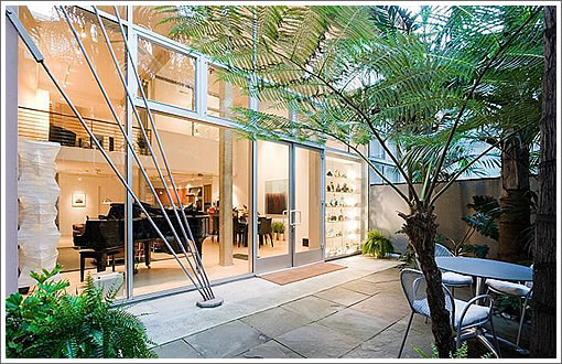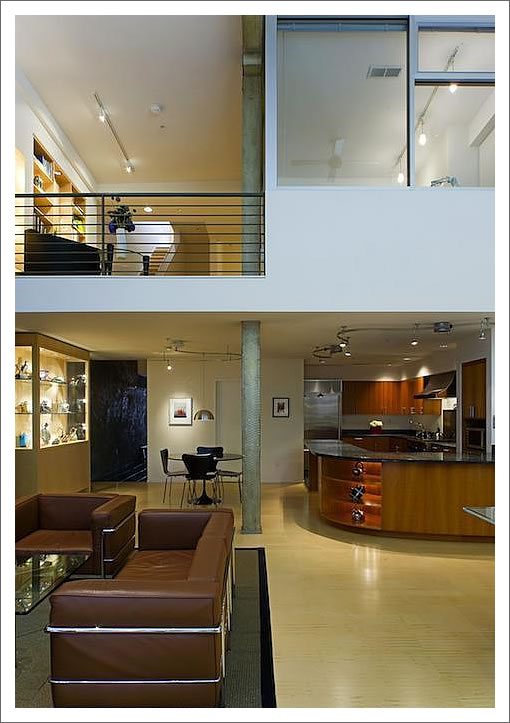
In 1998, the tri-level loft at 230 Ritch was created when Santos Prescott & Associates led the conversion of a 1930’s South Beach warehouse to live/work condominiums.

In 2004, the 2,640 square foot unit with two outdoor patios and twenty-two foot ceilings in the master suite was purchased by a local architect for $1,420,000.
A few weeks ago 230 Ritch returned to the market and yesterday it was officially listed for $2,499,000 with a bit more style and built-ins in the living room versus its listing in 2004.
∙ Listing: 230 Ritch Street (4/3) 2,640 sqft – $2,499,000 [230ritchstreet.com]

Looks dated already, for 2.5m in South Beach I would want something I wouldnt have to remodel. The curved track lighting, funky curved island, bamboo floors, tiled countertops…the thing needs a facelift, also the doors look very small for a place this scale
I don’t think that homes need to be constantly updated every few years to keep up with the latest trends. Instead of trying to match the latest style, why not shoot for something more timeless?
agreed, nice but kinda dated. dig the palm trees and outdoor space.
but $2.5m for a place with no views?
Agree milkshake, a more modern timeless design would have worked better…but this thing seems like it was “designed for the moment” and that moment seems a bit dated
timeless means “conservative,” here, right? “more historically referential?”
I think I could live with “dated” as long as it is beautiful and functional. But beauty is certainly in the eye of the beholder. The idea that everything needs to be up to date is wasteful (as MoD points out), and, while admirable, the idea of being “timeless” is much easier to achieve in retrospect.
Hmmmm… maybe “timeless” was the wrong word. I meant something more on the lines of having enduring appeal. And I think that good modern design can have enduring appeal.
Everything styled “modern” seems to go through phases of appeal: clothes, cars, hairstyles, and homes. There’s an initial bang, then a deep dip, then it returns to favor. Off of the top of my head it seems to go like this for buildings:
[age in decades],[example decade],[appeal]
————————————————–
-0, 2010s, fresh modern new cutting edge A10
-1, 2000s, looking a little dated A7
-2, 1990s, dated A4
-3, 1980s, more dated A2
-4, 1970s, very dated though now cheap enough to appeal to hipsters A1 (A8 for hipsters)
-5, 1960s, dated but coming back in style in a retro trendy almost ironic way A3
-6, 1950s, trending towards classic A4
-7, 1940s, becoming more classic A5 (though in this example WWII kind of put a kink in the chronology)
-8, 1930s, classic A6
-9, 1920s, classic A7
…. then sort of leveling out around A8-9 or so.
If this place can survive without a total gut overhaul before 2040 then its value should rebound. Yeah maybe do some superficial stuff like get rid of that curvy track lighting but keep the rest. Seems like a quality build, why waste it?
I was initially turned off by that retail storefront look of the first photo but now that I see it faces a private patio I like it.
After 166 days on the market, the listing for 230 Ritch has been withdrawn from the MLS without a reported sale.
RedFin says it sold 9/10/12 for 2.065, but not an arm’s length transaction FWIW.