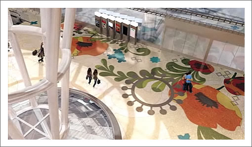
Staring a host of plugged-in readers, the video highlighting the four large-scale pieces of art which will be woven through the architecture of San Francisco’s new Transbay Transit Center is now playing on the Transbay Joint Powers Authority’s website.
In addition to pieces by Jenny Holzer and James Carpenter, the integrated art will include the terrazzo floor by Julie Chang pictured above and a 300 meter water fountain by Ned Kahn atop the center which will trace the movement of buses below.
∙ Transbay Transit Center Public Art Program [transbaycenter.org]
∙ Scoop: Transbay Interactive Map (And New Transit Center Website)
∙ So You Want To Be In Animated Renderings Redux [SocketSite]
An awesome and brilliant approach to bringing large scale art pieces to the public. This can only enhance the great design of the new terminal.
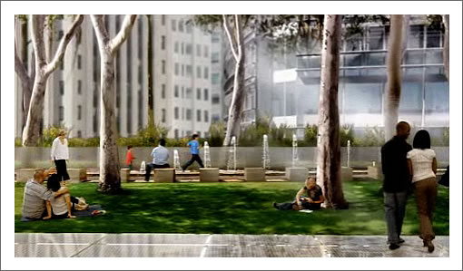
^^^ Agree. Beautiful. I love the outdoor cinema at the end.
Fantastic- now if they can just tweak the architecture of the tower to uphold Pelli’s supposed high artistic standard.
I love that floor art. I feel like it could become dated in a good way… representing its time while remaining beautiful, almost like a WPA mural.
Reminds me of a Hawaiian hotel lobby in the 70s.
Then you probably don’t know Hawaiian hotel lobbies from the 70’s.
Art installations that extend over a long distance are never well maintained. Whether it’s water or light, they get ignored and fall into disrepair.
The editor can confirm I am posting from island of Lanai. Like you, I am also an architect, and am a dual Hawaii – California resident . Believe me, I am very familiar with resort design. Aloha .
Cool, but I dont mind where you’re from. I used to live in Honolulu and worked for the top hospitality/design firm in the islands, maybe the world.
When I think of 70’s Hawaiian hotel lobbies, I generally think of dark exotic woods, lots of tiki themes, rattan, bamboo, torches and music by Don Ho. nothing wrong with all of that: it’s a part of the culture, but I just don’t see that here.
I see more of a Peter Max/ Andy Warhol pop style of graphics, with a predominate white background.
Noearch, when I think 70s Hawaii I think Mauna Kea, and the original interiors of the Sheraton Waikiki which had floor designs similar to above. All of 70s design was not horrible, and the use of bright colors was rather refreshing.
At the moment my favorite terminal architecture is the new terminal 3 in Dubai .
OH, I love the Mauna Kea on the Big Island. We’ve stayed there. very nice, classy, understated, modern and Hawaiian in feel.
I love some of the 70’s design too. and then, of course there’s the bad 70’s stuff…like what you see at the Outrigger chains…:(