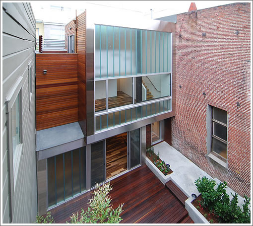
Two buildings on one parcel, one remodeled and the other designed anew by Iwamoto Scott Architecture, 2145-2151 Powell hit the market in February asking $2,649,000 for the pair or $1,500,000 for the 2,680 square foot remodeled Building A (2145 Powell) and $1,149,000 for the 1,182 square foot modern Building B hidden behind (2151 Powell).
Now in the hands of a new brokerage, the two-units returned to the MLS last month asking $2,149,000 for the pair. And yesterday the two units were listed individually as TICs with a new $1,159,000 to $990,000 split.
i like the way the listing starts out ” This unique is in desirable North Beach Area, features”
The interior hardwood flooring shown in the pictures for #2151 looks similar to my own (Pacific Wenge Rustic). I’ve never seen it anywhere else yet, so I’d be curious whether it evokes a love/hate reaction from others. With each piece being so different from the other it’s very difficult to imagine (much less predict) how it will look once installed.
Needs a rope ladder to that patio on the left.
Translation: “I’m a flooring contractor and the margins on this stuff are insane! Should I start pushing it?”
Al: that’s not a patio, its called a roof – the ‘patios’ are on the next levels up or down…before making lame comments you might want to try using your eyes, and/or brain.
Lovely as it appears – it is unfortunately a prison in design. The only opening to the outside world is the long narrow corridor to the steel front door. All the windows are facing into the rear courtyard which is encased on all sides by adjacent structures. In case of a fire, there is NO escape onto the street if the front corridor is blocked. This is the equivalent of a flag lot in a suburban lot split – you get the undesirable rear parcel connected to the outside world by a long narrow passage way. May be ideal for house arrest…
$1M+ for no parking? What planet is this (Cue endless people power weenies only too ready to shame me for even thinking such a thing so let’a just skip that stage…)
No comments on the price but it’s very, very nice design and execution.
Lack of parking is worse than the flag lot thing. If a fire sprang up that became a problem for this place, insurance would be in the mix anyway. And it’s not like it’s historical! It can be built up again just the same afterwards. One of the groovier non-highrise (non-view, I guess) bachelor pads.
Outsider: It is hardly a prison – on the contrary, its in fact very bright and airy in person, and all the windows do not face the courtyard: rather a large slider opens to the upper level deck to the south, as does the bathroom window, and a there is a large skylight as well.
To disparage something based on untruths is both shallow and ignorant.
There are many, many more houses in SF that are far more dark, closed-in and claustrophobic feeling, and for much more money at that! The building is basically on the same footprint as the old dilapidated mid-block structure that it replaced. Many examples of urban courtyard houses like this exist in cities throughout the world (though few where the courtyard is as big as the house as it is here).
EH: If there is a fire, either from your own unit or a neighbor’s, the biggest concern is not the rebuilding part but whether you would be around to rebuild it. I find it difficult to live in a place where there is NO exit other than the front door at the end of a long corridor. On the other hand, one should have little worry about people breaking into his/her home as it is completely inaccessible from the outside…
gmlgrl: My point is – this is a neatly designed place but has a very serious flaw not necessarily within the control of the architect. If the backside of the property is not completely closed off, this would be a very cool place to live in spite of its relatively small size (1182 sq ft on three levels.) Being so defensive – you wouldn’t happen to be related to the seller ??
I am impressed that the architect and builder built two very different structures on one lot like this.
Overall they come off quite nicely. I like the layout of the front unit although the finishes are somewhat bland.
The back unit has much more style. Unfortunately although I love all the wood choices individually they do nnot work well together. The zebra wood type floor with the cedar like deck and the dark cabinets and the wood panelling on the walls…
Given how small a place this is I think that matters.
I know many like the opaque covered glass but I would love this place much more with regular glass. it would open it up so much more. The stuff they have reminds me of 1950’s louvered Windows.
lots of images and plans:
http://www.archdaily.com/52713/ps-house-iwamoto-scott/?f=selected
seems really expensive relative to its lack of parking and privacy but if you could use the storefront commercially i guess it could be a good entry point for the front bldg.
speaking of really expensive seeming tic’s i see that the $1mm + units on the 700 block of clayton are showing SOLD.
the 764 clayton tic link,
http://www.redfin.com/CA/San-Francisco/764-Clayton-St-94117/unit-764/home/28931124
No comment about price, parking, or fireproofing.
But when so much of SF residential design is mediocre and/or
dull as dishwater, it’s nice to a house that is neither.
@anonee, do you (or anyone else), have any idea how much the Clayton st. TIC’s went for?
They have been pending on Redfin for over a month and the Sold sign has been up for the same amount of time. But I cannot find any info on sales prices.. Any help would be appreciated.
-Quip