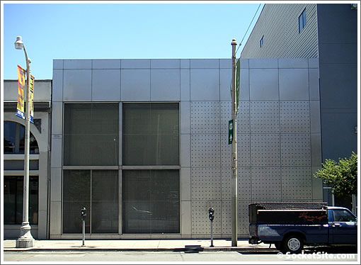
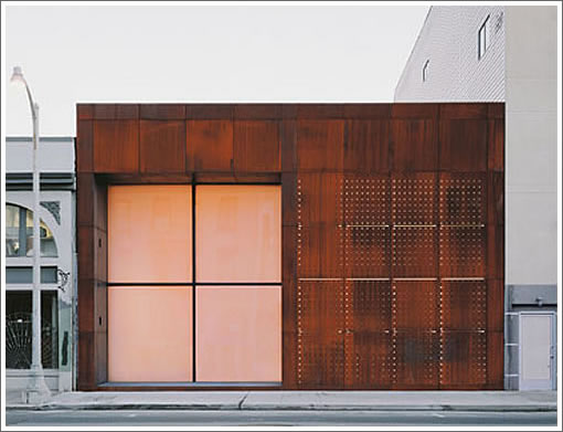
The new Howard Street façade for 464 Tehama above and as was originally built below.
∙ A Collectable Apple (Save The New Façade On Howard) Closes [SocketSite]
∙ No Words (Just Drool) [SocketSite]

San Francisco real estate tips, trends and the local scoop: "Plug In" to SocketSite™


The new Howard Street façade for 464 Tehama above and as was originally built below.

∙ A Collectable Apple (Save The New Façade On Howard) Closes [SocketSite]
∙ No Words (Just Drool) [SocketSite]
Someone added parking meters.
Wow, 7 owners in 11 years.
I liked the original facade better. Beautiful patina on the steel panels. More of an art statement.
The new facade looks like the Apple store. The old facade felt much warmer.
Just a wild guess…but I’m thinking this is reversed (e.g., what is labelled as the old facade is actually the new facade).
[Editor’s Note: Nope. Think ongoing maintenance over original design.]
I’ve always loved the original. Wonder if the ongoing graffiti probs forced a different treatment. New is far less interesting (to me) but perhaps can resist the graffiti brigade — in anything-goes SF.
I wonder how much of the on-going maintenance had more to do with the inset window bay as opposed to the rusted surface.
The word “flush” comes to mind for more than one reason.
Sheet metal and parking meters – home sweet home!
Mapjack from ’07 shows the parking meteres. They were probably shopped out of the pic above. At least you’ll get good cell reception.
http://www.mapjack.com/?Y97mWCk9bFpC6CWA
In the original design, I’m sure there was an entry door on the right hand side of the window set back – picture is taken at the wrong angle to show the door. I am assume the door was removed to accomodate the new window and the mullion on the left side marks an emergency egress door.
Right after this place was finished and photographed, the corten steel was tagged with graffitti. The city used the typical “beige/brown” paint to cover said graffitti so I understand the facade change.
A design that would never be approved in a nice SF neighborhood, and yet it can’t survive a bad one.
It belongs on Abbott Kinney Blvd in Venice.
Before the flush glass was put in, but after the stainless steel panels replaced the CorTen steel panels, there were open-air stainless mesh panels securing the window recess. So this is actually the third facade — that second version definitely looked better than this latest incarnation…
Right you are rubber_chicken, right you are. Seems like every time I went by this over the past several years it was either tagged or recently cleaned of tags. Sad really.
I can only imagine the mornings spent cleaning up the pee, graffiti and overnight guest’s garbage in that original facade’s recess. As obviously visually superior a facade as it was, it’s ostentatious statement of wealth in such an area begged a response from the real world. The new facade is a sad reminder of this reality. It may behoove architects on such projects to consider this more carefully?
how do you get into the place?
^^^^ turn into quicksilver and seep through the holes.
Some greenery would greatly enhance the design. Is there anything preventing the owner from planting a tree between the two meters?
It needs a sidewalk garden on this side.
Original photo seems to be from 2002:
http://bridge2bridge.com/properties/downloads/Architectural_Record_April_2002.pdf
I won’t be surprised if the parking meters are new. SF has installed a great number of parking meters in the past 10 years.
You could put in a little sidewalk garden and never have to water or fertilize it.
well, at least the architect has his photography…
This is one of the finest, most livable, most beautiful residences in San Francisco – in a totally impossible location. This is the problem with NIMBYs – something like this could never be built in Tel Hill or Pac Heights – only where no one cares what gets built. Tis more the pity.