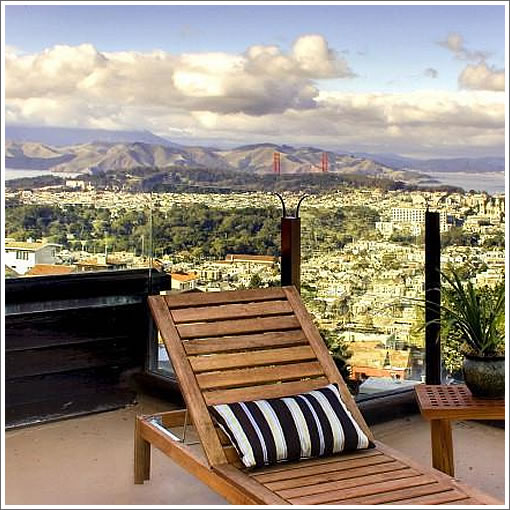
Like there’s any way we could resist that deck shot on a day like today (this too shall pass). Asking $2,850,000 for the five bedrooms, five and one-half baths, three parking spaces and view from 20 Palo Alto atop Clarendon Heights.
∙ Listing: 20 Palo Alto (5/5.5) – $2,850,000 [MLS]
Ohhh. I’ve got to have this place. Can someone who has a good record guessing the actual value of this place please reply such that I can figure out if I will eventually be able to afford?
Funny, I was just in this neighborhood for the first time in my life a few weeks ago. It is an interesting little niche of the city with great views. The neighborhood is a mix of grand and funky houses.
… and you’ve got to be comfortable with Sutro Tower looming over you as well.
That deck view photo is heavily processed. Those colors are very unnatural.
That deck view photo is heavily processed. Those colors are very unnatural
I think it just looks like it captured the glare off the southern exposures of a lot of whitish buildings is all. All the colors in the foreground look natural.
^ looks like someone went apesh*t with the contrast level!
^^
No way. Totally Photoshopped. In the marketing field, we call that lack of sophistication with the built-in Photoshop controls “contrast fiesta.”
Love it. Must have. Looks like a killer media room.
At almost the same price, I’d take this over the Noe Valley raffle house any day of the week.
hey anonn..you better just stick to real estate, dude. you don’t know nuthin’ ’bout colors. what’s with that green tint to all the buildings?
totally photo-shopped. totally faked.
the views are to die for
I would want to update the house a lot. Unappealing from the outside.
luckily, you won’t be looking AT your house much if you lived here, you’d be inside looking out.
photoshopped or not, those are great views. And I love the floor to ceiling windows.
That deck view photo is heavily processed. Those colors are very unnatural.
The foreground is in the shade, which naturally has a more blue-ish cast than the sunlit distance. What the photographer did in this case was to color-correct the image for the foreground by “warming” the image up (e.g. making it more yellow). This in turn yields the excessively yellow background. The photgrapher should have selectively warmed up the foreground, or at least found a better balance between foreground and background. Take a look at photo #24 in the MLS listing — that’s more along the lines of how the distant background looked that day.
The photographer also darkened the sunlit background (or brightened the shadowed foreground) so that there would be more detail in the overall photo, similar to what Ansel Adams used to do in the darkroom (burning and dodging). The photographer did such a horrible job with this — take a look at the sky and the clouds. Horrible.
I sometimes wonder what people are thinking when they list their multi-million dollar properties with such photos.
I stand corrected. I guess they just tried to make up for all that glare and didn’t know what they were doing? So now “contrast adjusted” and “photoshopped” = “faked”? Or just fake looking? As far as I can tell they didn’t remove any obstructions from the view.
Ex-SFer – what would you update? I love the look of the exterior. Not sure if there’s a specific name for it, but I wouldn’t change a thing on the outside.
Oh, I wouldn’t do much to the exterior, although I may try to freshen the shingles.
I was speaking more the interior.
I actually love floor to ceiling windows, but don’t like THOSE floor to ceiling windows (black trimmed, strip down middle etc)
I would replace those windows with full glass panels if it is possible (it might not be)
I also hate the mouldings/trim, both the style and the color and the size. I would either try to paint it all, or rip it out and see if the place works without trim or using different trim. I dislike thin trim, honey colored trim, and cheap trim (maybe it’s not cheap but it looks so to me). the problem is that the trim is the same color as the staircase, so that might prove tricky. might have to go white trim.
I’d also redo one maybe two bathrooms.
and I’d probably rip out a lot of that carpet in the bedrooms and replace it or more likely do hardwood floors.
so overall, just modest updating, or perhaps you could say “ex SF-er styling”.
others would probably call it a crime against architecture! 🙂
overall though I really like the place.
I should addend:
although I wouldn’t change the outside (I don’t see it as practical), I also don’t feel that it is $3M appealing, that was what my comment meant.
I would think this is rustic and cute if it were a $150k beach cottage in Maine. but it’s not.
I guess they just tried to make up for all that glare and didn’t know what they were doing?
I don’t think the original photo had much glare. The city below was hit with direct sunlight, and the deck was in deep shade. When the deck was brightened, the whole city was brightened as well, which made it appear as if there was lots of glare. A competent digital photographer or retoucher could have done a better job in toning down the city below.
So now “contrast adjusted” and “photoshopped” = “faked”? Or just fake looking?
In this example, the latter.
Our eyes can see a far greater contrast range (from dark to bright) than a digital or film camera can capture in a single frame. If anybody took a photo of this scene with any camera, they’d end up with a near-silhouetted deck and a properly exposed city/bridge/headlands/sky, or a properly exposed deck and an overexposed city/bridge/headlands/sky. The photographer simply tried to bring all of these elements into range so that there would be detail throughout, similar to what we’d experience if we were there firsthand. In this sense, Photoshop is nothing more than a tool to make a photo better represent reality. Like all tools, it can be used poorly.
Of course, there are also people who use Photoshop to alter reality by adding/removing elements. Nothing wrong with that, as long as they are trying not to represent the real world (e.g. listing of a home on a hill made to look like it was on level ground, or removal of power lines).
I actually love floor to ceiling windows, but don’t like THOSE floor to ceiling windows (black trimmed, strip down middle etc)
They look like sliding doors to me. Instead of dusting, you could just open some on each side of the house and let the wind take care of it. And if you wanted to refurnish, just open ’em all.
Note the chairs with cup holders in picture 10.
Nothing says class like chairs with cupholders.
I have two in my backyard.
I previewed this house tonight and it is a special home. Awesome. The architect did a fantastic job relating to views from every location. No matter where you are (hallway, staircase, bath), you see a jaw-dropping outlook.
I love this ‘hood and have seen many homes up there. This architect did a much better job than most. You may remember 60 Clarendon which was an abomination by contrast. I good architect, like a good Realtor, is worth his weight in gold. Don’t you agree Noearch?
The word on the street is that there will be 3 or 4 more homes in Clarendon Heights coming soon. I hear they range in price from $2.8M to $5M so it will be fun to compare.
Very 60’s interior..and quite dated looking. Dated, small kitchen, truly out-dated and ugly baths.
Interior trim, lighting cheap looking. Views are great, yes, but from the site location, not so much from the architecture, except there are a lot of windows.
Be a great project for a full remodel.
It looks better in person and finishes are easily updated.
My point about architecture is that a home should relate to and optimize the benefits of its site. The architect here did a fantastic job. When you see it you’ll see.
There are architects who do not take advantage of the site and it’s a crime. The place at 60 Clarendon for example really irked me because lots on the north side of Clarendon are rare and with new construction there is no excuse. You should have a spectacular end product. When you open the front door of that home, you don’t see the view, you see the backside of a stairwell. When in the main living area you mainly see ceiling unless you squat down. Ugh.
I know it’s more fun to slam places, but the guy who designed 20 Palo Alto got it right and it’s refreshing to see.
Well, I disagree with you in some ways. Your comments are well taken but you are generalizing in extremely broad terms. Yes, the house is an awesome location, views are great..that’s a given.
A house must also function well; and utilize good finishes, lighting, materials etc. When it was designed and built (60’s) this one probably did. It was appropriate for its’ time. The photos portray, to me, what the potential is..Mostly just interior remodeling and finishes. I would be cautious to say that finishes are “easy” to update.
Whether it’s “fun” or not to slam houses, I don’t know. I don’t slam them. I critique them, both good points and weak points. That’s all.
This house shows very well in person. I was skeptical about 2.85M because of the verticality and no yard, but it doesn’t matter here IMO.
In contract, as of yesterday.
The sale of 20 Palo Alto closed escrow today with a reported contract price of $2,840,000. Don’t forget those invitations to the housewarming.
Nailed it. Again.