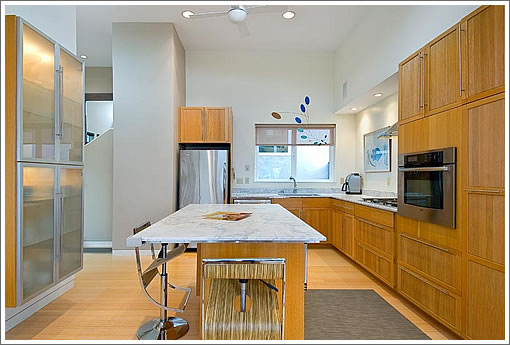
Okay, so we know it might seem to be a bit nitpicky to some. But if you’re going to go to the effort of undertaking a gut job remodel, either customize the cabinets or pick a refrigerator that fits its designated space. Pretty please?
∙ Listing: 262 Corbett (2/2) – $975,000 [262corbett.com] [MLS]

Agree the refrigerator is out of character for this otherwise lovely place. A built-in will cost an extra $6000 plus modification of the cabinet above. Not a big deal but I guess they decided to spend the money somewhere else. Personally, I am a “refrigerator” kind of guy.
I am sure someone will comment on the peculiar “light” as a decor. It has the look of a TV dish. Then again, there is not a TV in sight…
Is this a two or three unit building? Nice interior space, location and views.
This for a million or 56/42 Mars (each sfrs with yards and cottages in the back) for 1.2m just around the corner.
This has a different (imo better) style and target market, but the Mars St houses seem like somewhat better value for the money. That said, this is pretty sweet. I guess we’ll find out what the market says soon enough.
If you look at the photo above and compare it to the first page of the website, it takes some careful comparison of details to realize you’re looking at the same space, stretched out in different directions in each photo.
The fridge doesn’t look so out of place when you realize it’s just a small kitchen.
If you look at the photo above and compare it to the first page of the website, it takes some careful comparison of details to realize you’re looking at the same space, stretched out in different directions in each photo.
They’re both taken with fairly wide-angle lenses. In the photo above, you can see how the grain on the cabinets become stretched out near the edge of the frame. In the photo on the opening of the website, the strips of hardwood near the edge suffer the same type of strething.
The photo above was taken from a point very close to the kitchen island. If I had to guess, I’d say that the camera was at the edge of the animal print rug (the edge nearest the stool).
Wide-angle-palooza. The goal was to make it look bigger than 1425 sqft, but who are they fooling with those shots?
Also, the front of the house is severely shopped — there is a pole directly in front and wires stretch both from that pole and along the side of this place (lots of wires on this street in general).
http://www.mapjack.com/?fE2mWC7vbF7F
Yea, they’re fooling with us again..or trying to. when is photoshopping going to made illegal? or at least considered sleazy anymore?
As for the nitpicking about the refrigerator! THANK YOU!..that kind of cheap ass solution does get me going. It looks cheap and is cheap. The soffit should have been carried over the sink as well and above the refrig, then the upper cabinet would not look so out of place. For almost $1m, you should get a built-in refrig; Sub-zero or Thermador, imo.
haters.. i dont think it’s tricky photography, this place just seems to have two kitchens!!
nearly identical, but one is long and narrow, and the other is wide and shallow.
Google street view and Mapjack have different photos of the facade. The telephone pole has been removed, so it’s not a Photoshop job.
Jim is right — looks like the whole street got the lines buried, so I retract that comment and apologize.
Hard to say that that photo isn’t shopped nonetheless though.
Stand alone refrigerators require breathing room usually 2 to 4 inches on the top an an inch on each side. If you payed more than 4 grand for a 30 inch built in, you needed to shop a little more.
I spent the 1st five years of the last decade ripping out soffits now i need to put them back? Does this include the florescent luminous ceilings too?
A case of “value engineering”. They ordered the kitchen and planned a fitted refrigerator, then got nervous and saved 3K by sliding in one from Best Buy.
absolutely hilarious! – posting ‘critical’ comments, purporting to offer some sort of personal insight on a property, but instantly shown to be based on nothing more than months (or years?) out of date google map information!! hahaha! brilliant!
this is then followed, of course, by a totally insincere ‘apology’ which can’t even resist the pitiful “Hard to say that that photo isn’t shopped nonetheless though.”
yeah right! and the Man is responsible for all your troubles!
mister, your credibility is somewhat less than zero, i’d say. haha
veritas, good luck with the sale.
I’m surprised that they used the space so poorly.
I like that it has a nice LR and DR.
The kitchen is likely pretty tight.
But then they have that dead space next to the kitchen.
Does it really make sense to have a LR, a dining room, a “zebra rug” space, and then a tiny kitchen?
who is going to sit in that loveseat by the zebra rug?
I would have taken that useless zebra space and expanded the kitchen into it. This would have helped with the problem of the cooktop being right by the range (and thus inadequate countertops by your cooking area).
In a bigger space it makes sense to make a “great room” with a sofa/lounge area next to the kitchen. but not in this space where you sacrifice much needed (IMO) kitchen storage for a seat that you’ll rarely use.
I’m also surprised because they could have put in a HUGE island if they stole the zebra space… and decorators/builders/architects really seem to love huge islands for some reason.
otherwise the place is nice.
veritas, since you appear to be the agent for the property, do you disagree that the wide angle shots are misleading as to the size of this place? Many of us have lived in spaces of this size, and the pics are a distortion here.
Second, do you disagree that the photo is shopped? It is pretty obvious — there are tell-tale marks.
I’m not quite sure where the “personal insight” came in there — I used publicly available information to express an opinion. No reason to be so defensive.
Gut remodels using IKEA cabinets have several limitations, one major one being the size of the refrigerator which ends up not fitting well with the cabinets
I was in this property this weekend — I thought it looked pretty nice, with the obvious exception of the fridge. Odd layout as staged with the sitting area between the dining and kitchen, but the main room had plenty of space. Fit and finish looked fine to me in person. Views are very nice, but the shared space in back is a little odd.
At the open house, there were lots of people in the lower unit (260), which is a 3 bed and on sale for 1.1-1.2 I think. Fewer in this one.
As for relative value, 56 mars is a disaster (unfinished remodel, holes in wall, etc) and (I’d guess) is being marketed for way more than it’s worth in a hail mary effort to stave off foreclosure. 42 mars is pretty nice, albeit with lesser views.
I wouldn’t be surprised to see 260 go quickly; this might take a little longer.
260 was hopping….almost a dozen private showings today and a “pre-emptive” offer was submitted before the Weds date but was rejected….should go for at least 100K over asking when all is said and done. Layout and views really work although appliances dissapointing. May be worth the potential 1.25M getting price?
I’ve designed several kitchens recently using IKEA cabinets and a built-in SubZero refrigerator. It fit beautifully into the cabinet system.
IKEA has a very wide dimensional range of cabinets.
What specifically is the complaint with the refrigerator here? I’m not understanding. Is it the inches of space above the refrigerator and on the sides that is objectionable or that it sticks out too far from the wall beyond the side view of the cabinets? Or is it both?
^^^ All of the above.
While it makes sense to match the cabinet to the fridge during a reno, it does seem a little nit picky to expect a good match. The fridge will conk out eventually and good luck finding another perfect match.
… and this is why I have a problem with those built-in drawer fridges. Is the expectation that the whole kitchen gets a remodel every time the fridge conks out ? Seems like an excessive waste of resources.
The sale of 262 Corbett closed escrow today with a reported contract price of $1,011,000 (4% over asking).
The sale of 260 Corbett Avenue referenced above closed escrow yesterday with a reported contract price of $1,175,000.