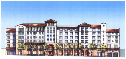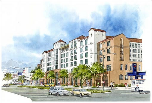
The discussion of Arquitectonica’s proposed design for 1960-1998 Market Street somehow takes a turn toward the Institute on Aging’s new Senior Campus rising at 3575 Geary where the Coronet Theater once stood.

Expected to be open by early 2010, the new campus and will provide housing for 150 seniors and serve as the home for the Institute’s health and social support programs.
It’s the Senior La Quinta Inn!
The Institute for Aging, a progressive organization, wanted and started with a much better design. After years of getting beaten into the pulp by the NIMBY neighbors, they finally capitulated to this design more appropriate to 1910 than 2010. Once more, SF shows it is populist not progressive.
I just don’t understand why we would re-create something verbatim from the past – like a hollow thoughtless stage set. A look-alike wouldn’t be permitted in a historic district. It takes the wind out of any interest at all. It bores and isn’t even interestingly derivative. The Good: I am delighted that SF’s fear of height has allowed something over 2 stories on a major corridor. Now, another 100 properly sized family-friendly buildings @ these heights will be just the beginning of a new vision for Geary.IMO
I agree with Invented that this an appropriate height for Geary, and that is boring. We have very litte Spanish style architecture in San Francisco, so this isn’t even contextual. If you want to go historic on a building this size, the best route is probably Deco. But why go historic? Even a mediocre modern building tells a more genuine tale than this.
I would rather have to look at this every day than anything built in Mission Bay in the past 5 years, even if this is a pastiche copy of a past architectural style. My reasons:
-Visual detail at various scales–something for the eye to focus on, then refocus at a different resolution.
-Colors that didn’t come from krylon can.
-Variegation in the roofline.
-Street level approachability–no sheer unadorned wall of blank for the pedestrians.
-A break from the rectilinear conformity of modern construction, namely curves.
Show me a modern design with the above attributes and I’ll applaud. Until then I’ll have to be happy with copying the past.
“We have very litte Spanish style architecture in San Francisco” True, but if you are really talking “historic,” this Spanish Mission style IS original, pure San Francisco, since 1776 (Mission Dolores), which also coincides with the birth of America. I’d say that this style is more San Francisco than Victorian, which was reproduced at a much later date.
The old Laguna Honda resurrected on Geary St. Out of neighborhood character and out of style. Buildng belongs in Santa Barbara.
I am just still mad about the destruction of the Coronet.
hhatmm, you got it exactly right – Santa Barbara.
flaneur, “Even a mediocre modern building tells a more genuine tale than this.”
I’d trade derivative for mediocre modern. Do you really want
another jukebox Marriott – or worse? Tamely invisible is better than aggressively ugly.
Out of neighborhood character and out of style.
Is that a joke? If by “style” you mean bleak, 50’s-era, Soviet-esque boxes (like the one directly across the street that it replaces), then yes – you’re absolutely correct. Agreed – something more progressive would be nice, but to turn a phrase, people get the architecture they deserve.
Still, relative to everything around it, it will be a welcome addition to the neighborhood.
is this some kind of a joke. the building on geary looks like a la quinta near santa barbra or any other airport turnoff. unreal. i know the area and project well and the nimby’s hammered this building really hard. why would anyone want market street to be subjected to this type of bad retro design??
Nice. This is a thousand times better than the normal lego-land with windows boring soviet crap they are spewing throughout this town.
Older architectural styles have always been recycled. Sometimes with great skill and new vigor. Palladio, for example, did quite well with classical influences. And Thomas Jefferson did quite well with Palladian influences.
On a much smaller scale, down in Palo Alto, Birge Clark designed many delightful Spanish Colonial Revival buildings. Also called Spanish Eclectic, this is the style that is being recycled here. The unfortunate thing is not that the style is being used. It is that it is not being used with wit and ingenuity. It’s just a pastiche.
I, myself would have preferred to see a modern building on this site, even one that “looks like an office building,” whatever that means. But that’s like preferring coffee to tea and says nothing about the quality of the design. Interesting thing about Birge Clark, later in his career he switched to producing modern, International Style buildings. They don’t hold a candle to his earlier work.
this is a horrible suburban design. good things it’s so far out no visitors will see it.
agree with the laquinta comments. the buchanan market building designs are amazing. these are embarrassing.
i’m with kthxbye. it’s all crap compared to the coronet. they can build whatever they want for all i care, the real damage has been done and lame architecture just adds to the insult but does not change the future. there will be plenty of conservative building designs to keep this one company in the years to come.
it looks like an oversized convent or rectory building that at one time was part of a church. i’m not always a fan of modern but i can’t compare this to the building at market street.
It also not so quietly suggests that seniors don’t appreciate good contemporary, thoughtful design and that pleasant fluff can always pass. Similar to that that huge over the top, newish Victorian-poofy confection for seniors around Pine and Van Ness.
That whole area on Geary is so forgettable and bland. This will fit right in.
The whole problem for me with using architectural vocabulary from the past is that it is not “carried all the way through” most projects such as this. From cheap windows, to inferior flashing and roof tiles, aluminum doors and stamped concrete, we are much better off with something modern instead of a cheap knock off of a 1920’s Southern California structure. The devil is in the details and there are very few architects and builders in California today who could pull this off correctly. Now we will be stuck with the worst of both worlds instead of something that anticipates a better urban future.
The Spanish-revival-revival is boring, but given that it’s senior housing, perhaps references to the past are relevant and appropriate.
Please, this thing is more attractive than 50% of the run down tagged up crumbling urine soaked buildings in SF. At least Santa Barbara is clean, and has great weather, and attractive people everywhere. Here they are all confined to 3 blocks of Union Street (attractive people that is).
This looks to be a reasonable attempt to design an attractive spanish colonial building. It is true that this style is more common in SB than SF but that doesn’t mean we can’t have the style here. If they pay attention to details this will be much more memorable and attractive than your average glass box.
On my monitor, the latest comment for this topic under the “Recent Reader Activity” appears as
“This looks to be a reasonable attempt to design an attractive spanish colon…”
I couldn’t have said it better.
This fits right in with my idea of what that stretch of Geary looks like.
I guess they took out one old relic to help lots of old relics live longer.
Poor Coronet….
I agree with NoeNeighbor, “If they pay attention to details this will be much more memorable and attractive than your average glass box.”
My first thought was, “What will the details be?” But then I realized that in this day and age details are a relic of the past.