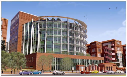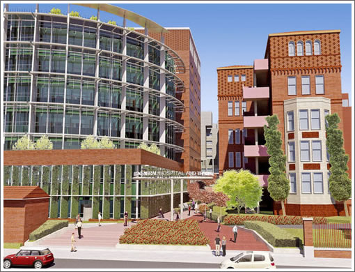
It’s a plugged-in tipster that forwards the latest renderings for the San Francisco General Hospital addition and directs our attention to the Webcor overview:
The 448,000 sq ft steel moment frame structure will have two levels below grade and eight levels above grade including a mechanical penthouse. Ties to the existing hospital will be made by means of a tunnel at the B1 level and a bridge at the 2nd floor. The building will be constructed on base isolators to withstand a major seismic event.
The project will be built in 4 phases. Phase I consists of site utilities relocation and replacement. Phase II consists of service building modifications and equipment additions. Phase III consists of excavations, foundations and structure frame. Phase IV consists of the new Acute Building Enclosure and build out. The new hospital is seeking a minimum of LEED Silver certification and is expected to open in 2015.

∙ Project: San Francisco General Hospital [Webcor]
I think is a good replacement for what is basically empty street front down potrero now. For reference Here (google maps) is what it looks like now.
I spent a few prime years of my life as a medical student and resident there in the 70’s and this new addition is long, long overdue. Those adjacent old five story pre-WW II buildings were rumored to be soon torn down back then and it is hard to believe they are still here 30+ years later. These brick buildings were considered seismic hazards in the ’70’s and whoever works in them today has got to have signed a waiver to be allowed in…
Sweet- this is an important addition that will improve SF General’s utility, as well as an improvement to the streetscape. It will hopefully raise the prestige of the hospital too, and by extension, the surrounding area. And given that I own rental property nearby, me likey!
outsider- wasn’t there some earthquake retrofitting that went into those buildings? maybe that happened after the ’89 quake?
and if not, all i can say is: welocme to san fran-cis-coooo! where the armory bldg on mission (at 15 st) went through decades of debate, oh-no could not be turned into housing w/o owner going broke on low income requirements, but ultimatley becomes home to kink.com- headquarters for s&m videos! (you see, shooting videos was considered ‘light industrial use’, hence did not need rezoning, and could not be sabotaged by lefty-nutso low income whores like MAC, etc.) let’s hope SF Gen does not follow a similiar ‘only in SF’ fate.
Would it be too much trouble to either a) replace those hideous fire escape stairs on the old building with something metal and architectural instead of leaden and concrete? PLEASE. PLEASE. PLEASE. or b) paint the damn things to look like brick? I mean, really.
Awesome. Now can they please get rid of those tacked-on pink stairways?
^ good point. i’d opt for architectural metal.
hee…hee…two different poster, same comment, same time, same hideous staircases!
Those stairs were color matched with the building way back then. I have no idea what came over the hospital administrator to turn them pink. In the ’70s, the Western Addition used to have the infamous PINK PALACE. SFGH used to treat a lot of the residents. May be that was a reminder of era past…
Nice renderings. In addition to being useful, the final product should look great.
Looks great– yes please fix the ugly pink stairs.
Between the new hospital and the tree median on Cesar Chavez, this neighborhood is getting some good stuff in the next few years.
I like how the new design connects the hospital with Potrero Ave, as well as allowing connecting to the middle of the basement and second floors of the existing hospital building, to allow continued ease of use of the cafeteria and administrative offices, in close proximity to the new hospital (since only the hospital beds and OR need to be in a building that meets the 2013 earthquake standards).
In response to an earlier post: one does not have to sign a waiver to work in the older brick buildings.
Exposure turns most red colors pink over time, so age along might explain the color change there. Replacing or rebuilding that entire structure might be a better option.
Yeah, changing the color of the stairs isn’t going to do a lot for them. They are just plain terrible. The renderings make them look almost attractive compared to reality.
45yr old hipster – how many properties do you own in the mish?
It looks like a baseball stadium…
I like the mix of modern with traditional that will be achived by the new additon to the hospital. However as a designer and ametuer architect,I would suggest removing the pink concrete railings on the fire-escapes ont the original towers and replace them with glass and metal to marry the new with the old successfully.
hmmm. so does Mission Emergency stay in the old building? it’ll put the ER a long way from the inpatient beds. also–no driveway in front so i doubt this is a practical rendering.
No, there will be a new med ER in the new hospital. A rendering is here:
http://www.sfdph.org/dph/rebuildSFGH/