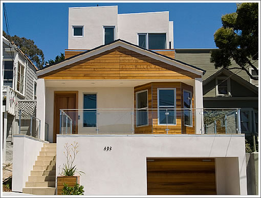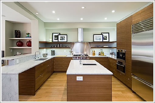
It’s yet another soup to nuts contemporary renovation in Noe Valley (“from the foundation to the roof and everything in between”). And while there isn’t an apple to be had, there will be coffee and doughnuts tomorrow morning from 10am to noon (in the kitchen below).

Keep in mind how the sale will contribute to the neighborhood median sales price (which truly plugged-in people should know better than to confuse with “appreciation”).
∙ Listing: 422 Valley (4/3.5) – $3,195,000 [Sotheby’s] [MLS]

Looks both awesome and cheap at the same time. Another good luck. Market down 400 today!
Just wondering: Are there any other districts in SF apart from Noe?
What exactly is the design style of that house? It basically looks like a huge mishmash of crap. I’m not sure who would pay $3mm+ for something so ugly on the outside.
To me, the front of the house does not look finished, but I’m probably not sophisticated enough to “get it”. And no bathroom pics?
Funny how they trump “walking distance”, and google/apple “commuter bus routes” along with the 3+ car garage (admirably, with no irony at all). I was wondering when Bell was going to be pushed out of Noe in favor of Whole Foods — glad that’s happening on schedule. Now your gas savings walking everywhere will be eaten up with grocery costs! 🙂 🙂
Boy, I’m grumpy today, but for 3.2m it seems clumsy, which is not to say the target market (found-money google/other .com employees) won’t jump at it. Of course, I haven’t seen it, etc., and maybe it’s awesome.
Hilarious! I’ve got to agree with MattM. What theme was the flipper going for? It’s not really clear at all. If you’re going for a modern themed house, then take out the bay windows and flatten out the roof.
the top floor addition looks like the Gila Cliff Dwellings:
http://1whoof.us/Gila_Cliff_Dwellings_NM.jpg
Well said DubDub & MattM.
2212 Castro was just around the corner, normal house inside and out, with 4K sqft and barely crossed the $3M.
What are they thinking…
… would that make the architectural style ‘Gila Monster Home’? or Gila Monster for short?
This is a mess.
Worst. Renovation. Ever.
I have to disagree. For me, this home brings up fond memories of when we used to get old scrap lumber and build tree forts. We were too young to use saws, so the shape of the “building” pretty much matched the wood we could find.
That’s pretty much what this building looks like, except ours were better finished and didn’t have the stucco. 🙂
Sort of makes you think that they are getting out of the business after this one, and so they just used up whatever scrap they had lying around. I like how the wood in the front of the peaked roof has the “seam” down the middle, like they didn’t have any left over lumber from their last flip that would go all the way across. Should be great until the first rains, when the water leaks in there.
DOG. (or, if you prefer, BEAST.)
I”m sure if the seller were able to tear down the fascade a very different house would have emerged. Some of the rooms are very nice, I would certainly enjoy the kitchen, family room and the fact that it opens up to the yard, looks awfully comfortable. Albiet, not quite a value at 3 million. The rooms built around the old fascade seem strange to me and not quite as inviting as the rest of the house, the bay windows and angles original to the footprint ruined it for me. Does not matter though, can’t afford it anyway.
Saw this project in progress and was astonished by the speed and competency with which it was completed. 2212 Castro was built by an unskilled crew to the lowest bottom dollar and it showed. Here’s the crazy part, because the developer paid under 1.2M for the single floor shack that was standing on this site, it qualified as “affordable housing” and they couldn’t get a demolition permit. The frame of the shack ( a few rotted 2x4s) had to remain in place while they chiseled the garage out of what passes for bedrock underneath. Guess the inspector gave them a break because they were allowed to replace the studs before they built up – the mudsill really is the only part of the original structure remaining. Valiant attempt to integrate the front bay into the design as they were forced to adhere to the “original building” envelope.
Great story, Peter, except A) the garage was already there and B) they didn’t really match the shape of the original building. Nor does it even try to fit into what once was a cute neighborhood before they built this beast.
http://www.mapjack.com/?4yumWjtzbFFGBDNA
Just hideous.
Saw it today, it’s actually pretty nice. From the inside the floor plan makes a lot of sense and feels more spacious than the 25th st house.
2nd level bdrms are on the small side, the house lack much detailing and doesn’t have this awe inspiring thing as the picture suggests. On the other hand it feels big and quite bright.
Overall still too pricey,
Agree – saw it today…it’s nice, but still expensive. Plus, I’m not a fan of the location that much – you get views, but (no surprise) you get a long walk downhill/uphill to key areas. Plus, seemed like you had a lot of other units looking into yours.
This house is just okay on the inside, but looks absolutely crazy on the outside. I liked the Mapjack picture of the “before” product much better. If I could afford a $3M house, I definitely wouldn’t buy this one!
Great home – maybe over priced a bit; but a nice home in a great location.
Thank you for the MAPJACK picture. It was good to see what was there before..a charming home. I don’t dislike the new front. The door being moved to the left does allow for better use of space. What I do mind is what was done to the backyard! There is not a single tree or flower just a sqatty looking yard to replace what was once an amazing space.
Thanks Michael L and Dan. I grew up in that house and it was a charming and homey inside as it looked outside. My mother and father bought the house in the 40’s for $4,000 and converted a set of rental “rooms” with a narrow hallway into the charming house that it was. Peter – it was not a “shack”! 5 people lived in what is now the bottom level with 2 small bedrooms and 1 bathroom (and 3 girls!). I agree that the renovation is hideous but what is most devastating is the back yard. As you can see on Mapjack, the front yard was pretty but the back yard was about twice the size it is now and no grass! Lots of trees and flowers and roses with a lovely path to a back “cottage”.
Ouch, affordable housing continues to disappear in San Francisco. 3.2 million is a lot of money even in Noe Valley. Peter, as you seem intimately familiar with this house, why did the flipper opt to build ONE expensive house vs two affordable units as this was an R-2? What happened to trying to fit into a neighborhood? This tall eyesore just simply doesn’t fit into the neighborhood.
You’ve got to be kidding me with this negative crap. The before picture was better? If you say so, Mr. Brady. Have you actually been inside of this home? It has what most of these posters do not: breath (as in air into the brain?)it feels expansive and subdued and is lovely. I think it’s lonley being a pioneer. And the finsihes are far from cheap. Fisher Paykel dishwasher drawers that they got a cabinet maker to custom make covers for so it seemlessly melted into the rest of the cabinetry? oh yeah, EVERYONE is doing that.
Beast, hideous,horrid… I have to say these only begin to describe this eyesore. Hate it.
Soma guy – had you actually been inside the old house? How can you compare Paykel dishwashers to trees (that had been razed)and 2 patches of grass to a previously gorgeous garden?
The developer is not a lonely pioneer – just a guy (married to the realtor!) laughing all the way to the bank…
The chatter seems irrelevant the house is in contract as of this morning. I’d be surprised if it sells for asking or above but not shocked.
Overall pretty impressive quick sell at this price range, given the competition in the hood