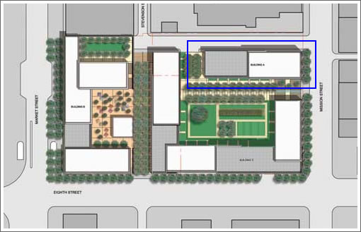
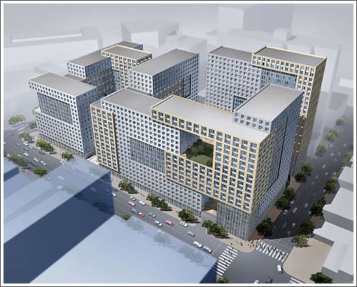
A tipster directs us to a few new Trinity Place renderings. The portion that’s currently under construction outlined in blue above. And that’s the whole shebang below.
San Francisco real estate tips, trends and the local scoop: "Plug In" to SocketSite™


A tipster directs us to a few new Trinity Place renderings. The portion that’s currently under construction outlined in blue above. And that’s the whole shebang below.

If I bought facing West at Soma Grand I would be a little upset right about now…
Ryan-feeling dumb might be a better way to put it
I think this looks pretty interesting. Great way to build some big time density downtown
Few more projects like this and we are talking about actually doing something about rental prices
yawn.
another full block of mediocrity. let’s get excited about sales statistics!
yawn.
another full block of mediocrity. let’s get excited about sales statistics!
h o’connor its rental housing. What would you expect design wise? I think its actually interesting and a nice design to hide a very practical need which is thousands of small rental units for waking people in the center of the city
I agree with the criticisms on this site that design in SF is often banal but sometimes it almost seems like a parody and so predictable time after time.
Ryan & Zig, the sales folks at Soma Grand have been very upfront about the Trinity project, and the West facing units are priced well below the East facing ones.
Michael-I assumed so and even if not anyone with common sense would see that the old motel in the middle of SF was likely going to be gone someday
I think the interlocking forms are visually appealing. It does sort of look like a Borg cube, after a battle (i.e. a few holes shot in it).
The large number of residents should help re-vitalize the Mid-Market / UN Plaza area. Maybe the boarded up lot across from UN Plaza will see some action. Anyone know if there are any plans for that lot? The bar tender at Mr. Smith’s told me he hear a rumor that a Hyatt was going in there…
p.s. When I walked past T.P. last night, Chris Daly was standing out front with a golden shovel. Ugh.
Zig – Agreed. Although in all fairness to Ryan, I have seen adds on Craigslist for renting/leasing sold West-facing units that refer to the unit’s Twin Peaks view.
is that like a 9th floor intra-building borg garden? it’s sorta cool if it is! I wonder what it’ll look like in real life?
i actually think this building is more interesting looking than 99% of what we see here daily!
i’m pretty impressed.
Really fugly. It looks like the infamous communist Paris suburbs that were in riots a few years ago.
Architectural delirium at best without consideration for the humans living there.
When I was looking at SOMA Grand last year, they were pretty up front up the Trinity project and the impact to the their project. They were also offering reductions for the units that would be blocked by the Trinity.
San FronziScheme I can’t see how you can defend those comments. First, the context of this building is totally different which is a big criticism of the towers in a park, le corbusier style of urban design and that of isolated and segregated French suburbs
Second, the designers have taken great steps to break up the massing on these buildings to make it more livable and less oppressive from the street. It even appear that they have includes open walkways though the buildings
Please explain your comment
Nice, hi density, walkable. I wonder what these would rent for? ($1400 Studio, $2000 1-br) Probably more by the time these actually get built. Hey, but this is a great step for the city.
It looks very Stalinist to me. I am at a loss as to why everyone thinks this is so great? Could someone tell me how this design is influenced by our climate, light, and urban context? This is exactly the type of project that would be dumped outside the outer ring road of a European city, especially Paris, Berlin, or even Moscow.
Oh well, maybe the “Paris on the Pacific” theme was brought into this project after all.
This building is oppressive solely the fact that it starts straight from the curb, and not 60 feet or so like the older ones. Less air, less sky, less light. The older buildings are ugly too and then need to come down, but at least you can see the sky. Good thing they allow through traffic, but go to La Courneuve North of Paris and you’ll see architectural geniuses that have left their footprint with big theories. It ended up like Sofia, Romania. Dead, cold and soulless.
Dropping names like Le Corbusier is a dangerous game.
Le Corbusier had great designs, concepts and theories and extremely good political and cultural support but his housing buildings haven’t been great community builders.
The cite radieuse in Marseille is a great concept but slowly went into a giant slum in the 70s and 80s (I visited it in 1987 and it was a really scary place). It has become trendy again in some way but it had a good 40 bad years.
He redid the same thing in Briey (East of France) with the same results. I’ve been there too, believe it or not.
These giant blocks, whatever the nice theories that are applied to make them more human are a necessity in a poorly dense city like SF. But that does not make them human.
I had no idea soma grand was making people aware this box was going in next door. i always assumed it would be a lowrise and not go above the parking levels. but clearly people who are advertising twin peaks views wont be able to for long…
yes. rental. more rentals is good. and the interior space (from the renderings) of the studios look liveable.
but the monolithic, city block-sized development. it’s ugly, and massive. if anything, it reminds me of ’60s-era projects… or the Fillmore Center. Or nearly anything of similar scale in West LA from the past 40 years.
I am ready to accept SF’s total failure as an urban area… no point in lamenting. This is the SF of the present.
looks like some of the 70s style housing projects on the SOuth side of Chicago
yawn and snnnnnz
more shadows and wind tunnels in a no man’s area of the city. looks like the low income housing in Chicago that was imploded twenty years ago.
I really like the way it starts right at the curb – it creates a more urban feel and vibe – think NY – setback buildings in cities, particularly on the main thoroughfare in town just do not work – hope there is retail on the ground floor to provide essential services
I like it. Whimsical, interesting, gives us what we need where we need it. I just hope it doesn’t take 20 years to get built.
A great legacy for Angelo.
LEGO LAND.
If the material used is of high quality it will look good. The building is probably to the sidewalk because of the bums/crazies/dope heads. Architechs have to design with the bad elements of society in mind.
I will be looking at this building probably for the rest of my life as I live a block away in the Fox Plaza.
The project provides badly needed middle-income and affordable rental units along with continuous street facing retail and generous public plazas. A complex of this scale which is located right next to BART is a great thing, as it will encourage people to walk more and drive less.
The massing, although very monumental, is somewhat playful and includes pedetrian-scaled portals and retail entries which will ultimately help the project to feel much more vital and urban than the suburban blight-producing motel which is currently located on the site. However, the quality of the scheme is ultimately dependent upon the use of substantial materials for the exterior skin, but I suspect that the city mandated this as a condition of approving such a large project.
As for the height, if we could mobilize more people to support modest density increases on other transit corridors such as Geary Street, then maybe a project of this scale would not be necessary. However, SOMA appears to be the only area in the city where higher densities are encouraged…
My eyes recoil at the sheer weight and unending dullness of the project.
I’m shivering even now just thinking about the mean shadows that will be thrown off by this monstrosity.
I’m dismayed at the ludicrious notion the this old style “urban renewal” like project is taken seriously for even one second.
The radiant city must be locked in the dust bin of history. The ONLY exception is that the given ideas are masterfully TRANSFORMED and executed in the poduim + tower style of Vancouver, BC.
Almost reminds me of Gehry. Stunning and World Class. The revitalization of mid-Market has begun. This is the future, folks. An amazing metroplex of infinite possibilities to respark what was once the heart of the city, which one day will be again.
My eyes brighten at the playfulness of the design. It has a kinetic feel the way the various shapes seem to slide together.
I’m shivering with excitement at the possibility of actually being able to walk past the completed project.
I’m dismayed that provincial San Francisco almost lost the opportunity to add this colorful block to the skyline.
I’m excited by this project. The density is just what is needed to jump-start 8th and Market, and makes total sense from an urban planning perspective. I agree that the execution and the materials used will make all the difference, and hope that good, neighborhood-serving ground level retail, restaurants, and cafes open up in the complex. It’s also of note that this is a privately funded, mostly market-rate development with the potential to make both a contribution to the neighborhood and to the supply of rental housing. Win-win-win-win.
A great story about this in this weeks Business Times:
http://www.bizjournals.com/sanfrancisco/stories/2008/05/26/story2.html
Unfortunately, only available by subscription. The short of it is that the developer is going to use high end materials in the project, even the low income portion and knows that the project doesn’t pencil out and doesn’t really care.
Amazing that this took 30 years to happen.
At the risk of piling on: Yes the SOMA Grand sales people have been completely up front about this project. In any case, the project was debated in the press and well published for years, so unless you’ve been living under a rock…. And yes it will be high quality materials. Trinity Properties has a long history of hiring top-notch architects and building quality projects. And this clearly is a legacy project by an excellent architect. I can understand that it may be a challenging design for those who cannot “read” spatial composition from plans and renderings. It is a type of project that has not yet been built in San Francisco (but common elsewhere) – an intricate composition of slabs not a “tower in the park” a la Le Corbusier. It in fact is the complete opposite of the tower in a park. It promises to be a major positive addition to the urban design fabric of the city; it fulfills a tremendous need for modest rental housing on the edge of downtown, and just imagine a thousand middle class residents walking down Market and Mission to work in the financial district. It will have a major uplifting effect on these blocks that for decades have had seemingly intractable social problems.
I live at the current TP and will be glad when the project is finished. They are moving very quickly and seem to work non stop. Hopefully he new building won’t be full of mice. I will miss the view of “Market street but I think the new design is perfect for the neighborhood. the fact tha it will be buildt in phases is good as there are other projects in the neighborhood as well and the residential and retail will grow toether as another 5000 residents are added to the area over 5 years. Its good that it up to the edge of the sedwalk to ehlp get the homeless from out front.