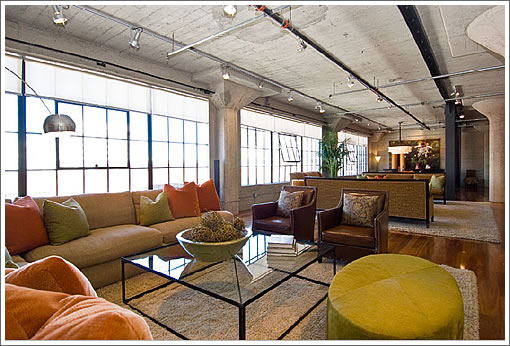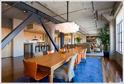
What do you get when you combine three adjacent lofts? Five bedrooms, four baths, three parking spaces, two dishwashers and one big span (60 feet) of industrial windows.

And yes, a seismic beam to boot (or to others, to bonk).
∙ Listing: 650 2nd Street #502 (5/4) 4,190 sqft – $3,125,000 [650-2nd.com] [MLS]

sold for 2.3mm in 2004—was there a significant change/upgrade made to this unit or is it just worth more money now?
Awesome space though I am just as baffled by the noggin knocking diagonal bracing as when we saw the same structure in the developer’s unit.
It looks as if they went with the cheapest brute force solution to stiffen the URM. Given the price points for these units, couldn’t a little more finesse have been applied to these diagonal braces ? Think Eiffel (the engineer himself, not his namesake tower). The same strength could have been produced with a curved or cantilevered brace that doesn’t block traffic flow so much.
It’s a loft – who cares about the beams. I love this place, and I love the building. I’d push my mother down a flight of stairs to own this one. My guess is it sells this weekend.
“It’s a loft – who cares about the beams”
Why does the fact that this is a loft excuse suboptimal design decisions ? I can see why rough wall textures should be expected (and I have no problems with that). The walls were part of the original building.
But those braces were added to the original structure to meet seismic code. If you have two choices :
1 – a diagonal brace that could block flow
2 – a less obtrusive brace that opens up the space and makes it more livable
Then why would you choose the inferior option ? Just to save a little construction money ? I’m guessing the cost delta would be about $1000/brace
Yes it is a loft and it’s ugly – especially with those beams. Despite all the purported space there’s something suffocating about the overhead sprinklers and concrete of this one – I think the ceiling feels lower than it otherwise would because it is a much larger space than originally intended. As 3 lofts, the ceiling would probably feel fine, but with all the walls gone now (and the ceiling height the same) it feels sort of like a brightly lit cave. Oh, and then there are the beams….. If this had been developed with higher ceilings, it would be much better (and w/o that bracing).
It is a loft, but my god – what a mess.
The kitchen is a redo (asymmetrical island has to go, cabinets belong in Danville circa 1996), the subdivision of the space is an enormous waste.
And the furniture.. I don’t know if it’s staged, but Z Gallerie meets Beetlejuice is nothing short of tragic. Given location, it should grab $700/sf. But it’s really nothing special. At all.
The seismic beams are actually redeeming, in the context of all of the other design crimes.
The other way to seismically brace an older concrete or masonry building is to use MOMENT frames, where the brace is eliminated but the strength comes from the welded beam to column connection. It’s perhaps more visually pleasing, but costs from 2-3 times the cost of conventional exposed bracing. I actually like the exposed bracing, after all it IS a loft type of living space.
Yeah – unless you are a structural engineer, you’re going to have to live with diagonal steel I-beams as the seismic solution in a lot of these older buildings (I doubt that decorative curved steel is designed to hold the same horizontal loads). And yeah – moment frames are great, you are basically building a new seismically sound structure inside of the existing structure and then attaching the old building to it – so yes, it’s ridiculously expensive (and you lose plenty of living area at the same time – just at the edges of the building). Personally, I’d be glad there are horizontal beams here – it really is a design feature (structural albeit) – I’ve been in plenty of older open buildings like this that don’t have them and one day seriously wish they did.
I like this space myself.
Those Darn Braces: The diagonal braces are a relatively standard solution to a lateral resistance for seismic reinforcing in older buildings and are very common in new steel frame construction as well. They probably occur in almost every high rise built in San Francisco in the last 25 years. Before then it the practice was to merely provide very stiff welds at instead of bolted connections at “moment frames”, but that solution was proved to failed in the Northridge earthquake and is longer used.
When you are designing from new, you can usually find places to conceal them unless you want to feature them as a design element. Concealed behind gyp. board at the back and side walls of elevator shafts is a popular location for example.
Contrary to some of the other posts, there really isn’t much latitude in the design of these, and they are really stand-ins for what the structural engineer really wanted – a solid concrete wall spanning between the columns.
The latest solution is called an “Unbonded Brace”. With this design the diagonal tube is still there but it doesn’t have a steel to steel connection to the gusset plates at the base of the columns and the center one at the underside of the beam. Instead there is a seperate steel member that is attached to the gusset plates and extends inside the tube for a fourth of the tube’s length or so. The tube is then filled with a fancy concrete-resin mix that holds the steel members in place but acts as a shock absorber allowing a little movement without breaking anything. That solves for the major problem with the traditional braces – they tend to be one use only and are ruined (in the act of holding the building up) in a seismic event.
Typical San Francisco DPW Story: I was involved recently in a healthcare high rise in San Francisco that included brace frames that were usually concealed but also exposed as design features in public spaces. The inspectors for DPW made us put handrails around the low ends so that people would not bump there heads. This is actually an ADA and CBC accessibility code requirement. We had a couple braces in fancy conference rooms where we didn’t want to put the railings (they were along the walls). DPW was very insistent we add the rails until we had a final meeting in their Otis Street headquarters in one of their conference rooms. It just so happened that the conference table was positioned right under the same kind of brace. I suggested to DPW that if I put my railings in that they had better do so as well and that if they didn’t, it might make an interesting item for the TV news and the issue was dropped.
I choked on the monthly $1340 HOA dues
All that space is nice, but the outdoor area is severely lacking if you ask me.
I’m not a loft guy, but this place looks fine to me. It is a loft anyway.
I never understand why people like the one big room thing. so if your spouse is watching TV you can’t get away from the noise… but it’s all the rage so…
I like whatever those greenish-blue glass things are in that one bedroom. can’t tell if they’re closet doors or something, but they clearly are different!
Are we in a contest to see who complain the most?
No, I am not a loft person. No, I don’t like the beans either. No, I don’t have a cool 3M.
However, it is over 4000 sqft! It is big enough for a indoor archory range! That itself is enough to make me drool.
Come on, people, this is exactly what RE porn is – something you would love to have, but won’t in real life. Complaining about the beams and the ceiling is like complaining about a Playboy model having brown eyes but you prefer blue.
The problem isn’t that this playboy model has brown eyes, but a hook nose, a 3rd arm, and a siamese sister. So she’s big. Biiiig deal. It could be 40,000 square feet and I wouldn’t be drooling for this place. Beetlejuice plus Z Gallery is the best description I’ve read. I would take my gorgeous 1150 square feet any day over this place, period.
One of the cool things about lofts is the gritty industrial look of the structure contrasting with the residential furnishings and decorations. I suspect that remaining consistent with that look was the thinking behind *not* using a decorative type beam.
On the other hand, having that metal monstrosity blocking the openness doesn’t seem to work. “Lets open up the space, but then slap this black hulking think right here to close it back off.” I would have skipped anything decorative as inconsistent with the hard edge of the design, but perhaps not used something quite so diagonally “bonkable”. I don’t think it’s that much of a detraction to make much of a difference either way.
If someone feels they need a 4100 square foot loft, here’s what is likely to be about your only chance. You might hear your wife’s TV shows, but think of the parties you could throw here! As soon as someone walked in the door, they could instantly calculate your popularity by counting virtually everyone at the party. If that’s your thing, this is your place.
Great space, not my choice of bedroom furniture, but sure is nice and open. I just don’t understand why someone would put baseball figures on top of those speakers and place them in that arrangment. Those are Wilson Watt Puppies and used to cost $20K, up to almost $30K now, what a waste to put them in a small and ackward set-up when they can be spectacular and sound incredible anywhere else in that huge space.
“One of the cool things about lofts is the gritty industrial look of the structure contrasting with the residential furnishings and decorations. I suspect that remaining consistent with that look was the thinking behind *not* using a decorative type beam.”
Sorry if my comment was vague, but I was not implying to change the design for aesthetics but rather to make the flow work better. The sort of structure I have in mind would essentially reduce the envelope consumed by the brace by sort of bending the midpoints of the diagonals closer towards the upper corners. This would require more steel. And it could still be designed to look hella industrial rather than decorative.
And as for it not being a “standard solution”, of course structural engineers are going to recommend standard solutions. They’re cheaper and less hassle. There’s no reason a decent engineer couldn’t design something non-standard that was just as solid (though likely to require more steel).
Analyzing and verifying non-standard structural designs has become a lot cheaper and easier with the advent of powerful computers and software. Can you imagine anyone attempting this Koolhaas CCTV builting without extensive computer design and modelling ? http://designcrack.com/v2/wp-content/uploads/2006/10/cctv.jpg (notice the irregular diagonal latticework)
I have a hunch that SF has the talent to build outside the box too.
john,
Are we in a contest to see who complain the most?
No, I am not a loft person. No, I don’t like the beans either. No, I don’t have a cool 3M.
Come on, people, this is exactly what RE porn is – something you would love to have, but won’t in real life. Complaining about the beams and the ceiling is like complaining about a Playboy model having brown eyes but you prefer blue.
HILARIOUS!!! ok, my turn…
this is an expensive loft, it need more outdoor space, everybody loves being a crab-apple on SS, the people that comment and the majority of content are painfully negative, i would never buy a multi-million dollar loft, there are not enough bathrooms for me, real estate is the worst investment ever, i would never buy, i would never take this listing.
what the hell is wrong with everybody. it’s a sweet loft, lighten the eff up!
Nice, but I would rather daydream about 845 Sanchez that just came on the market for about the same amount of bucks. Ahhh classic deco!
Rebarka said: “I would take my gorgeous 1150 square feet any day over this place, period.”
I am speechless.
I changed my opinion about SS…it is not a RE site, it is not even a bear market RE site….it is becoming more like a support group where negative people get together and pad each other on the back.
Well, at least joerealtor has his sight on something hotter.
Socketsite: Where you can be viciously critical of things you could never afford to buy. This is a real estate porn site, for the most part. I come here to look at the pictures of all the overdone/overpriced renovations and real estate listings. I take it a lot of people here are realtors. There are some really good insightful posts about SF real estate, which is a bizarro world.
no?
I would not want to live here either. Not everyone loves lofts. It reminds me too much of the long hours I spent working at dotcoms housed in them.
Oh John, lighten up, can’t a girl have some fun expressing her opinion? Socketsite is a fun real estate blog to read and freely comment on, repeat, freely comment on. Like all blogs, it is whatever you take from it.
I love it. What a great place to entertain large groups.
I love it! Great building in a great part of town. I think this loft is super sexxy and just need a touch up from limn gallery.
Not sure if it’s worth 3+ mil …
I had the pleasure of seeing this place yesterday, and my assumptions from the pics held true; this place is a beautiful loft. To address the complaints I’ve read so far – the beams didn’t feel intrusive at all – they’re located only in one corner part of the house, and are simply not in the way at all. The walls are of a normal height – and the fact that the living room is so expansive doesn’t make them feel shorter. The Beetlejuice comments don’t make sense to me – because the bathroom floor in one of the guestrooms is checkered???
The only potential negative I found was the master bathroom layout was a little funny (shower and toilet separated from tub in a different room. Just kinda struck me as weird, but not a big deal. Also, this building is too close for comfort to SF’s worst condo disaster – the Palms. That’s gotta hurt the value a tad. 🙂
If I had 3 Mil, I would have put an offer in on the spot. I think a loft lover will snatch this one up quickly.
I like it. Pretty in a lofty way with the price tag to match. Sadly I’ll never be able to afford the homes in the style I love so much in the city I left my heart in. *sigh*
Are you all aware that the roof deck is common area? So, 3M with no private outdoor space…ouch
John, I heart your comment. I’ll admit that “oh she’d be sweet if she was a brown eyed girl” is a big part of the fun for me when looking at these posts but an indoor archery range would be the awesomest, wouldn’t it?