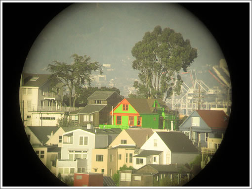
Through the lens of “oscar champagne” and in the subtle words of our tipster, “yikes.”

San Francisco real estate tips, trends and the local scoop: "Plug In" to SocketSite™


Through the lens of “oscar champagne” and in the subtle words of our tipster, “yikes.”
OMG. Where’s an HOA when you really wish you had one? Yikes is right! :/
What were they thinking? “Yikes” – I agree!
The thing is, this took some real time and effort. Sustained, conscious effort. Dear God.
This brings up a very interesting question. Should neighbors have a say in what color you paint your house? After all, color selection is VERY subjective.
I agree this one is “rather hideous”. There are some really offensive paint color schemes in my neighborhood too. truly awful ones. How and should it be regulated? Check out a very ugly color scheme on a corner house at Sanchez and 27th..very bad..different colors on all 4 facades.we call it a spite house.
It is what it is…..
What is the address? I want to mapjack it.
HOA?? LOL. I find it laughable that the same people who proclaim ‘PRIVATE PROPERTY!!!’ are the same ones to turn this into communist San Francisco, making everything bland and fitting to your pathetic liking. This is AMERICA, we have the freedom to paint our houses however we damn well please. Please go back to N. Korea with your ‘intellectualism’
noearch – I am guessing that you mean the house on the corner of Sanchez and Duncan : http://www.mapjack.com/?oWvmWLi2bFEE7CAA
This does look to be intentionally foul looking. Either that or done by someone with really really juvenile aesthetics.
I’m split on the question of wild painting. On one hand, I think unusual paint jobs make the cityscape more interesting. (There are plenty of tasteful ways to paint a house with vibrant colors). On the other hand I empathize with the neighbors directly across the street who have to see the wild paint job every day.
If I ever got the urge to use wild colors, I would definitely consult with my immediate neighbors first. No sense in alienating neighbors over just a paint job.
Interesting fact : a gallon of electric blue or popping pink costs the same as a gallon of any one of the kerjillion shades of tan.
Oh, do the neighbors want to block my addition of a second story because they don’t think the new home will fit in with the character of the neighborhood?
No problem, I’ll just use the money to paint my house. I hope the neighbors like the color, they are going to be living with it for a long time. At least until they allow my addition…
Come on, isn’t that one of the things that makes this such a fun place to live? People doing their own thing. I used to live down the street from that tiger mural near cole and carl and I always kind of liked it. Not to live in, necessarily, but one or two in every neighborhood isn’t such a big deal. This is SF, not Celebration. We have a history of native crazy bs.
I agree that the house is ugly, but at least it’s INTERESTING. And SF has a history and a well-deserved reputation for our colorful houses. In any other city this house would be a travesty– here it is part of a well-worn tradition.
Economic Obsolescence
tipster…
I snorted my diet coke through my nose when I read that.
…exactly!:)
Posted by: sf at March 21, 2008 12:42 PM — I’m SURE you would feel the way you do now if this were your neighbor right across the street or right next door to you … right?
You need to pull a permit to paint the exterior of a house in San Francisco. The planning department has a say in what happens.
Basically speaking, anything seen from the street has to go through the planning department.
What? I didn’t pay over a million dollars to live in a city where people are free to do what they want with their own property! Buffy and I have a hard enough time steering the Lexus around the domestics and homeless on our way to 24th St. Our sensitive retinas should not be assaulted by other’s free will.
I see this house from one room of my home. I pass it and look at it every day. The day the painting scrim came down a couple of years ago, we stood on the sidewalk with our other neighbors and laughed. With the passage of time, however, we’re OK with it. It’s not my taste, but then it’s not my house either, and the neighborhood is better for the variety. If I wanted to live in a monochrome planned community, I’m sure I could find one. I’d rather live in Noe Valley.
Doh. Wasn’t clear. I was referring to the coloring book house at Sanchez & Duncan.
The Sanchez/Duncan house is a beautiful home (inside)- we looked at it when it was last on the market in the late 90s. A family moved in and we long thought it was the child that picked the color scheme. It made us sad since we loved that house so much. But for the record, the previous color scheme was one solid tan color – no real accents. So it needed a paint job, i’m not sure that this is the one I’d have chosen though. But, be glad it’s not bright green and orange like the one pictured above.
Yea, i was referring to the house at sanchez/duncan. we like to call it Fort Duncan..the raised planter posts are made of pine logs. looks like something a 7 yr old boy would build.
The owners of that house were VERY antagonistic when the new 3 unit condo building went up across the street from them. they fought it a lot. they made the planning dept. require the upper windows facing west to be obscure glass..so the neighbors could not see into Fort Duncan. They painted the house to spite the ‘hood.
Yea, I think it’s plain butt ugly..not “interesting” or “creative” just ugly. there are intelligent ways of painting a house full of color and style. this one does not do that.
Actually, the Sanchez/Duncan house is not THAT hideous, at least compared to the one pictured in this post. I mean, if it were me (I repeat, if it were me) and if I REALLY wanted to spite the ‘hood, I can imagine I would have/could have made it look a WHOLE LOT WORSE. 😀
A permit to paint does not require Planning Department review. Whoever told you that is mistaken. FYI- there are many types of permits that are approvable without being routed to planning.
Well, I live in Noe Valley off the Church street corridor opposite of what I am sure is the ugliest house in NV, if not the entire city. I would kill to have the Sanchez/Duncan or even the green machine house to look at instead of the peeling beige mess with a garage and concrete/steel stair slapped hideously on the front I still cry over after 4 years in my current residence.
How about the rainforest facade house?
Whoops. Forgot mapjack link:
Weird… I’m sure I included the link on the last post.
If this comes out blank, I’m talking about 1074 Church on the east side of of the street.
chipie : I know the rainforest house well having missed buying a house on the same block by a very thin hair a few years ago. I think it is cool and would have been happy to live near to it :
http://www.mapjack.com/?RuxmWYB3bFhB7CXA
And I totally agree with your comments about those amazing ugly retrofit concrete and steel stairs. Yeah, they might meet code but they are fabulously ugly. And unlike paint they are much more permanent.
Can we rally the NIMBYs and the SF planning department to put a permanent ban on those ugly drop-in external staircases. Bleh !
Not True:
Personal experience. Last year I pulled permits for window and color changes. I was escorted to the planning desk, where they required I take photos of the block, submit the photos, and then they charged me $500 for the trouble.
Yes, for the windows.
Yahoo and good for the people in The Mystery Machine-green house.
No, I don’t like the colors, but this is San Francisco, and I don’t find extreme colors nearly as disturbing as that resale-beige shit I see being inflicted far too often these days.
If I wanted conformity with just a little bit of zazz, I’d live in SoCal.
I lived in Montreal many years ago and throughout Quebec at that time, particularly in rural areas, you’d see houses painted lime green and shocking pink, kind of like this house. After a while they were the ones that conformed 🙂 I went back recently and was kind of sad to see that memory dispelled, and all the new housing conformed in the generic tan way. But I think San Francisco is a pretty conforming city colorwise, and prefer it so. The biggest eyesore to my mind was built many years ago … the Bank of America … that dark brown, looming tower. Ugh.
No, I wouldn’t mind one bit if this were across the street from me. I’m a man, I can take it.
Re: Duncan/Sanchez. I live a couple blocks away and like seeing it’s color on my walks. Bright, but fun. Designed by a 7 year old? Probably right.
But I’d much rather see more of those than anything designed by Bob Buckter. Does that guy know there are more than 7 colors?
It looks like a tribute to the wild parrots of Telegraph Hill. I bet I’m right.
funny Oceangoer…I grew up in NH, and was familiar with those Quebec colors. Often a very vibrant robins egg blue as well. Since there was a little bit of a class issue in NH….colorful houses like that were referred to as “french” with a raised eyebrow, and seen as so tacky compared to a pristine white house with a choice of a)black b)dark green or c) brick red front door. Taste is taste is taste…and I’ve got to say to each his own….
that said…yeah, yow that house is ugly!
learning how to link MapJack, priceless:
http://www.mapjack.com/?qA5mWDEwbFiB7CXA
And if orange is your thing, Clayton at Fell:
http://www.mapjack.com/?zi5mWMZubFiA9CHA