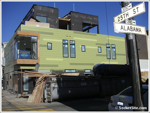
Walter gets it right. The 2007 San Francisco Idea House looks to be located at the corner of 25th and Alabama (3027 25th Street to be exact). And if PropertyShark is as accurate as Walter, the lot size is 2,238 square feet (and it’s zoned RH2).
San Francisco real estate tips, trends and the local scoop: "Plug In" to SocketSite™


Walter gets it right. The 2007 San Francisco Idea House looks to be located at the corner of 25th and Alabama (3027 25th Street to be exact). And if PropertyShark is as accurate as Walter, the lot size is 2,238 square feet (and it’s zoned RH2).
Interesting. I live in this neighborhood. I like “modern architecture” (remember this movement started in the 1930’s), but turns out to create
Sunset’s Idea House, they destroyed what appeared to be a well maintained and beautifully detailed, inside and out
Victorian House, wonder how they got around the Landmark’s
Board?, to make this “Green” building.
Oh ugh.
We also live in this neighborhood.
The owner never did a Pre-App meeting, and when the plywood sheathing went up around the exterior siding, we thought it was to protect the facade. Little did we know that what they were doing inside of that wall of sheathing was what seems to have been an illegal demolition.
The Building Inspector says that there is nothing we can do about any of this.
We call the Monster on the Corner various things; the most obvious is “the refrigerator.”
Another of us says it reminds him of Ren & Stimpy. I think he says that because it’s so ugly, with no redeeming neighborhood character whatsoever. Or maybe because it’s the ghastly color(s) on unremittingly cheap composite siding.
Leafing through the Architectural Design Guidelines,
http://www.sfgov.org/site/planning_index.asp?id=29558
what stands out are the sheer number of items which are “out of compliance,” “out of character,” “out of place” in contrasting this structure with the house which was demolished.
It’s difficult to say which of the many many Design Guidelines/ Design Principles it violates are the most egregious, but perhaps in the two top positions may be
– the lack of a 15-foot 3rd-storey setback,
– the bad fit with the rest of the neighborhood in each and every Design Guideline category.
The sheer Ren & Stimpy refrigerator-ness of it is appalling, and as we learned today we are looking forward to a windmill rising in its backyard which will tower over 15 feet over all surrounding structures. Aren’t we lucky to have this as a neighbor!
We know this was supposed to be “green,” but we know from the trash blowing around the neighborhood during construction that the builders took no care to contain the materials and trash.
Lot size is 3,750 sq ft, (not 2,238) according to
http://www.sfgov.org/assessor/
It definitely is a considerably larger lot than the standard 2,500 (25 x 100).
It is zoned RH-2, but it has been a single family above retail for at least 15 years, and probably before that.
Got a green mail from someone yesterday because I’d written about the Sunset house on my blog. Mail was to give me a heads up that the Sunset Idea House opening has “been delayed.” The Sunset site says to check back often for updates.
Perhaps the issues raised by neighbors are causing some troubles for the building?
Sal,
I rather doubt it is because of us (neighbors) that the opening is delayed.
As the building inspector told us, everything is permitted and there is nothing we can do about any of this. Too bad for us that we didn’t get Notice.
They are working on the Monster 7 days a week from 7:00AM to at least 7:00PM.
Looks near-perfect to me. I have lived in or near San Francisco my entire life and I am absolutely, positively sick of these absurd “Victorian” mausoleums. Guess what – the United States never had a “Queen Victoria” and the 1800’s ended more than 100 years ago!
I got an email from chicken john that he is doing a fund raiser on Monday Aug. 26 at 6pm- all of you with your issues, ideas and complaints can see it first hand.
Perhaps those complaining would prefer an abandoned paint store.
I just stumbled upon this site for an unrelated reason, and then truly stumbled upon this thread. I couldn’t agree with Michael and Sal more strongly. Personally, I think it’s an aesthetic disaster; I’d hope we can “go green” in a more visually appealing manner. BUT, neither my, nor anyone else’s preferences are relevant here. As Michael so articulately points out, the violations of the Design Guidelines are indisputable. It will be a travesty of justice if this goes through without further investigation.
Pardon me. I misunderstood the headings/footings. It would be “CRS” with whom I agree.
It’s not a particularly innovative design, but I don’t see how anyone could think this is an “aesthetic disaster”. Certainly it looks better than 99% of SFHs constructed these days.
Wendy,
Let’s talk. How can I get in touch with you?
sidney W, James, and g,
We wholeheartedly support the 3400 Cesar Chavez Project and were at the forefront of the fight, speaking on behalf of Seven Hills, the Project Sponsor, in all hearings and meetings both at the Planning Commission and BOS.
We think the abandoned paint store and the MAC/BHNC “developers” are just plain greedy and obstructionist.
3400 CC has NOTHING in common with 3027 – 25th St.
3400 did extensive outreach, changing architectural design several times to comply with neighborhood suggestions, voluntarily contributing to streetscape greening and flood control measures, and many other items and issues.
3027 – 25th’s Project Sponsor did NO outreach and went out if the way to stick out like a sore thumb… thumbing their nose at the surrounding neighbors.
Basically, the problem is in basic respect for the neighbors and surrounding neighborhood in the DESIGN of the structure and Architectural Design violations.
It could have been complementary, innovative, and pleasing — and not necessarily aping the Victorians, either… A lot of the surrounding structures are from the ’20s, ’30s and ’40s.
A perfect example of a brand new structure which fits in nicely with the surrounding homes is in the very next block: 2964 – 25th St was built on an empty lot not more than 5 years ago, but fits in to the street as if it were an original structure. (The interior is gorgeous modern 2-storey condos and a garden level condo.)
I am close with the builders on this house and everything was permitted now it might not look great but the inside and the outside will be beautiful when the owner has to stop listening to sunset magazine and make it how she wants
Permitted yes, but neighborhood notified….questionable.
Wendy and CRS, how can I reach you? I’m in complete agreement with you.
Venus and Wendy,
You can email me at
aaferguson32@hotmail.com
This.. seems to be a very interesting addition to our world.
I like to see architecture that doesn’t appear to be the norm.
Quit being squares. I wonder what’s inside. 🙂
I don’t know what was there before the current house – but I’m pretty sure the rules state that if you don’t have a vertical addition and/or if your horizontal extension is no more than 10 feet, you don’t need to do a pre-app. Was this the case?
Anyways, what people don’t seem to realize is that doing “extensive outreach, changing architectural design several times to comply with neighborhood suggestions” costs money. $. $$$$$$. Every time the architectural plans change, the owner pays the architect to do so. Neighbors don’t feel the pain in their pocket book so they feel free to whine and whine and whine.
The process should really kick 50% of the cost of design modifications as a result of public comment to the neighbors – I bet the whining would be a lot more focused and a lot more constructive as a result.
I have to agree with SickOf SFNeighbors. Everybody seems to think they know what is best for your project when it’s not their money. Taste is such an individual thing, who decided that the neighbors have better taste than the property owner.
Again, many of you are missing the point. If everyone could just put up any design they wanted, that would be fine. But, that isn’t the case. The rules state that you must meet or compliment the surrounding area….do you think this building does that? If you do, fine. If not, you have/had a right to voice your opinion.
The argument is why THIS building didn’t seem to go through the same process as others in the city and in the area. That is it…no more, no less.
For this specific project -> it was fast-tracked through the process by the city because the city allows projects meeting a certain green-criteria to be fast tracked.
That being said, taste is such an individual thing. I’m sick of people whining about what does or doesn’t fit their neighborhood. If they don’t have skin in the game (that is, $$$$$$$$$$) then their opinion is worth just about squat.
I live in this neighborhood and I pass this house every day. It is creative and innovative and pushes the boundaries. I love it.
Wow, this house is amazing..truly amazing.
However, i did notice that it was lit up like a Christmas tree and I wondered why there needs to be so many lights up on the third floor and how much extra electricity the windmill must generate for all of that.
I think so many architects and designers think you can have as many lights as you want IF you generate your own electricity. Isn’t modern design all about “less is more”? Isn’t that the real basis of “sustainability”?
Besides that, it is beautiful..well done.
Venus, totally agree with you.
BROADCAST:
To all those who don’t have the money to buy the land and build your own stuff.
Stop complaining about others who are trying to move the city forward with new developments.
If you like old homes so much, buy them and keep them the way you like it. I (unlike the commmies here in SF) respect private property and the right of property owners.
Beauty is in the eye of the beholder and design by nature is subjective. So if you want to argue, focus your points on facts that can’t be disputed rather than on some old city design guideline that brought us so many ugly buildings along the water front because they have to “comform” to the immediate area.
You commies are more conservative than the “yuppies” you try so hard to keep out.
Let the tagging begin….looks like the taggers have just been waiting for a new canvas and found one at this property.
“Go Home Yuppey” (with an arrow facing the ground…could that mean grave?)as well as “minty” are boldly tagged across the windows.
Regardless of what you think of this property, tagging is just plain bad.
I disagree, “walkingtobart”
tagging is a lifeform.
this building is a deathform.
The Mission “Progressives” are actually ultra-conservatives. They want NOTHING to change. Change is bad. That is the definition of conservatism. Chris Daly and Chicken John are power hungry madmen.