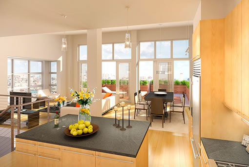
The Esprit Park “3-D interiors illustrations” that were coming soon are now here. And even though we prefer our refrigerators a bit closer to the sink (yes, we’re picky), we can’t stop ogling the rendering for unit N516. The windows, the deck, the counter space…oh my!
∙ Esprit Park (900 Minnesota): The Website (Sales Office This Summer) [SocketSite]

Everything about this place is impressive, and I believe their website is more informative than any of the other new homes out there. I guess it works out that way when you know your product will present like it does! I took a look at the floor plans and seems like most will be single floor 1 bedrooms… Lining that up with their pricing quote, “Homes ranging from the $600,000s to high one millions,” where would people see a 2 bedroom falling in that price range? And with a deck… Closing in on $1M? Any thoughts?
I don’t have a problem with the placement of the refrigerator. It seems sufficiently close the largest work surface in the kitchen.
Wait…I’m not a master of kitchen design, but isn’t the refrigerator door handle on the wrong side? If the handle is on the left, like it is in the rendering, then you have to walk around the door to get into the fridge. Putting the handle on the left also means you expose the contents of your fridge to everyone who’s not in the kitchen. Maybe whomever did the rendering only had refrigerator art with handles on the left side?
I registered on the website for more info, was immediately told I would need to pre-qualify with one of their two “preferred banks” before I would be able to submit an offer. Hasn’t the market flattened enough that buyers don’t have to go through these bullsh*t prequalifications with “preferred banks”? I have a relationship with my own personal bank and am prequalified with them — why on earth would I want to share the intimate details of my financial life with Wells Fargo if I have no intention of using them? Argh!
-SF Renter
Yeah – the fridge door is irking me too.
Am I missing something or for a rather affordable price is this a well designed project with a website that actually provides real information and a design that would be attractive and interesting to live in? Nice job!
SF Renter,
A LOT of places are falling out of contract because the buyer can’t qualify. They don’t want to take a unit off the market only to find out you can’t qualify when the time comes.
Seems reasonable to me, and more reasonable in a down market when qualifying suddenly means more than having a pulse.
I wouldn’t take it personally.
This neighborhood, Dogpatch, is one of the most interesting in the city I think. It’s not right in the thick of things, so it’s priced accordingly. New Muni line along 3rd is a plus, so is Caltrain for people headed south.
What’s also a plus is that the neighborhood isn’t dominated by large full-block projects that project homogeneity onto the street. There are still SFH’s here that date from the 1870s, although they’re in kind of rough shape.
Pier 70 right across 3rd is a diamond waiting to be polished. Pier 70-Dogpatch has the chance to be a real neighborhood whereas most of Mission Bay just to the north gets big-boxed in.
And yes, those renderings look really sweet, if you’re willing to look past the fridge door thing.
The little court parks in this design seem quite nice. It will be interesting to see how they come out especially over time.
The refrigerator handle and hinges are on the wrong side in all the renderings, so that is probably a stock art model thing. Refrigerators are usually built so that the hinge and handles can be easily reversed because of design and handedness issues. This is a right handed refrigerator configuration that just happens to seem backward in this kitchen.