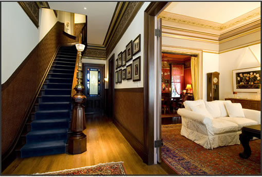
This 1885 Victorian isn’t going to garner any accolades for curb appeal (at least not from us), but the original interior is quite spectacular. 760 Haight features some amazing architecture and detailing – beautiful woodwork, stained glass and operational gas chandeliers. The kitchen? Well, that’s a different story…
∙ Listing: 760 Haight Street (4/3.5) – $2,149,000 [VictorianMiniMansion.com] [MLS]

the funny thing about the kitchen, is that it looks like someone put time, thought and money into creating such a mis-matched vision. the eichler atomic mod meets subzero appliance fetish (yet not so well executed). so at odds with the glam gothic victorian look predominating the rest of the pad.
“Oh my God!” I exclaimed aloud. “That’s horrible!”
That kitchen would inspire me to follow the old matchbook advice (am I showing my age?) to “Enjoy life, eat out more often.”
Uhhhhhh … that’s one, ehm, groovey kitchen that’s just so out of place with the rest of the house.
Nice house but that kithen looks like a jamba juice bar.
The odd website for the house is remarkably annoying – as challenging as the interior of the house. The term is negative marketing. Major headache and annoyance factor. I’m dizzy from the clicking – and where’s an exterior shot? Every room needs major editing.
Agreed on all counts. The kitchen is so out of place it is astounding. Actually I can’t think of anyplace, except maybe the aforementioned Jamba Juice that it might work. The tile counters in the bath seemed out of place as well, seems like the last place to skimp a few hundred bucks and not get marble, or the like.
Website is annoying as well. Flash is great for property websites…just not that Flash. Sound, Ugh. Tiny, tiny thumbnails, ugh. No back button on the tiny tiny thumbnails, ugh.
The main house. Amazing.
hmmm… i actually like the website quite a bit. its sleek, clean and easy to use and the photographs are beautiful. it really presents the property well.
I wonder if there are mental price points that people have for property types and styles i.e. one will spend up to $1million for a condo, and perhaps $1.5 million nowadays, anything over must be a SFH. And for this area, one is willing to spend up to $2million and not any more, no matter how nice the house etc. For $2.15 million, you can buy A LOT of nices property in much better locations.
Prime
“glam gothic victorian look”
this comment is great. I dig the blood reds in that room as well as the candles. That room pops great againsts the other rooms.
The kitchen is GREAT in my opinion! Damn you naysayers! It is almost as though the property is polking fun at itself. I like the whole vibe of this place.
great find socket!
I like the web site and the photos are great. I agree about the sound though. The house is awesome.
I’m probably in the minority here, but I think many of the first floor rooms look like they belong in a bordello. Then some of the rooms have more of a modern look. Let’s not even talk about the kitchen. I’m too confused.
Forget about the website, forget about the pics, ignore the shingled facade. It’s the only place you will ever want to live in. A must-see. Saw it on tour day.
It is still on the market.
These photos belong in an interior design textbook under the heading, WHAT NOT TO INFLICT ON YOUR FUTURE CLIENT. This is an absolute definition of the most UNSENSITIVE Renovation or Restoration of the most egregious variety. What kind of drugs were these people on? Whoever designed (a term I use very loosely) what passes for a kitchen should be brought up on charges of culinary indecent exposure. Please tell me that these people have not inflicted such visual atrocities on other unsuspecting properties as well. And, of course, this absolutely begs the question, “And what for Heaven’s sake does the OUTSIDE of the building look like?” One can only imagine…