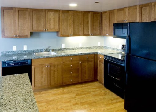
We had a chance to walk through a couple of the condos in 767 Bryant this weekend. And while we found the sales team to be quite friendly, the soundproofing from street noise to be surprisingly good, and a number of the units to be quite spacious (and bright), we’re struggling to rationalize the “value” of these condos.
Irrespective of the location, the quality of the finishes in the units we toured are not competitive with other million dollar (plus) condos on the market. The bathrooms are a far cry from “luxury,” the kitchens didn’t strike us as being particularly “chic,” and in the tri-level units, the scale of the lower levels seemed off.
For the most part these units are large and functional. But at these price points, we’re wondering if buyers won’t demand more.
∙ 767 Bryant: The Apartments Condominiums [SocketSite]

OMG! Those cabinets are criminally ugly!!!
From the looks of the photos, these places look like the design direction was “whatever’s on special at Home Depot”. The floors (which look cheap) clash with the cabinetry (which Sexy & Sassy has already keenly described). Even the staging looks cluttered and full of furniture cast-offs. (Maybe stuff renters left behind?) And, of course, there’s the exterior architecture, which is reminiscent of a strip mall. With much nicer loft on the market already seeing price drops, 767 Bryant will surely provide future socketsite posting material!
I agree with Christopher. That kitchen looks like a sad union of Home Depot and Ikea. And could they spare the granite on the backsplash? Sheesh, were they trying to save an extra couple of bucks by only having about 1″ backsplash? And what’s up with the black appliances? Ugh. Definitely not a way to send a high end unit.
Ouch, that’s hard on the eyes! This looks like a *very* inexperienced project from all angles (exterior design, floorplans, finishes, staging, pricing, marketing, etc.).
If you take a look at the photos posted on the marketing website, you’ll get an even better idea of the “style”. Now, these are apartment-conversions, so some dating on the finishes could be expected.
And, I try to keep in mind that you can fix a finish, but you can’t fix square footage or location (did I hear “syringe throw away”)… but let me complain about the finish and “staging”.
I seriously thought that the photos actually represented an homeowner’s eclectic collections. However, I now realizing that it’s just bad design. What’s with the random collection of rugs of different styles, shapes, patterns, periods, and colors thrown throughout the monstrous room? Rugs can be used to define “rooms” within a large space, but this ends up looking like a rug showroom.
Is that an (oddly high) fireplace I see ignored behind the white flokati (with randomly arrayed twigs, near the Windsor chair)?
http://innovative.idxmedia.info/images/bryant_loft3.jpg
I’m sorry, I can’t take it anymore. The mismatched rugs are going to push me over the edge. Make it stop! Hire a stager for God’s sake! Or fire the one that did this unit!
FINALLY. Someone is doing something about these lofts. The units are quite spacious and really just needed some good vision to help them shine. WITHDRAWN FOR UPGRADES, new staging and SOME SENSE OF STYLE. HITTING THE MARKET AGAIN MARCH 25, 2007 with LOWER purchase prices and awesome incentives.
Sellers are discounting and offering buyers: no RE closing costs, no appraisal fees, Seller paid HOA for 1 year…They also installed stainless steel appliances in units. AWESOME. At the new price they are worth taking a second look.