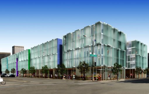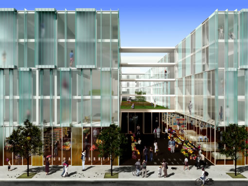

A tipster forwards a few drawings of 555 Fulton, a proposed 164 unit development by Henry Wong (developer) and Stanley Saitowitz (architect). Our question: anyone care to share the inside scoop on its status?
And a reader asks: “Do you know what is going on with the lot at the [SE] corner of Polk and Geary?” (Once a laundromat/parking lot, they’re now starting to excavate.) We don’t. Anybody?
UPDATE: The readers respond with regard to the corner of Polk and Geary, it’s an eight (8) story senior housing development. “Herman & Coliver Architects – roof gardens and streetscape by GLS Landscape Architecture.”

Stunning! Build it!
“what defines San Francisco’s architectural identity and where is it headed?”
This does!!!!
(from previous post)
What’s uniquely San Francisco? – I think of the buildings which are pacific, luminescent, vulnerable, elemental, whimsical — from sunset stucco Deco numbers to the only-in-SF (ok maybe Tokyo) concrete & glass phenonenal Yerba Buena Lofts — to the new see-through shimmering Federal building. THESE are uniquely San Francisco. As for all the derivative press-on brick facades and all the condos with exposed flim flam plywood exteriors — well, this is the bland stuff which could land in any city, won’t endure, and makes our authentic new buildings all the more unique.
what is going on with the lot at the [SE] corner of Polk and Geary?
I am told ~8 (?) story senior housing.
The rendering sure looks nice. Hopefully it won’t end up looking like the Stalinist tomb that is the Yerba Buena lofts.
What, no faux Victorian pastiche? It’ll shock the sensibilities of the natives and never, never get built.
You too can live in a display cabinet! I love foolish renderings of floor-to-ceiling windows that reveal sofas, beds, and closets from the street. Strangely missing: the curtains that every single tenant will buy and keep closed so they can take off their pants or kiss someone or eat breakfast without being casually observed from the street or other apartments.
I like modern designs, but I’ll bet the architect has never tried to live in a fishbowl apartment.
That.is.gorgeous.
Saitowitz is local and his YBL is the only SF structure noted in the Phaidon Atlas of Contemporary World Architecture. And no, I don’t live at YBL.
Regarding the fishbowl comment. It looks like there are blurry glass panels in addition to the clear glass. Looks like maybe they can flap open and shut, presumably controlled by the people inside.
I think those glass panels are Saitowitz’s signature Profilit glass blocks, which don’t open. While I admire Saitowitz’s designs, I agree with the earlier poster’s comment that he may not have considered what it would be like to live in one of his creations. I bought one of the Yerba Buena Lofts when they were first developed, lived in it six months, and turned around and sold it. I was taken in my the building’s sleek appearance (and sleeker marketing), but living it in was like inhabiting a storage locker or loading dock–it was simply uncomfortable to be in. The Profilit glass was tricky, too. It lets in heat and light, but doesn’t really look good with window coverings in front of it. I think the rendering of the Fulton design is beautiful, but the units will be sweat-boxes for those who don’t want to compromise the design integrity of the building by hanging window coverings, or the exterior will look junky from residents putting up window coverings or belongings near the Profilit sections. (Have a look at YBL and you’ll see what I mean.)
I agree with Christopher. I really really really wanted to like YBL. I toured it while it was under construction, and again when it was completed. All the architectural cogniscenti had orgasms over it when it was under construction, and some still do apparently.
But as living space? Awful. Uncomfortable. Dehumanizing. And it betrays the unfortunate tendency of some architects to trump practicality with the big design idea. Even on little details like the ice-cube tray like balcony railings. Which if you notice quickly get encrusted with dirt and are obviously hard to clean.
I agree that the rendering is stunning, and i would love to see something like that built in SF. But there is a lot of difference between a rendering and a completed project. If Mr. Saitowitz decides to pay attention to the comfort of his final users, I’ll change my initial negative suspicion.
Confirming the 8 story senior housing building on Polk & Geary by Herman & Coliver Architects – roof gardens and streetscape by GLS Landscape Architecture.
I too can admire Mr. Saitowitz’ conceptual approach and aesthetic, but think his floorplans suffer at the expense of elevation and, even more, rigid “programming”. Look at his website for some of the smaller infill housing actually built south of Market (on Natoma) — the program of “thickened party walls” for all bath/kitchen or, even thicker, stairwells, leaves the interior space a long, long open area less than 13 feet wide. And those baths would put a one-hundred year old Victorian to shame, as well as shame a Victorian, with vestibules only 3 feet wide lined up with translucent sliding glass doors seperating them from the living spaces.
Not nice spaces, not helped by the unconcealed fluorescent lighting at the recesses atop each wall, and I know as I toured them on the recent AIA tour. The plans for 555 Fulton are similarly rigorously programmatic, albeit with better looking baths, but similarly narrow living/bedroom stacks. The renderings do look smart, though.
The defect in thinking about this project as a spot for the Symphony/Opera crowd from the Peninsula to crash rather than driving home, is the same defect with timeshares, i.e. how about staying in a very nice hotel whenever you need it?
I am still wondering about all these “glass buildings”… How will the facades hold-up after a sizable ground shaking? Shards of glass tend to kill those who happen to be beneath them when they fall. Just wondering, are non-glass facades less likely to come down than glass?