
To answer a reader’s question, while plans to raze the former Sparky’s and current Thorough Bread and Pastry building and build up to six stories in height upon the 240-250 Church Street site have yet to be approved, they are working their way through Planning.
As recently rendered by Schaub Ly Architects for the project team, which purchased the parcel for $4 million in 2018, the proposed development would rise up to 65 feet in height upon the Castro/Upper Market site and yield 20 condos (a mix of 15 two-bedrooms and 5 ones, averaging a little under 850 square feet apiece) over a new 1,946-square-foot retail space (which could be re-occupied by the bakery).
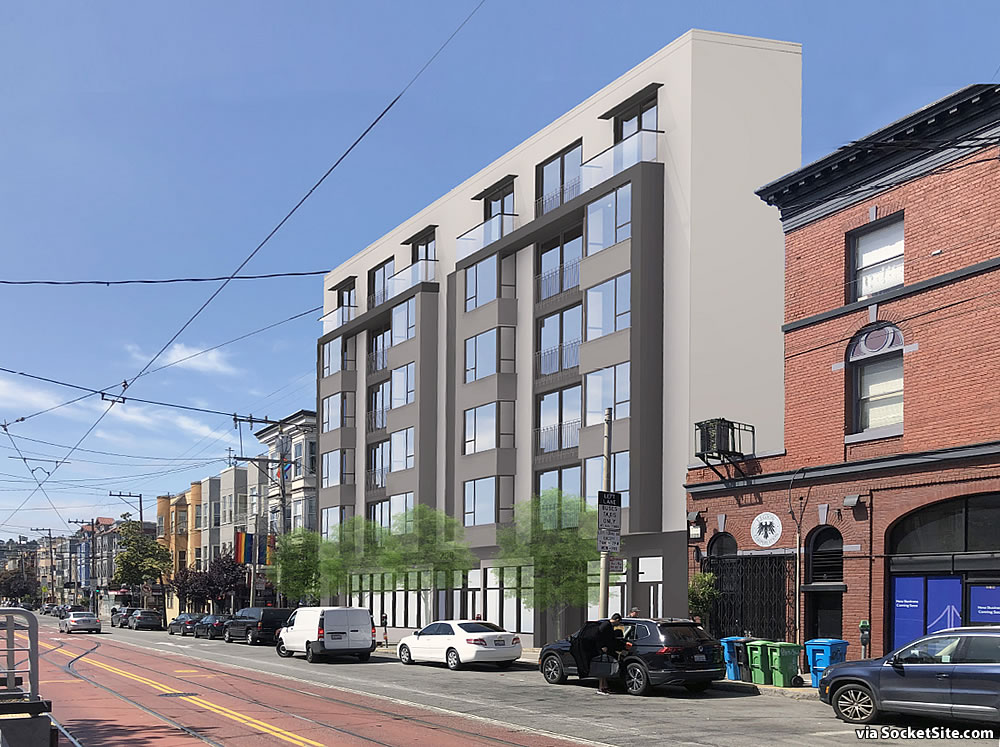
As the site is principally zoned for development of no more than 45 feet in height, the project team is planning to invoke California’s Density Bonus Law for the additional 20 feet in height, with a rear yard for the new retail space, a secured storage room for 20 bikes, and a roof-top deck for the building’s residents.
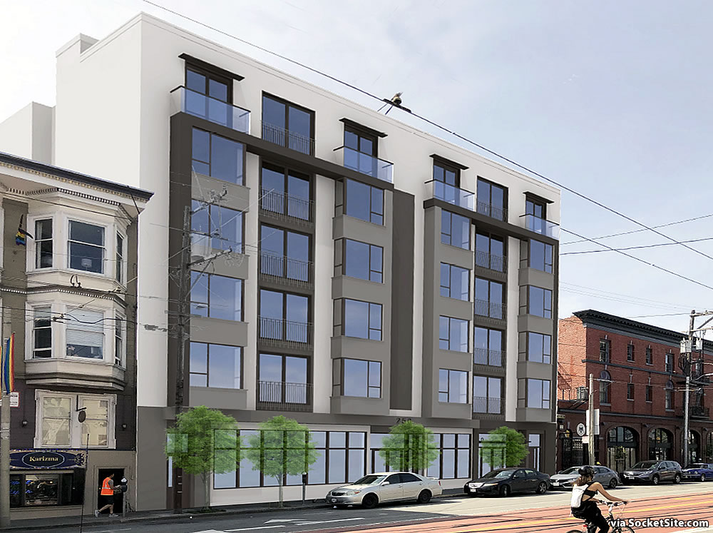
And while the existing building/facade on the site is a century old, its latest survey resulted in a non-historic rating (Category C).
In my humble opinion, the HRA report should have concluded the structure was an ‘A’ (Historic Resource) rather than a ‘C’ and the one story facade incorporated into the new structure. The proposed design is banal and uninspiring.
Agree with retention of the current facade and redesign of the superstructure.
Why do people think every single on building has to be a unique, inspiring, world class architectural wonder? Such a completely bizarre thing to believe.
Speaking for myself, I think about the insane amounts of money being made by people involved in this project, and then look at this design… Just feels like we’re all going to a fancy restaurant and being charged $60 for a pop tart.
Completely agree. If we’re going to suffer through another guilded age, some decently ornate architecture is the least we can expect out of it.
Then design it yourself. That’s a god-awful line of reasoning to oppose something.
Not opposing it, it just looks ghastly
So do many, many of the designs that people here think look good.
Maybe you should then save up some money and buy some property and develop it yourself. Why do people feel entitled to dictate to others what they can do with their money and/or property especially with something as subjective as design.
Ok I’ll get right on that to save you the apparently unavoidable insufferable anguish of reading comments on Socketsite
Why don’t you just develop some better taste, and then you can join us in making fun of these ugly tech worker barracks? It’s more fun than licking developers’ boots, I promise.
Looks like a slab of concrete that will fall over and flatten any passerby… banal is the correct word of the day…
No, it looks like windows of class and privilege that will cause much pain and despair amongst the “marginalized” in our community. This must be stopped!
Thank you Scott Parsons. You get it. No more glass!!!
I totally agree. There are too many windows in SF. The less fortunate don’t have windows, so why should anyone else…
I’m sure people actually believe that.
There was a project in the Mission which had to be redesigned because the initial versions had floor to ceiling windows which are apparently a cause of gentrification.
Gentrification or envy? I’d go with the latter.
The proposal looks like trash but I don’t care. I believe any project this close to a streetcar station and having sufficient minimal density should be approved over the counter, instantly. But one of the conditions should be that street-level retail retains the same number of doors. It looks like these developers are replacing 6 small retail locations with one huge one, which isn’t great.
This would be easier on the eye of it were set back even a small amount starting at the second floor; as well as a more articulated facade. Looks more Geary or Market; seems to show lack of consideration of the street, altho I fully support dense development on this site.
Is it me, or does the first picture make it look like the building is only a dozen or so feet deep?
Is the building bland? Of course. But is the façade of the existing building worth saving. No. No it is not.
The parcel and proposed building are triangular.
Echo the sentiments above. Yes to density and new housing, especially at this intersection. Hopefully the design gets refined, preserved facade or not. Still waiting for Safeway lot to get developed.
I imagine planning will suggest they maintain the facade and set it back. 100%
Regardless, in these sorts of cases, planning should (instead of forcing to integrate the old-timey facades) encourage the use of similar materials and street-level context. I think it’d be a much more reasonable compromise and get more high quality, period materials while also helping improve the pedestrian experience AND allowing the architects some actual creative liberty.
This ^^^^.
Some amount of homage to the historic buildings surrounding it — perhaps by using masonry at the ground floor, but I’m sure there are other ways they could do so — would go a long way toward making the building feel as if it fits with its surroundings. I’m not talking faux-anything, just a respectful hat tip or two to its surroundings.
This design looks like it could be equally banal in Mission Bay, along Geary, or in Walnut Creek. It just doesn’t seem like it would take that much effort to make it look a little more stately.
I totally agree. The density is fine. But the facade is ugly, intimidating and non-contextual. The color is maybe the worst part placed next to the lovely old brick next door. It doesn’t need a massive redesign and it doesn’t even need to be set back, just make the facade materials something that harmonizes with that brick.
To all the armchair critics, these are not actually “renderings”…they are cheap computer generated place holders while all the frustrated architects at the Planning Department and in the neighborhood get to weigh in, pull, prod, pontificate, and redesign the building.
These drawings are slightly more than mere massing diagrams, and give no hint of materials, window mullions are lines with no depth or dimension, the glass is opaque, there are no doors to the retail spaces (the central door is obviously for the residential units as it lines up with the elevator/stair stack), etc. etc.
Any developer would be a fool to spend the money on detailing out at this stage of the process, when much bigger design decisions will be made by others in the process. Look at other completed buildings, and go back and look at the presentation drawings. Sometimes the finished product is worse, and sometimes it is better. Save your bluster.
They clearly need better expiditors.
You’d think the developer would want to keep that historic brick facade and use the setback to position the new building further back from the property line. This is going to be one INSANELY NOISY place to live with the way the current design of the building juts out toward the street (and with all that glass). Yikes. No thank you, hard pass!
This used to be a lively hub in an eclectic neighborhood. Now it’s a repository of the banal, by the banal, and for the banal who seem destined to inherit the earth.
PS We call this vivacious new style Penitentiary Chic
UPDATE: Bigger Church Street Project Even Closer to Reality