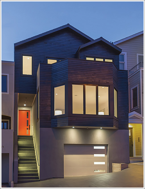
Purchased for one million dollars this past January, the former 1,200 square foot Noe home at 2220 Castro Street has since been redesigned and rebuilt with an ebony shingled façade, colorful front door, and a nearly 4,000 square foot contemporary interior.
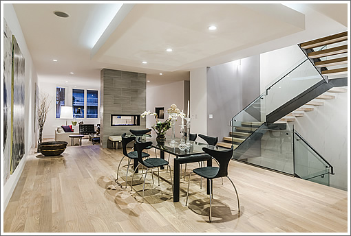
A double-sided porcelain fireplace separates the dining area from the sunken living room.
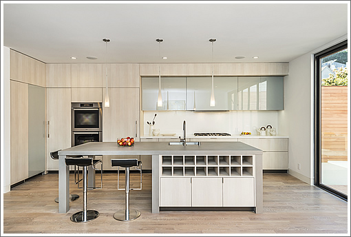
At the other end of the floor, the kitchen opens onto a glass terrace and landscaped patio:
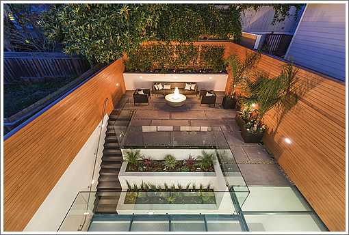
Back inside, an open steel staircase connects the three levels with four bedrooms and four and one-half baths.
∙ Listing: 2220 Castro Street (4/4.5) 3,972 sqft – $3,295,000 | Floor Plans [2220castro.com]
Seriously, why is the only sink in the island? Such a bad practical design. I can’t be the only one who feels this way?
how could they have gotten the permits and completely construction to turn a 1200 sq. ft. home into a 4k sq. ft. home so quickly?
I agree ExBernaler. Though we should be grateful that the kitchen designer even provided a sink at all (I guess the building code has that one covered :-). They didn’t seem to be designing for function. Check out that wall of cabinets to the left. There’s no convenient counterspace for transferring hot stuff in and out of the oven.
It looks impressive though and that was probably the designer’s main focus.
Re: adequate counter space to transfer hot stuff in and out of the oven, isn’t [that an] issue faced by all wall ovens?
Agree with respect to the kitchen sink placement, it’s way too small for a “chef’s” kitchen as well; would be perfect if it was a secondary sink. Impressive job overall.
jack – Only if they’re isolated in the middle of the wall like in this home. There’s no reason you cannot place a wall oven next to some countertop. Or at least have countertop directly behind (though it is nice to avoid having to do a 180 while holding something hot and heavy).
Not a huge problem but it would be nice for a dream kitchen to be easy to use. This is just my personal opinion. I see the kitchen as the room where attention to traffic patterns workflow really pays off.
This is a home for imaginary people that is why all the practical issues raised so far don’t matter. This would be funny except I think it is actually a serious issue.
The residential housing stock of SF, particularly in Noe Valley is being altered in ways that make real living very impractical. How will this house hold up in ten years? Who will want to live in it then? I guess there was no opposition from neighbors about the project or maybe they built within the existing envelope which doesn’t seem possible which is the only exlanation for why it zoomed through the process.
Another question. What is up with these orange doors, usually with grey/dark grey and now black facades? They are everywhere. Why this apparent trend? Are there that many Giants fans or ha, ha is Larry Baer the secret owner of all these properties?
Milkshake – True. Now that I think about it, the wall ovens I’ve seen before are fairly close to counter spaces.
On second thought: perhaps the saving grace here is that not much *constant* baking will take place in kitchens, so it’s ok to place the wall ovens a little further away. Looking at my own cooking needs, the range top gets a lot more use than the baking oven. Therefore, if I have to choose, I would assign more counter space to the range top.
I don’t understand the counter space issue. There is a big island that can be used as food preparation space. With a hot dish from the oven, you just turn around and place it on the island counter.
@ Milkshake,
“We should be grateful” ?
Why do you write that? Grateful?
the Orange Doors etc remind me of the Georgian doors in England/Ireland.
We are about to paint our place Gray and put a red door on it!
“The residential housing stock of SF, particularly in Noe Valley is being altered in ways that make real living very impractical. How will this house hold up in ten years? Who will want to live in it then?”
Please tell me you are joking.I suspect many people will want to live here in 10 years despite the perceived misplacement of the sink…
Truth – It was hyperbole and just a dig at these sorts of show kitchens. I put a smile in there in hopes that statement wasn’t taken too seriously 🙂
Forget the kitchen- look at the size of that dining zone! I say zone because it’s not really a dining “room”. That giant expanse of wall is great for hanging artwork which would be useful to me personally, but then you have acres of space around that table which makes the space feel cavernous and ill-defined. I cite by way of contrast the living room (actual room this time) that is well delineated with its step down and the fireplace wall. Both spaces are examples of open concept, but one is a better application of the idea than the other.
Love it!!!
No, I wasn’t joking. I think that the large open floor plan may prove impractical in the not too distant future and people will be putting up walls or turning away from these houses to those that have not be “infected with this virus” of turning single family homes into lofts. The non-remodeled homes if they survive will become very desirable, and maybe they will all be in other parts of the CIty. For example, heating a large space like this and not being able to close off rooms. Issues of privacy within the home. Now for example in some older homes, the dining room is a bedroom. Will people want a media room and a large living dining family room combined? Will people want such large windows exposed to the elements? Blah, Blah, Blah. I just think these types of homes are being overdone and this one is perhaps the most egregious example.
As for the door. Red and Grey is classic. It is the orange and grey/black I am curious about. Why orange? People hated that color for a long time after the sixties. Why is it back and what does it mean?
@speedy, I was shocked myself, so went to sfgov.org.
They reinstated 2006 permits and I don’t think the 2013 sell was a real one, probably off the market deal. This entire plot was sold by heirs like 10 years ago to a bunch of developers and that’s why all the adjacent homes are new
Some of the neighborhood kids use to think that one of the houses on that site was “haunted” back in the nineties. It is interesting that the one remained intact so late. They must have still been individual lots and that one was the last to be developed.
I really don’t get the objections to the kitchen. I have eaten many very very good meals prepared in a kitchen with an island sink much like this one; the space between island and stove counter looks to be about that of a standard galley kitchen, creating compact space to work. And as for the wall stove, there is a space behind it to place hot objects: the island.
I agree that loft remodels like this will fall out of favor as times change, in about the same way nobody knows what to do with a mcmansion “great room” any more (if they ever did.). The highly compartmentalized space of a standard row house proved very flexible over the last hundred years in accommodating multiple living arrangements and a wide array of incomes – single family homes, two-flats, rooming houses, communes. The highly stage-managed blank openness in these places only serve as wealth signifiers; that long sweep of “dining area” would be more honestly expressive of its real function if the floor were 12X12 tiles, each one stamped “$829.00”. I think that’s the list price psf, right?
Regarding the island sink, as someone with a very tiny U-shaped kitchen, it sure seems like a luxury to me. I would be worried about where to hide dirty/prep dishes when I cook for company, but it looks like there might be a decent pantry – wonder if it would be big enough for a sink and second dishwasher.
At least it’s not a benihana island…
The kitchen is actually better than a lot of these remodels, but there are still some issues. The principle problem with the oven placement is the landing zone is where seating is. The island design is the true problem. The sink is undersized as the single sink for a four BR home and because the dishwasher is next to it, there is no room for a trash pullout.
Did anyone notice how close (even across Castro) the apartments across the street feel to appear from the formal LR? Now of course it is the City and we should expect close living. I wonder how it appears in real life.
I think there’s a middle ground between the loft-like expanses seen here and the (over?) compartmentalized spaces seen in some SF homes. Those with young families appreciate how from one’s kitchen where the soup is stewing one can sit at a dining area, snacking and surfing the web, while making sure the toddlers aren’t committing suicide in the living room. It becomes a line of sight issue really. And having the kitchen/dining/living together is good for that. I do draw the line of having a bedroom overlooking living space.
Anyone know who the architect or designer was?