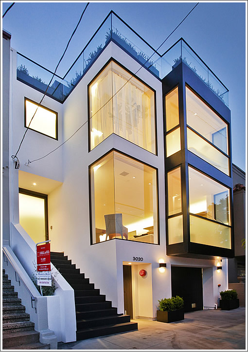
From the condemned canvas for 3020 Laguna St. In Exitum to an all new four-level contemporary Cow Hollow home, now’s your chance to peek inside 3020 Laguna Street 2.0.
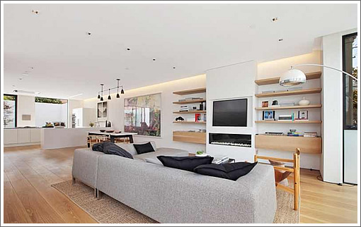
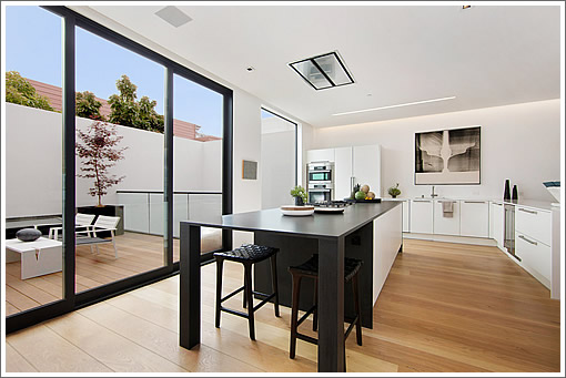
The open plan on the main level is accentuated by widows reaching from the floor to the floating ceilings and opening to a rear deck off the open kitchen.
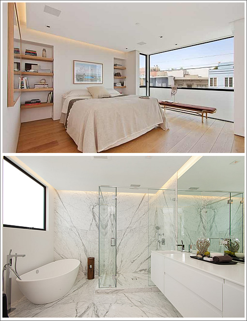
The third floor master suite features oak built-ins and floor to ceiling marble in the bath:
An au pair suite on the first floor opens to a courtyard, while atop the building a pent room sided in charred cedar opens to a wrap around deck and fire pit.
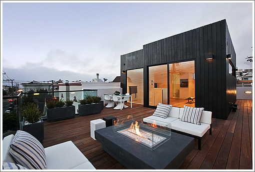
And while not yet listed, the contemporary 3020 Laguna is on the market for $4,495,000.
∙ Listing: 3020 Laguna Street (5/4.5) – $4,495,000 [3020laguna.com]
∙ 3020 Laguna Street In Exitum [SocketSite]
Prefer the look of the tiled bathroom in the au pair suite over all the marble in the master bath, but gorgeous job overall.
$4.5MM? Uh, wow.
Great looking place, modern done right, nice restraint and good use of quality materials and finish work looks to be top notch (at least in the pics). I dont think the price is to far out of wack considering the similar sized Teed Haze cow hollow listings that range from 4.5m-6m
love this place. the recessed and trough lighting, the steel stair rail, the expensive windows and doors, the restrained palette and use of materials. this is a real modern urban townhouse.
also love the look of the ceiling hood. anyone out there know anything about its performance?
about the apparently enveloped terraces up two stories: was this pre-existing or can one really wall off their lot this high? is there additional rear yard behind the wall and if so where is the access? do all the terraces mitigate the open space/yard rules at planning?
$4.5MM for a place smack dab between Lombard and Union seems like a stretch to me. Maybe in Pacific Heights or close to the Palace of Fine Arts I could see it selling for this.
Also not sure if Teed Haze listing prices are the best proxy for value. Will be interesting to watch this one unfold.
It is a beautiful building though.
The ceiling hood is Italian, from Best Range Hoods. Performance is strong. Up to 1500 CFMs.
http://vimeo.com/42707165
nice restraint
restrained palette
It appears that at least two sockersiters believe that the new word for plain is “restrained.” It sounds much fancier and implies more thought.
One has to have some excuse for $5m for this. “Restraint” is a great word.
Hope they get it. Makes everything else in Cow Hollow, Marina and Pac Hts more valuable.
If this bubble continues, San Francisco will become the most expensive city in the western world.
Looks great!
Nice to see a major project where the exterior and interior match coherently. On that note, bravo to the planner(s) who backed this demo permit. This replacement design is new and modern while not being totally out of place with the neighborhood.
Good luck to the developers.
“Restraint” in the bathrooms:
the marble one looks like the locker room in the OC, BEFORE the remodeling
the tile one looks just like a high school bathroom of the 1960s
Wow! I agree with all the agents and investors posting today. Buy low, sell highest!
…restraint isn’t the new word for empty and if you’ve done any building before you’d know with minimal concepts you see all the flaws so it’s harder and more expensive much of the time.
I know I’m going to catch a lot of flack for this but doesn’t anyone design for warmth and comfort anymore? It’s all hard lines and shiney surfaces. New doesn’t have to be sterile. Is contempory Arts & Crafts possible?
Intriguing. What would be a good (close) example of contemporary Arts & Crafts?
Look at the designs of Greene & Greene. There are a lot of lines and edges but they are done in real wood and natural stone. It doesn’t need to be as detailed as The Gamble House but why does everything need to be devoid of any natural materials and design?
why does everything need to be devoid of any natural materials and design?
1. Profit
2. P. T. Barnum’s ideas are alive & well
3. Mies van der Rohe and Philip Johnson are dead. Only their bastard children survive, at least in SF housing remodels.
This is clearly high end work, but I get the sense that this design will look really dated in 15 – 20 years. It’s like the boxy white cocaine palaces of the 80’s with the tubular railings. They had their moment, but look really dated now and it’s hard to renovate in way that makes them look fresh. More classic designs/styles tend to stand the test of time better, in my opinion. The style for kitchens and baths will always be changing, but a classy craftsman or victorian or spanish house tends to age more gracefully.
Outdoor space is kind of a bummer for a place that is otherwise admittedly very nice. I’d feel claustrophobic in the lower level of that walled in patio. Very private though!
If you are interested in fine contemporary classical residential architecture, San Francisco’s own exponent of superb taste is Andrew Skurman.
He does comfortable and beautiful houses.
They do not look like this one.
pretty houses on Skurman’s website, though I don’t see anything I’d call contemporary. It’s all French, Georgian, Italianate type stuff. That said, I’d much rather live in one of his houses than this one.
Skurman is a major neo-Classicist.
Ahhh I see. I do enjoy having clean lines framed by natural materials. Perhaps something along the over-used “zen” Japanese modern line?
Will probably be more cost-intensive, though.
what, no animal skins on the floor?
To each their own.
At $4.5M, the new owners can hopefully personalize an adapt the space. The advantage of a blank slate is that you can easily add.
The one thing I will cry foul on… the “Chef’s” kitchen is poorly laid out. Materials (Corian, really?) and style aside, all the function is packed into the same corner of the large room, but with the island bisecting the work triangle. Perhaps the new owners will have the au pair fetch the take out when they want to dine in.
Seriously attractive house but I’m not crazy about the neighborhood. Cow Hollow for me is a bit more up the hill– I think of this as being “Lombard Flats” which of course only exists in my imagination.
The price is a stretch, no matter how great the buildout is.
Interesting. A little too stripped of character for my taste.
Not a well known fact but gypsum wallboard must be installed with a min. 1/4 in. gap between the base of the board and the floor. I see this gap (maybe a little wider in some) in a lot of the rooms. Anyone else think that a simple baseboard moulding would have covered up this dust collection point?
And – the range hood mounted flush with the kitchen ceiling. It looks undersized for the stove. My understanding is that the greater distance away from the top of the stove, the larger the size of the hood. For every 30 in. in height, the smoke and steam expand 3 in. Smoke and grease stains on the pretty white ceilings? Certainly will happen in the au pair’s unit as there is no hood in that kitchen.
No anachronistic wainscoting, crown moldings or 30-sqft bedrooms with no closets? And the walls are white? Uh-oh, the judges of “character” aren’t gonna like this.
I don’t quite know how Skurman drifted into this. He is about as far away from this style as one can get. It’s pointless to even compare them. Like Robert Stern, Skurman is another Ralph Lauren of architecture. Some nice work that Stanford White might have done. And some not so nice work that is both ersatz and pretentious. http://st.houzz.com/simgs/e661a6d000fee446_4-1866/traditional-entry.jpg
@eskimogirl: While a baseboard would have covered the gap, closer inspection would show that the “gap” is actually corner-beaded and finished. Like the horizontal cove at the ceilings, the craftsmanship has to be immaculate. It’s also far more expensive than tacking on a bit of trim.
As for the ceiling exhaust, check out the video linked in the comments above (no comment on the au pair’s kitchen, lol.)
Sold for 4.4…
Rocco (or anyone else):
I would greatly appreciate it if you can please point out the picture that shows best the corner-beading finish on that “gap” between floor and wall? Thanks.