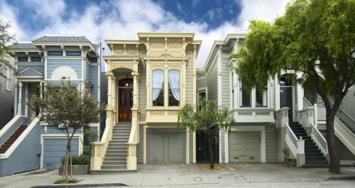
It’s really not the reduction ($155,000 or 9.4%), but rather the fantastic photography and presentation that caught our attention. Not to mention Duke.
∙ Listing: 2825 Pine (4/3) – $1,495,000 [2825pine.com]

San Francisco real estate tips, trends and the local scoop: "Plug In" to SocketSite™


It’s really not the reduction ($155,000 or 9.4%), but rather the fantastic photography and presentation that caught our attention. Not to mention Duke.
∙ Listing: 2825 Pine (4/3) – $1,495,000 [2825pine.com]
Wow, talk about selling a dream. Great job on the photography. The only thing I didn’t like was the melon-colored dining room. Other than that, everything looks tremendous. Maybe I’ll buy a lottery ticket today.
Awww..can I just buy the mobile alarm system alone?
If Wikpedia had an entry for “San Francsico House”, they should use a picture of this place. It is the ultimate feel good SF home. Too bad about the goofy floor plan, though.
This guy always does terrific presentations.
I am suspecting some photoshop trickery here : the photographer may have substituted an idealic cloudy sky from a completly different image (maybe even a different city !) Compare this with the following similar photo from a MLS listing :
http://sfarmls.com/scripts/mgrqispi.dll?APPNAME=Sanfrancisco&PRGNAME=MLSPropertyDetail&ARGUMENTS=-N172242148,-N195954,-N,-A,-N5161266
Do you notice anything odd ? The wires arcing from the houses to the street disappear in the “sky”, maybe because those wires never existed in the foreign imported sky.
That floor plan is bizarre even taking into account the long and narrow nature of the house.
[my last comment seems to have been lost, so here it is again, this time with a shorter link. Sorry if this is a duplicate].
That style of curbside photo looked familiar : homes bathed in smooth flattering light, perspective corrected image, and that blue sky with puffy clouds.
Then I compared the 2825 Pine shot with the lead image for 1331 Noe : http://bjdroubi.com/1331Noe.html
Notice anything odd in that image ? Those power lines magically disappear as they cross the boundary from the house’s facade to the sky. Its as if the actual sky was removed and replaced with a faux blue sky imported from Iowa.
Splicing two images together is pretty easy to do with a digital image and photoshop … Extra easy if the sky was an even sheet of grey fog (which might explain the nice even lighting on house facades).
I would never buy a place that is presented like this.
The slathering on and on about “notice this tiny detail and notice that tiny detail” has the hall mark of someone who thinks their place is worth a billion dollars because it has an interesting front door knob.
I’m sure those things are just lovely, but give me a break. When I see as one of the first photos a close up of a doorknob that you can buy at any used building supply store for $20, I know that a) the things I care about, like a floorplan that works and a nice kitchen, aren’t going to be there, or b)the seller thinks way more highly of the place than it desrves and that seller is going to be unreasonable as to price.
I realize that it might be the photographer or the real estate agent that may be the one who pointed out all this stuff, but if it’s one of these people, then they are covering for a big group of negatives, and if it’s the seller who dragged the photographer around and insisted on mountains being made of all those mohills, that person is going to be unreasonable when it comes time to sell.
So I don’t even GO to a place like this. Anyone who thinks they have done their client a service by bringing up all this crap is drinking their own cool aid.
I won’t even bother with a place like this.
It’s spelled Kool Aid.
The main drawback of this place is the Pine Street traffic and sharing walls with your neighbors.
I don’t think I would highlight the dog if I were trying to sell the place. You have just turned off anyone who is allergic or who sees the dog and imagines fur everywhere and fleas in the carpets.
Anyone pushing $1000/sq ft on Pine Street is already proving that they will be unreasonable. That place is at least 30% over market.
What a beautiful house. It would be great to buy a house that is in mint condition and not the usual SF fixer….
Hun. I like the photographs and the property although it’s not my style: he’s highlighting details that set this property apart from others – earning his keep so to speak, and so what if the sky is doctored, it makes the house pop. The idea is to entice someone to come in and take a look for themselves. Now if he doctored the house…well there’s a solid argument.
You can’t win either way. You put no photos or bad photos and people scream just as loudly.
“…so what if the sky is doctored…” ???
Many buyers are looking for not only an attractive house, but also an attractive neighborhood. Absence or presence of power lines makes a difference to many buyers. What was presented for 1331 Noe is a scene of the neighborhood that doesn’t actually exist : the real neighborhood’s sky is cluttered with wires.
If instead whomever prepared that photo had spliced out a run-down neighboring house and spliced in a nice shiny well kept house then this form of photo deception would be more obvious.
Great how some love this, and others hate it….shows that marketing is truly an art, and you can’t please everyone. For the record, I think a close up of a door knob is a bit much as well. And the dog is loveable, but too cutesy for me. (But better than that damn photo of the real estate agent with his dalmatians..that one makes me want to vomit).
However…back on subject. I hate hate hate the floorplan. It is everything about cut up Victorians flats that I detest. Someone turned the dining room into a bedroom, then turned the second parlor into the dining room. To maximize the number of bedrooms they completely screwed up the floorplan. You aparently even have to walk through one bedroom to get to another (ick!).
Personally, I like my bedrooms upstairs and my public rooms down, and I must be able to get from the front door to the kitchen in a direct shot.
This house has beautiful doorknobs and an adorable dog, but not much else.
Oh…and in all the photos..not a single one of a garden or anything in back. Must be UGLY.
Look at the photo’s metadata. Something definitely fishy. Photo was taken on August 28th at 11:21 pm with a Nikon D70. The image creation software (Photoshop CS2) probably provides the faux-idealism.
My part of the city must have horrible weather, cause the sun sure don’t shine at 11:21 pm.