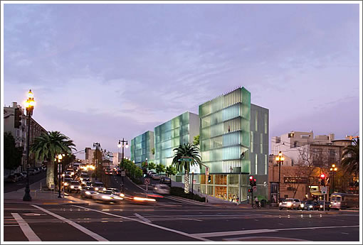
Deigns for the proposed modern building to rise on the undeveloped Central Freeway Parcel V at the corner of Octavia and Market Street, and to be known as 8 Octavia Boulevard, have been on the boards and in the public eye since 2007.
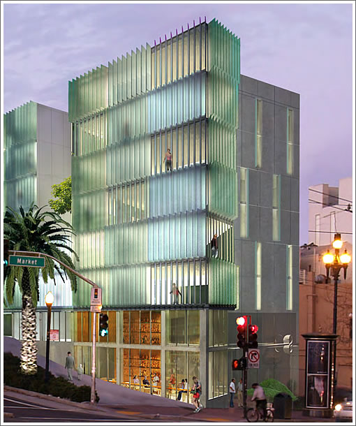
Having been waylaid by the market for a few years, the proposed Stanley Saitowitz | Natoma Architects designed building which rises between five and eight stories and yields 49 condos over 2,085 square feet of ground floor retail and 25 parking spaces is headed before the Planning Commission this week seeking their blessing to be built.
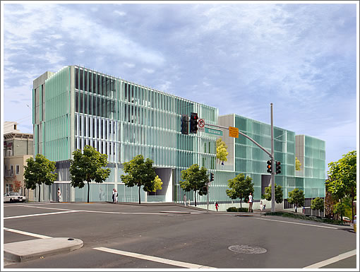
The building maintains a consistent roofline as Octavia slopes from south to north and will be broken into three masses via deep voids along the Octavia Boulevard frontage which will be clad in a glass curtain wall with vertical colored sunshades.
The required seven Below Market Rate (BMR) units will be included on-site. And in terms of overall unit mix, it’s 13 one-bedrooms, 33 two-bedrooms and 3 three-bedrooms to rise with an average unit size of 952 square feet.
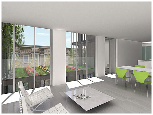
According to a plugged-in source, the developers plan to start building this fall if approved.
∙ RFPs For Housing Along Octavia Boulevard [SocketSite]
∙ Infill Along Octavia Boulevard: And The Winners Are… [SocketSite]

With all the other projects further up, this is gonna be one busy stretch of Market Street. I also hope they put enough signage upstream on the 101 exit, because some cars will be zooming by at 40MPH+. I’ll make sure to stay clear from Octavia when I’m cycling.
Freeway exit traffic light + upcoming hill = vrrrooooomm
That is going to look like one ugly buidling in 10 years. So much for timeless architecture. Looks like a Miami prison.
I really like this design, not only because it is refreshing and cool, but also because it will piss off a lot of conservative san francisco [conservatives].
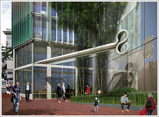
The haybale store looks interesting.
The really need to update the renderings because the growth of the trees along the Octavia blvd has been pretty spectacular.
Most of the building will be obscured by greenery at this point.
Is anyone who lives at 1234 Howard a louver lover? It’s the Saitowitz building that also features a louvered window design. It looks cool, but is it livable?
I think it looks great.
It is interesting that the oldest blds in this area are some of the oldest
Reminds me of the Federal Building and how this too will be auto soot gray in a couple of months.
After the fever breaks, perhaps in as little as ten years, people are going to look back at the Saitowitz oeuvre and ask each other: “People actually liked these buildings? People not in prison lived and worked in them?”
Drop dead gorgeous and truly inspired.
the growth of the trees along the Octavia blvd has been pretty spectacular
They need to cut down every other tree. They’re strangling each other.
Living at this location is going to make Franklin/Gough and the Pinebush freeway feel like cul de sacs in the suburbs.
I hope the building has A/C because opening windows will be loud due to the traffic on Octavia.
Additionally, I see the glass panels as a maintenance headache for cleaning.
Of course, even this building is better than what is currently occupying the lot.
Does someone have a lucrative glass concession in this city that provides an incentive to build every new structure in the city with glass? Its getting old.
I kind of agree…lets ease up on the floor to ceiling glass a little. Hopefully there is better consideration for the street level design than what Im seeing here… looks sort of dead in the middle.
Within a nanosecond…how did I know it was a Stanley? Kind of boring now actually.
Nice, but who wants to live at one of the busiest intersections in SF.
Roger-
Manhattan is a very busy place and has the highest real estate prices in the country.
To answer your question- plenty of people.
What a lot of belly-aching! This looks great and will be a huge positive for the intersection. It’s a lot better welcome to SF than a weed-strewn lot.
these just look like office buildings to me – not sure they fit in here
Omg, how the heck are they going to squeeze three bedrooms into “an average unit size of 952 square feet”?
^Um, the units with 3 bedrooms will be larger than that and some other units will be smaller than that? Perhaps you should read up on what “average” means.
952sf is roughly 86m2 which is standard size for a decent 3 bedroom apartment in Paris. Bedrooms cannot be much bigger than 170sf of course but that allows you somewhat decent 13X13 bedrooms.
Of course we are all used with 1000sf 1BR victorian apartments with double-parlors, dining room, laundry rooms, walk-in closets and such. But if are not too claustrophobic and very minimalistic, 952sf should be enough. The kids will need to take up karate to vent off their extra energy.
Anon, who pissed in your coffee/cereal/whatever today? A simple explanation/reminder is adequate. No need to be a rude, condescending, smart-ass SOB.
Anon, who pissed in your coffee/cereal/whatever today?
I’m not sure who it was, but I’m hot on the trail of the mystery pisser. Updates to come later in the afternoon.
The kids will need to take up karate to vent off their extra energy.
Or bungee window-washing…
To my eye, it’s extraordinarily ugly, but we can agree that it’s “a lot better welcome to SF than a weed-strewn lot.” That’s a pretty low bar. I agree that this project clears it.
Saitowitz really doesn’t care what others think, I’d wager. He’s an egoist and his goal is to get a maximum amount of these cold, severe looking neo-Brutalist hulks built and then rely on the passage of time to force everyone to get used to them. Cue the classic chestnut about how Parisans didn’t like the Eiffel Tower when it was first constructed…
That layout does raise window washing to the level of an Olympic sport.
The height at the Market/Octavia corner will require a platform or Bosuns Chair system supported from the roof with davits. Cal-OSHA limits ground rigged systems to 40 feet or so, and they have shown 7 or 8 floors at that point.
Those vertical sun screen vanes will need to be engineered to withstand getting whacked by one of those platforms.
A rendering at twilight with all the lights on? Really? This is only one rainbow short of a Thomas Kinkade. I mean I like the building, even if it is a little boring, but I wish architects would not do gimicky, cliched renderings like these. To see what a building is really going to look like you have to show more of the surroundings too.
Yes that is a classic rendering cliche: the new building illuminated like a beacon against the purple skies of dusk. It really makes the proposed building stand out looking like an improvement in the drab surroundings. And the sea foam green/lavender color choices work well together.
If this ever gets built I’ll be tempted to shoot a photo under the same conditions to see how close reality matches the rendering. It would look awesome if it did.
————-
redseca2 – good call on the practical problems with this exterior. I wonder if the developer realizes this problem. I guess the solution is to design the window washer platform with generous padding where it bumps up against the vanes.
With all the valid negative considerations raised on the ability to clean the windows and glass panels, I hope the Planning Commission also reviews the issue.
The busy traffic corridor of Octavia and Market streets definitely will cause grim on the building. The artist’s conception is not based on reality.
Heck, even an idiot with a BB gun could cause thousand of dollars in damage.
I’m surprised the project sponsor is pushing a Saitowitz design for this location.
Another Saitowitz eyesore. Thanks for bestowing our fair city with your schlock Stanley.
Milkshake,
I have lived in the mid to western part of SF, not too far from this site, for more than 30 years. I know too well the layering of damp salty fogs and dust and pollution that build up on every exterior surface. I hate it when the you realize that your building is literally sticky and the run-off from power washing it might be toxic.
Keeping this design pristine would be a herculean task, like parking a new gloss black Bentley on the street and expecting it to be perfect every morning.
No, this building might actually be more interesting as it ages into its’ own San Francisco reality. Moss and lichen on the vanes. Graffiti where one can reach. Some middle european DG takes the top corner penthouse and plays to the cars coming down from 101 at 3 AM.
lol wrote
952sf is roughly 86m2 which is standard size for a decent 3 bedroom apartment in Paris.
It is actually 88.44 square meters. But that is not a “decent” three bedroom by the standards of American, or French haute bourgeoisie.
A minimally comfortable three bedroom Paris apartment is 125 square meters. 88 is at best two small bedrooms, without a dining room or “cuisine americaine” which means open kitchen. Most Americans who are buying a Paris apartment to live in, not just as a pied a terre, would find 150 square meters “normal.”
Usually Paris apartments do not have closets as we know them, among many other problems. That some people in Paris live in very small spaces does not make the apartments either decent or comfortable.
Moreover, prices in San Francisco are much less than Paris per square meter. Paris is probably in a bubble, and it seems there may be some leakage beginning in recent months.
This is directly from the Market & Octavia plan’s Fundamental Design Principles #8
“Buildings on sloping sites should follow the slope to reinforce and accentuate the city’s natural topography and maintain a strong relationship to the street. One of the qualities most revered in San Francisco is streets and buildings that rise and fall in concert with topography. New buildings or additions should follow the slope of the street to accent and celebrate the natural topography and provide a vertical rhythm to the street. Where buildings fail to step up slopes, they adversely “flatten” the city’s natural topography.”
Why does this not apply here?
Renderings seem to lack a garage entrance.
It’s far from the worst Saitowitz in the city.
It looks nice on the Octavia side, but I’m concerned that it seems to turn its back on Market (when coming up Market from the east).
It’s far from the worst Saitowitz in the city.
that’s a pretty low bar…
That should be 15 stories. Too bad its only zoned for 80 feet.
Saitowitz….its like most of his buildings now. Just like all of Gehry’s projects look exactly like Bilbao Guggenheim. Thats what the clients want.
I’d sooner have Bilbao Guggenheim … especially if the Spider statue goes along with it.
I love it – it’s modern – No faux victoriana shit – it’ll piss of the SF preservationist whacko’s
BUILD IT!!!!
I’m not normally a fan of uber-modern architecture, but I think this would be improved by having smaller windows and green walls? I just am thinking about the small amount of light that pours into the back of my apt even in the winter and makes the back room unbearably hot. Having floor-to-ceiling windows to me just means I’d have to make floor-to-ceiling drapes or just deal with living in a greenhouse.