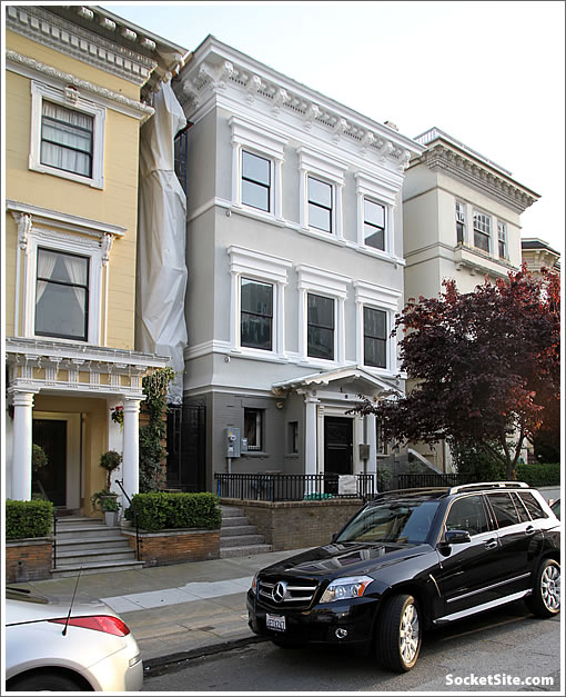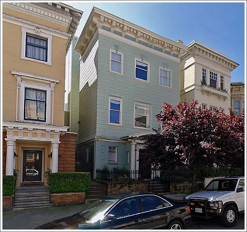
A plugged-in tipster with mad perspective matching skills captures the first glimpse of the newly remodeled façade of 2219 Pacific. As it looked previously:

And as we wrote in December 2008:
In April of 2007 the listing for 2219 Pacific Avenue touted “Beautifully remodeled and maintained Pacific Heights Edwardian…Detached 2 car garage…All bedrooms are generously sized.” It closed escrow two months later with a reported contract price of $4,250,000.
Three days ago a gutted and reframed 2219 Pacific returned to the market touting “Permits issued and complete plans available to finish this spectacular 3 story home in AAA Pac Hts…needs elect, plumbing, flrs, mechanical…will be a 4900 sq ft home…3/4 of foundation is brand new w/ all current seismic upgrades.”
Now asking $3,495,000.
And while the unfinished property failed to sell at $3,495,000, we wouldn’t be surprised to see it return to the market soon seeking (and perhaps securing) significantly more.
∙ From “Beautifully Remodeled” to Gutted And Asking $755K Less In PH [SocketSite]
Enough already with the grey tones!
Not everyone wants to come home to a black-and-white photograph however “artsy” some think it looks like.
A few good details can really transform a building. Love the windows now. They “work” with the building next door.
I like the new facade with one exception : why was the power meter / breaker box moved to the front ? I realize that this place is unfinished, but it is often really hard to move a breaker box since so many branch circuits terminate there.
You know I never really took notice of how these types of changes to a facade can so transform a structure. Good job to the architect or designer..
Buildings without curb cuts just look so much more pleasant. Tired of seeing garages owning the street in this town.
wow, the facade looks so much better now. not sure why the meter was moved though… seems like a rather strange choice.
yea, that meter moving to the front was a major mistake. wonder what the reasons were. The new window bracketing and trim is awesome,very well done, richly detailed and scaled. great job!
really nice. re: the meter, I’m assuming that it used to be in the basement, accessible by key. My understanding is that PG&E hates this, and that in the case of major remodels requests that service be moved so that it can always be read from outside. However, I’m still surprised that there wasn’t a better place to put it.
I personally like how they enlarged the windows of
this buildingthe building to the left.In the “after” shot, They appear to have made the windows both taller and wider from the before shot.
why was the power meter / breaker box moved to the front ?
WAG — the meter reader can now read it from the side steps, instead of having to go inside the fenced in area. Christmas wreath thieves and such, ya know.
At the very least, they should have hidden the meter better.
We had to move our meter for an electrical upgrade a few months ago to comply with newer building codes. It has to be “far enough” from various things like gas, other structures, etc.
They did a good job hiding it in plain sight.
Hey lol, well it’s a good thing you don’t live there then isn’t it? When you buy the place, paint it any color you want. Until then, DIAF. Who made you the style police? Oh that’s right, your ego.
I really like this! Tasteful and well done. Great job with the new window trim and the paint is classic and sophisticated. These Pac Hights East blocks are kind of off my radar, but there are some really lovely homes nearby. Is there parking in the back? I look forward to seeing the interior.
We’ve discussed this ad nauseum, but I also wish there were fewer curb cuts that allowed for more sidewalk plantings…
I’m sure they will put a cover and hide the utility box. This place was just uncovered last week and there is still a lot to do there. New addition on top. There IS a detached garage in the back off bromley (i think). The new floor plan is nice. Looking forward to seeing this one hit the market. I’d say $5.9 will be the target price.
The windows look too big now. Otherwise, not bad, but it looked fine before.
I assume that the big windows are nice if you are indoors, but from the outside, they look odd on this building.
@sleepiguy: yes, I too am always pushing for more sidewalk planting areas. Curbcuts have little to do with more planting. Example: look at the sidewalk right in front of the houses above. No curbcut, still no sidewalk planting. I think a lot of new sidewalk planting still does not happen for these reasons:
1. People are not aware that it’s possible to do it. A minor permit and some initiative gets the ball rolling.
2. People (property owners) have to WANT to put in sidewalk landscaping.
3. Many people accept our insanely wide sidewalks as the norm, and therefore they just accept it that way.
That utility box in the front kills the curb appeal. Otherwise, beautiful structure.
They shoud run electrical conduits up the front of the house from the electrical box, and advertise the house as “solar ready”!
Remember that fad from last year? How long did that last? Two weeks?
Very nice work on this remodel, good job.
PG&E is making this look like a Third World city, what with requirements for exposed electrical meters, gas lines that must go over any foundations (often several feet above ground), which then must be “protected” with a steel pipe guard wrapped in black and yellow hazard tape, vent pipes, etc. etc. Then there is AT&T that insists on above ground utility boxes and will not let them have murals installed on them as many other Telcos do, and their boxes on the facade of apartment houses; and the multiple small phone companies and Comcast who leave coils of extra wire in the air for future use…
@eddy: 5.9? dreamin
@troll?