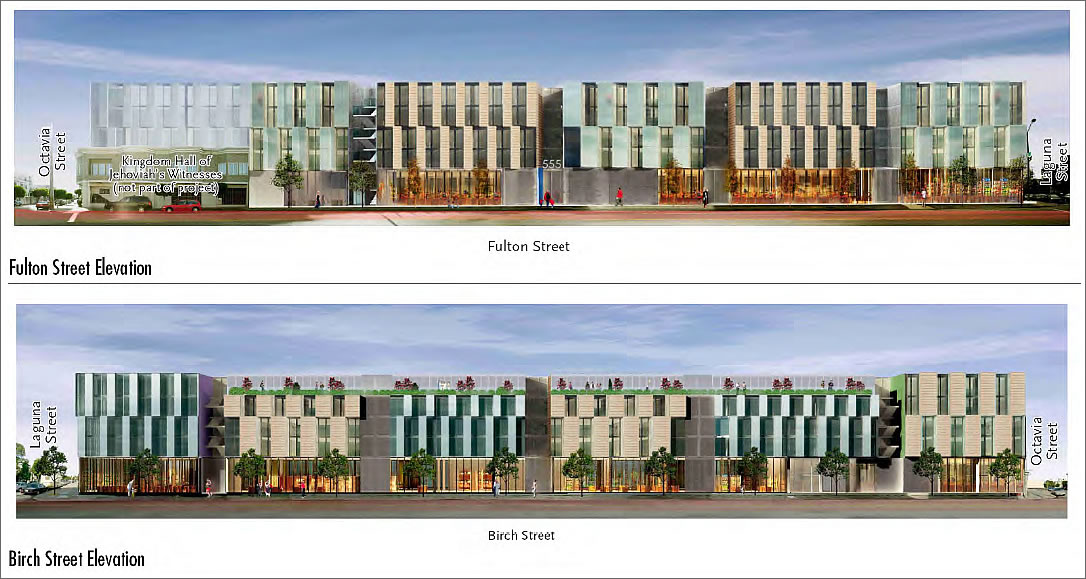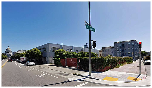
The Stanley Saitowitz design for 555 Fulton (click image to enlarge) has been “refined” a bit since a plugged-in tipster first forwarded the renderings three years ago. New details for the proposed 136-unit mixed-use project in Hayes Valley:
The project site is located on the south side of Fulton Street in the block bound by Octavia, Laguna, and Birch Streets in San Francisco’s Hayes Valley neighborhood.
The proposed project would result in demolition of the subject property’s existing two-story 19,620-square-foot industrial (office and warehouse) building and the removal of an approximately 70-space surface parking area (approximately 5,200 square feet). It would entail the merging of the two lots and the construction of a five-story, about 55-foot-tall, mixed-use building. Constructed in 1957, approximately 29 firms use the existing building for office space in addition to a plumbing company, a cabinet company, and a hot dog stand.

The proposed project would have 136 residential units (32 studios, 48 one-bedroom, 56 two-bedroom), about 32,800 square feet of ground-floor commercial (supermarket) space, and up to 195 spaces of parking in a two-level underground parking garage, which would also include 52 bicycle spaces. Total building area would be approximately 245,610 gross square feet, comprising 139,637 gross square feet of residential space, 32,800 square feet of commercial space, 68,700 square feet for parking, and 4,473 square feet for building services.
Residential access would be from one midblock entrance on Fulton Street and one midblock entrance on Birch Street. Retail access would be from Laguna Street. Ground‐floor parking access would be from Fulton Street. First level parking access (commercial and residential) would be from Octavia Street, and second level residential‐only parking would be from Birch Street.
The Kingdom Hall of Jehovah’s Witnesses at Fulton and Octavia would remain.
∙ We
∙ 555 Fulton Preliminary Mitigated Negative Declaration [sf-planning.org] [Map]
Institutional and uninspiring. SF does it again.
What’s with the oppressively flat elongated roofline? They couldn’t have broken it up?
Great addition to a great neighborhood!
Wonder if we’ll have another ‘only in frisco’ moment. Perhaps the preservation committee will declare the hotdog stand “historic.” they did it with some bookcases out in northbeach…
Saitowitz should be banned from designing buildings in San Francisco. His Yerba Buena Lofts building is like a prison, both inside and out – each unit is like a cellblock. Or maybe he should be hired by the Department of Prisons . . .
Some people like elaborate carvings and ormolu. Others don’t. But Saitowitz designs are certainly distinctive, and have interesting volumes.
Fab building; can’t wait. Makes my day.
Wish list
1) Taller and more units (one additional floor; better dense transition from HV to the 2-story projects lining Fulton and blocks north.
2) Offer 3-bedroom units. The insistence on tiny spaces keeps SF transitional and makes it unwelcoming for families. Families need realistic living options in all neighborhoods incl burgeoning HV. Strengthens the city.
Doesn’t the proposed height makes it amongst the tallest in Hayes Valley? The 2-story buildings on the north side of Fulton would certainly make more height inappropriate. Anyway, height was probably debated and deciced when the Market Octavia Better Neighborhood Plan was devised.
as soon as i saw saito’s name i knew people were going to be birthing kittens. it could certainly be articulated more, but 1) that’s not his style; and 2) it looks like there might be a long, park-like roof deck/garden.
It’s hardly a nice looking design, but way better than the deplorably ugly housing that’s across the street on Fulton. I think this would be a great contribution to the neighborhood although not the greatest part of Hayes Valley.
Not a Saitowitz fan but this is way better than most. I think it will work well, urbanistically. And yay for a grocery store of some sort at that location…would really add to the livability of Hayes Valley (and it would liven up Saitowitz…I agree with the comment about YBL, but even that building would be better with active groundfloor uses).
sigh
I suppose the facade variation is in response to complaints that the original design was too monotonous, extending as it did with the same materials from one end to the other, but at least the old design was attractive. This, like so much in the ‘hood, looks cutting edge… 1960 cutting edge. But, hey, it’s not my building, so my opinion shouldn’t matter. I wish more people thought that way…
Pity they couldn’t buy the Jehovah’s Witnesses building and make a full block of it.
Now that’s a novel thought: ..”it’s not my building, so my opinion shouldn’t matter..”
I don’t get that. All of our opinions matter. Doesn’t mean we’re all going to get to design it.
Saitowitz is sloppy with materials. Check out the rusting and grimey building he put up at 1234 Howard (btwn 8th / 9th). This particular proposal is out of scale and would make a lop-sided view down Fulton to the City Hall dome.
Out of scale? because the 60’s dreck across the street is ridiculously short? (and out of scale with the much taller Victorians the preceded it in the Western Addition).
Sorry JW, I REALLY don’t agree.
“Constructed in 1957, approximately 29 firms use the existing building for office space in addition to a plumbing company, a cabinet company, and a hot dog stand”.
Must be a lot of tiny, tiny offices. Just dividing 19,620 by 29 gets you a 676 Square Foot average before you factor in circulation, restrooms, lobby and a “plumbing company, a cabinet company, and a hot dog stand”.
i’m guessing that can be explained with a minimum of 3 DBAs per tenant.
I don’t get that. All of our opinions matter.
Opinions matter too much in this city. While I’m all in favor of preservation, it’s absurd to involve the public in decisions about color, material, etc. for a modern building set to replace a set of concrete walls across the street from some faceless housing projects which, if we’re lucky, will deteriorate so much in the next 20 years that they’ll have to be torn down.
Safety, zoning use, height, bulk, etc., sure, but style? Color? Better some bad and some great than a whole bunch of bland.
And someone said these buildings are too tall. Five stories is too tall three blocks from City Hall? There are plenty of buildings taller than that from Fox Plaza at one end of Hayes Valley to the apartment buildings on Alamo Square at the other end.
“institutional?”
Come on now, considering the less than favorable ghettotastic location of this development, we should consider ourselves lucky to be getting a building at this design level here. Also considering the reduced ROI the developer is going to get with said location and also our “flat” economy, I say please build it!
Everytime i enter YBL
i think I am a
Prisoner on Cell Block H.
Kathleen…that’s a haiku failure, but completely accurate
concrete prison cell
howling summer desert winds
self imposed exile