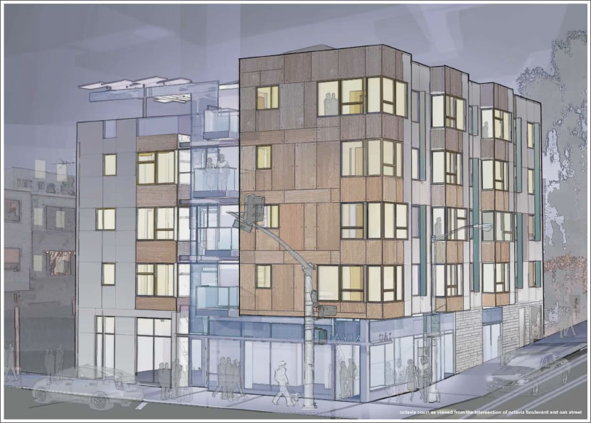
A plugged-in tipster delivers the original IE Collaborative design for Octavia Court.
Our apologies in arrears to IE Collaborative for misidentifying the final architects on the project, and our apologies in advance as we’ve been told the design above has been tweaked and new renderings are in the works (and hopefully soon to be on the way).

While this design is less interesting, it does look less like a mid-century modern house.
I could live with either, though. I am not someone who demands everything built in the city conform to my personal taste.
This looks like every other new condo in SF, how boring. The other design is way more interesting.
Mission Bay boring architecture, now available in Hayes Valley!
What a relief– for a day there I thought that something without bay windows was going to be allowed in SF. Thank God conformity rules.
fugly
it needs more bay windows.
What a dark and depressing rendering. Very good job at signaling that this is affordable housing for the hopeless, and nothing to get too excited about.
No sun, no sky, only translucent hints of people walking by. Even the building itself is not very excited to be there — it seems to be uncertain. This reminds me of a 1970s watercolor slowly worked out by a tired spinster.
Did they really pass on the name “Oaktavia?” C’mon guys, it’s sitting right there in front of you!
P.S. To SocketSite: your commenting engine sucks like 533 Laidley, and has for quite a while now.