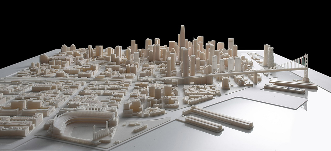
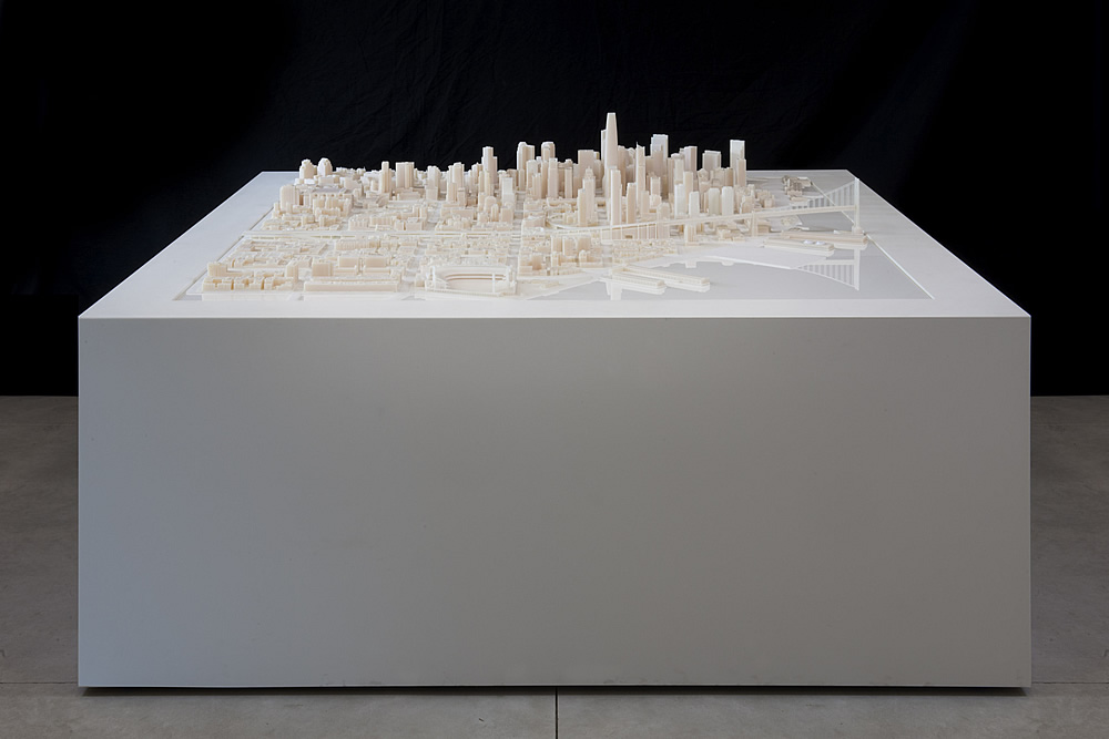
 A 3D scale-model which encompasses over 115 blocks of San Francisco’s Financial and South of Market districts has been printed by Autodesk and Steelblue for real-estate developer Tishman Speyer.
Based on a digital model by Steelblue which includes architectural drawings for numerous projects approved to rise and dramatically alter the skyline of San Francisco over the next couple of years, the model was fabricated at Autodesk’s Pier 9 workshop and took about two months to print.
Individual blocks can be switched-out as projects are approved or planned, and a high-resolution projection system can overlay images and planning data, such as traffic patterns, on the model as well.
The model will remain with Tishman Speyer for their use in planning, marketing and development, but a second print of the model is expected to be displayed at the Autodesk Gallery which is open to the public.

In the top photo, what are the two tall fuzzy looking tubes sticking up on the Embarcadero past the bridge before the Ferry Building? Seems like they disappear in the second photo. Art Agnos must have swiped them.
Are the “fuzzy” buildings representing the Treasure Island project?
yeah, what the hell are those 2 buildings in the bay, off by pier 14?
Steelblue has a short video of making the model.
http://vimeo.com/96664486
I noticed the two highrises on piers on the waterfront as well. No chance in hell of that every happening.
I think those are extra pieces just sitting off to the side in the Bay waters.
Just imagine if one guy had left his can of coke instead. This would make national news.
I heard the usual busybody Nimbys are busy preparing their picket signs “Stop the building of one-percenter Fuzzy Buildings on the Waterfront!”
I can’t think of a single fuzzy building in the entire City – why are they so hated here?
Otherwise, a great effort. Amazing results.
This is goofy. Steelblue’s animations are great, but there’s nothing dramatic about watching a bunch of grad students shave candle wax down from computer squirt blocks. I’m underwhelmed.
Chess game. Or is it checkers?
All that effort and they left out the topography – notice Rincon Hill is flat. What a waste.
LOL you’re right, I knew something was wrong with it when I looked at it yesterday – the Bay Bridge approach dominates this model way more than it does in reality, and the absence of topography is the reason why.
That’s really a riot.
what a huge marketing effort to get those 2 shaking shapes approved
They left out several buildings that would make the skyline appear even bigger: the two towers at 1st st. and Mission, the tower at 2nd and Howard., 399 Fremont (I think), the two proposals on Folsom between 1st and Fremont.
That fuzzy thing is Peter Weingarten from Gensler’s hungry hungry belly. He’s been wine-ing and dinning the Tishman crew trying and trying to get hired as something more than an AOR. They are working on 589 Brannan but lets see if Tishman actually has some good design taste. Too be seen.