
Five teams of designers and developers have officially “shown their interest” in tackling the design and construction of San Francisco’s new Transbay Terminal and tower. Confirming what we first reported back in November, Rogers, Foster, and Calatrava have all entered the contest (although Gehry has not).
The five teams of designers and developers:
1. Richard Rogers Partnership with Forest City Enterprises and MacFarlane Partners
2. Norman Foster + Partners with Related Cos. and TMG Partners
3. Santiago Calatrava with Boston Properties
4. Pelli Clarke Pelli Architects with Hines
5. Skidmore Owings & Merrill with Rockefeller Group Development Corp.
At the end of January, a seven-member jury will interview the five teams and then recommend a list of finalists to the Transbay board on February 15. The finalists will present drawings (remember, it’s [email protected]) and proposals in July; the winning team will be named on August 23.
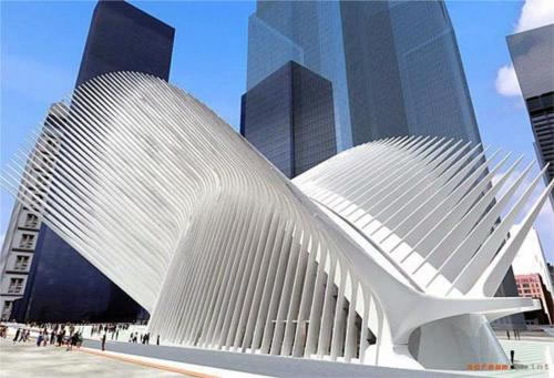
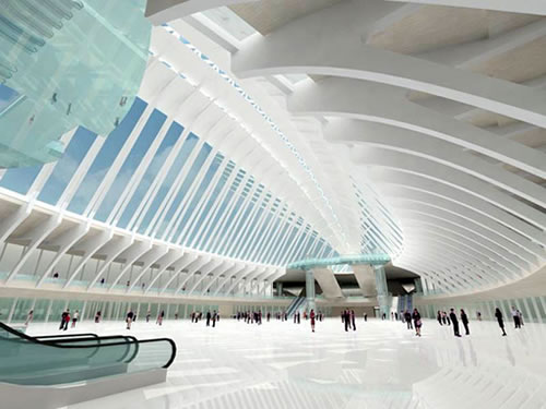
UPDATE: Images are renderings for Santiago Calatrava’s PATH Transportation Hub and Terminal that’s being constructed in New York City.
∙ San Francisco Transbay Terminal: Design Competition Update [SocketSite]
∙ We’re Thinking Gehry (No, Not Geary) [SocketSite]
∙ Transbay terminal race is on [SFGate]
∙ Five teams bid to design and build S.F. transit complex [SF Business Times]
I wish Santiago Calatrava designed the east span of the Bay Bridge. I have yet to see any kind of skyscraper from him that’s at all aesthetically pleasing though. I hope I’m wrong; he’s one of my favorites.
“I have yet to see any kind of skyscraper from him that’s at all aesthetically pleasing though.”
Good thing that their are 5 competitors. This will keep him on his toes and if his design falls short, he won’t win the design rights.
“I have yet to see any kind of skyscraper from him that’s at all aesthetically pleasing though.”
See his his remarkable stunning downtown NY condo!
It’s a vertical Saitowitz.
Yum!
http://www.gizmag.com/go/3766/12
I love Norman Foster’s Swiss Re HQs:
http://www.greatbuildings.com/buildings/30_St_Mary_Axe.html
and I WILL move back to Vancouver for this!:
http://www.jamesonfoster.com/
Does anyone know if and when they will release the 5 firm renderings of the proposed plans to the public?
Does anyone know who is on the jury?
Am I the only one who thinks the porcupine building above is hideous and wastes space that could otherwise be productively employed?
And what’s with the spikes? Defense against pterydactyl attacks?
“Am I the only one who thinks the porcupine building above is hideous and wastes space that could otherwise be productively employed?”
No kidding. It’s like a great big set of kabobs. You almost feel like sticking some big slabs of meat up there for the pigeons to eat off.
What is the concept behind that design, to discourage sky divers from jumping anywhere near its airspace?
“Am I the only one who thinks the porcupine building above is hideous and wastes space that could otherwise be productively employed?”
I think it a stunning structure, elegantly poised for take off, & a perfect & welcoming structure from which to travel in & out of Gotham City…. Last nite I was on the 45th floor of the black building (hotel) right behind it (in background) & this transit center needs to be seen in context, a light structure among heavy, grand, enormous financial center and downtown buidings.
It levitates and lifts – just what is needed in that unimaginably dense location.
etslee – I want to move to Vancouver for THAT. Gorgeous.
Oh, that design reminds me! I need to pick up a hair clip for my girlfriend on my way home!
http://store.grandwig.com/hair-clip.html
That thing looks like a decaying fish.
It still hurts my eyes to look at the pictures. How are they going to clean the structure? I bet it’ll make noises in the wind. Looking at the scale, we would have to walk a quarter of a mile within the structure just to be on a platform to take a bus.
I believe that smell is more important than architecture for public transportation infrastructure. Every large train or bus hub in that I’ve visited in the US smells pissy, especially those in SF.
I’d love something by Calatrava in SF. SF is culturally progressive, but not it’s new architecture. SF is not up to par with many other cities around the country or world. Our victorians are lovely and define this great city…let’s not water-down new, large-scale developments. Redding CA even has a great pedestrian bridge he designed. Go to Calatrava’s website to understand that this is not a hair clip or a rotting fish. He think’s outside “the box”; we should too in architecture.
Guys and girls with so many concerns, as in “how are they going to clean that porcupine structure, or how deafening the noise will be during the wind” go and get a breath of fresh air, man. Try to make a diference between sinthetic creativity of this kind of design and your low profile analytic memory of your pseudo and narrow pretentious aestethic culture. It always make my gut sick to hear the senseless moan of the minor disturbed brains about a refined design object, maybe the result of the work of about 15-20 brilliant architects and engineers for a couple of months. You seem quick to find something vulgar like a decaying fish or a hair pin(oh how so incredibly hilarious, or should I have said Oh my god?), while the reality is none of you pathetic turd-heads would be able to even dream of a structure that is anything more then four walls and a pitched roof. I am sure that suits you just right, and it gives you the “cozyness” that a cluttered mind like yours lingers for. Or maybe you are some of those misunderstood minimalist brainwashed pretenders, hiding your boring and weak personality behind the “advanced” theory of nothingness.