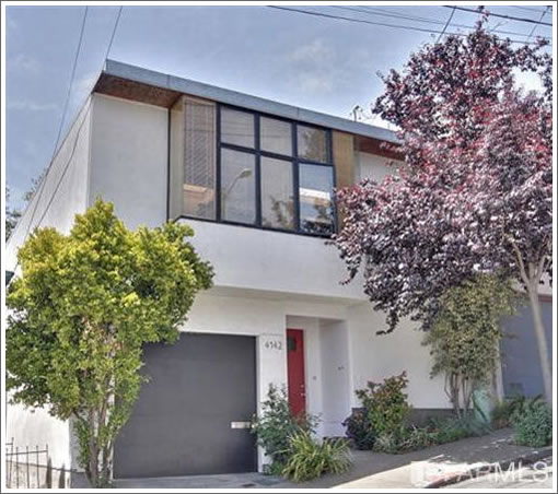
Built in 1996 and designed by Tobin Kendrick with a bit of throwback modern flair, 4142 Folsom last changed hands in August 2008 for $860,000 having been listed for $799,000.
The kitchen has since been remodeled with new counters and appliances. And the Bernal Heights home is now back on the market and listed for $799,000 once again.
As the kitchen looked in 2008:
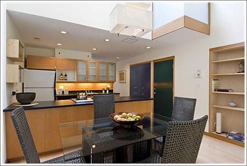
That is a very expensive box!
Wow. Same awful HDR as the place on DeHaro.
And I think the new counters actually lower the value of the place.
I honestly just don’t understand people who bought homes in mid-2008 (after the r/e market had already started tanking)and then try to sell 3 years later. Did they really think they could flip this place? Or was there some other personal reason (job, family…etc.)?
hard to understand why they didn’t have floor to ceiling windows in the back of the house looing at that gorgeous tree…
instead they decided to put a big blank white wall that closes off the entire space?
this house is ok, but also quite odd. seems like a few small changes could make it much better… and one large change (knocking out that wall and adding floor to ceiling windows) would make an enormous impact.
Looking on Redfin, it appears that someone bought the land in ’94 for $65K (a drop from the previous sale) and then built the house and lived in it until the 2008 sale. Is that correct? Seems like they got good use out of it.
Seems like a nice design for a relatively modest house. I don’t understand the window/tree comment, but I’ve not been to the place (perhaps the previous poster has).
It does seem that the current owner has somewhat different taste, but would also assume that the counters can be replaced if the new owner desires.
ex SF-er – Homes like this that seem to eschew obvious good chances for window placement make me wonder the reason is to create more wall space to hang large canvasses.
And yeah enough with the excessive HDR. It reminds me of what might happen when a cook suddenly discovers garlic.
Bernie Hill: I see a lot of comments (rightfully) asking why people sell so quickly. As someone who bought in November 2009, and whose job was unexpectedly relocated to the other side of the country, I can now understand why that might happen. When I bought, I had no intention of moving, but sometimes life gets in the way. Perhaps some of the people who bought in 2008/09 are just idiots, but I’d hazard a guess that many more are those who unexpectedly found themselves needing to move.
The whole rationale of moving to a city for a job then buying a place makes a bit less sense in this new, faster moving economy. When prices were going up 5-15% a year, buying a place was a safe bet. But with uncertain outcomes, you either need to revisit the idea of buying, or simply find an employer that will include a clause that will compensate you for any reasonable loss if they’re asking you to move.
After all, employers love people who get into a mortgage, because it often means more stability in your relationship with them. It’s only fair they’d help you if they want you to go places.
I agree about that big blank wall at the back needing to go. It was probably put in for shear (seismic issues). For another $30K they could have installed a steel moment frame up there and opened it corner to corner. Or used Simpson engineered shear walls at both corners and opened the middle. Or at least installed some transom windows across the top to bring in some light and a sense of the tree out back.
I hear the train a comin’
It’s rollin’ ’round the bend,
And I ain’t seen the sunshine,
Since, I don’t know when,
I’m stuck in Folsom Prison,
And time keeps draggin’ on…
Just up the street at 4013 Folsom, it looks like a jail break is in progress with an auction set for June 16. Originally bought for $320k with 100% financing in 2000, the home was refinanced by WaMu in 2004, 5 & 6. RealtyTrac is showing $517k owed.
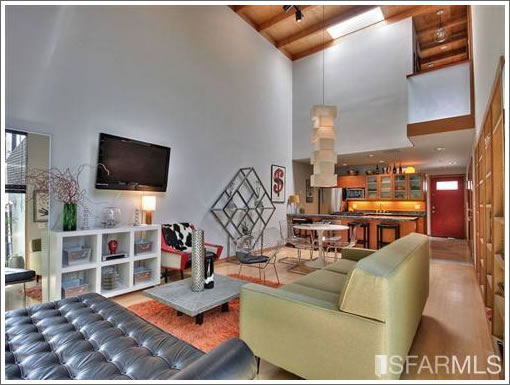
I really like this. It’s understated and thoughtfully designed. The bay window in front is beautifully detailed.
However, what I like best about this house, is the back window looking onto the garden. By not having glass to the ceiling it draws you toward the garden, so you want look out and then up. The wall above also provides privacy from the taller buildings opposite the garden. What really makes it work though, is the high window to the left, that is set flush to the wall and allows the light to slide across. That prevents glare and contributes to an interesting and changing mood of the interior light.
Is that a shill comment? The commenter “in” appears to be trying too hard to provide clever design criticism. For one thing, the house feels loud and crowded to me, not understated, but that could just be the furnishings in the main living room.
How is the bay window in front beautifully detailed? Please explain. There are plenty of houses with detailed bay windows in SF, but this is not one of them.
The high window on the left actually makes the room look more awkward, since it makes the mismatch even more striking, and the wall does not make me want to look out then up either (although the high window on the left does).
What’s that blue rectangle on the blank wall that we’re discussing? Is it a tinted window or a print of some branches? Either way it’s kind of bizarre.
I think that blank wall was a design mistake.
RE the comments about the upper level blank wall at this house’s rear being a mistake: it reflects a general lack of understanding regarding the power of the interplay between strong architectural space-making and site (as found in much Japanese architecture, the Eames House in LA, houses by Richard Neutra, and many other examples) versus all-too-familiar, expected and formulaic moves like “just bring the glass up to the ceiling”.
The post by “in” has it exactly right – the double-height living space being contained above offers privacy on an urban infill lot and makes the view to the yard below more special and charged, while the vertical glass strip around the corner reduces glare and further defines the simple space as a kind of subtly ‘deconstructed’ box (i.e. a more dynamic relationship between solid and void than just a tall window wall at one end). It would be different if this was on a site with expansive vertically-oriented views to the rear, but it is not.
If anything is perhaps a mistake here, it was putting the effort of building such a decent piece of architecture (not counting some of the interior finishes) so close to Crescent Ave – though if the lot price was really only $65K, that must’ve been a huge draw. In the long run maybe this house will have a positive effect on that somewhat sketchy area?
And I totally agree with the HDR photography overload comments.
Why not build something nice in a “sketchy” part of town? Does it cost that much more to build something more personal and interesting? What’s the premium that the owner likely paid in order to build such a place (dollars and/or percent)?
By the way, just noticed that Google street views doesn’t cover most of Bernal.
Try http://www.mapjack.com/. Bernal is fully covered.
I agree with the posters that think the windows as designed are better than an entire window wall. Not only is the view framed to include only the backyard and privacy is enhanced, but it appears the rear of the house faces west. An all glass wall on a western exposure results in either an oven-like atmosphere, or extensive window coverings being required, which negates the whole window wall concept. Even in SF climate.
Note to self, we’re on a real estate blog, not an architecture or design blog. Average person doesn’t appreciate subtle design.
And, do keep in mind that this is a modest house, likely done on a smaller budget.
Haven’t seen in person, but looks nice for what it is. Agree that location isn’t desirable. Pity that in SF it still lists for 800K. 🙁 But, even at that price it compares well.
sfrenegade,
Not a shill comment. I have never even heard of the architect.
I’m with you on the house feeling a little crowded, but that’s due to how it’s furnished (as you mentioned) not the structure itself.
The bay window: It’s beautifully detailed in a modern “less is more” aesthetic. What I mean by this, is there is an economy of line, good proportion and clean simple details. The butt-jointed glass at the corners is especially nice.
Other commenters have continued my points on the window wall, so I won’t revisit that item.
“in” mycountry
Why is it RE people assume that ignorance of design is a prerequisite to commenting on this blog. “inmycountry”, “OneEyedMan”, “citycritter” and “in@june7” obviously understand spatial and light principles, and what make this space special. The others…I am sure have their talents, but they have nothing to do with architecture.
the facade is ugly, the pop out front window– looks like an underbite on a pug.
Where’s that Noe Architect to comment?
This is an excellent example of modern architecture at its best, and anyone who doesn’t agree with me doesn’t know anything about architecture. I’ve been designing houses for many years and I’m an architect so I’m right.
Back on the market.
Given the back and forth happening about Valley rignt now, reading the June 9 “pretendnoearch” comment above just made me spit up my morning coffee. Lol.