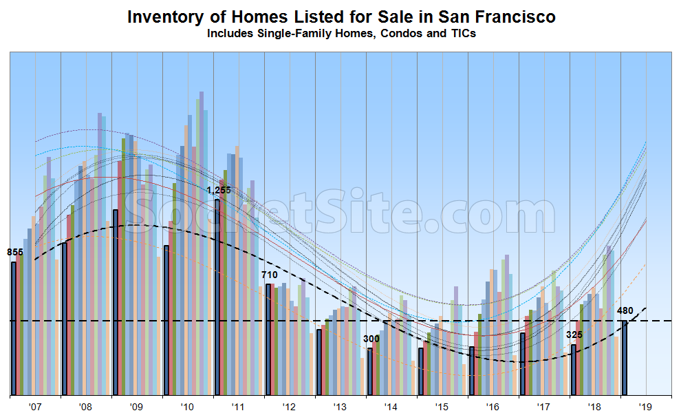
Having ended 2018 with around 36 percent more homes on the market in San Francisco than there were at the end of 2017, which is right in line with the ongoing trend that we’ve been tracking over the past couple of years, the number of homes listed for sale in San Francisco has ticked up 28 percent in the new year to 480, which is 47 percent higher than at the same time last year.
At the same time, the number of homes on the market listed for under a million dollars is now running around 70 percent higher on a year-over-year basis and six percentage points higher with respect to the share of all active listings (40 percent versus 34 percent at the start of 2018).
Despite the seasonal culling of unsold listings at the end of 2018, most of which are destined to return to the market as “new” over the next quarter or two, perhaps with “adjusted” pricing, the percentage of listings in San Francisco which have undergone at least one price reduction is now running around 20 percent, up 6 percentage points versus the same time last year.
And the number of homes in contract to be sold is currently down over 20 percent on a year-over-year basis while the average list price per square foot of the homes in contract has dropped to $866, down 9 percent versus mid-January in 2018.

These charts would be more meaningful if you followed standard labeling and formatting practices (i.e. label the y-axis, provide a color key for the columns, provide a color key for the various moving averages, etc.). Cheers.
Per previous explanations by the editor:
The y-axis is in the title.
The 12 bars per year correspond to the months Jan-Dec.
The smooth curves are color-coded to match the months they refer to. Really each of the smoothed lines should be offset to match the month it refers to, but it’s a reasonable way to downplay seasonality and and show the YoY changes.
What nobody has explained is what choice of smoothing function generates the wild extrapolation on the right hand side of the chart. It almost looks like they are trying to fit the data to a 12 year cycle based on a single 12 year window? I’m guessing the editor knows it’s broken but doesn’t have time to fix it.
I believe the diagram indicates that there should be around 700 units on the market in February, over 1000 in March and then between 1300 and 1400 in the summer (a little hard to tell the colors apart). We will see if the smoothing function curve is any good at predicting the market for the near future.
So it looks like we are projected to be somewhere between 2012 and 2013 inventory levels, but with a much stronger economy and a still booming tech sector. I can’t say that will have much of an impact on pricing.
Think 2005 and 2006, not 2012 and 2013.