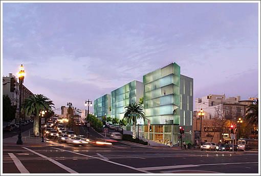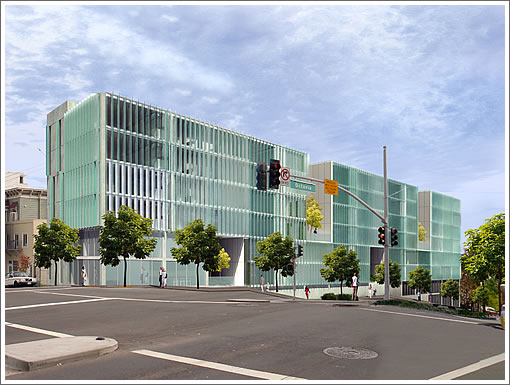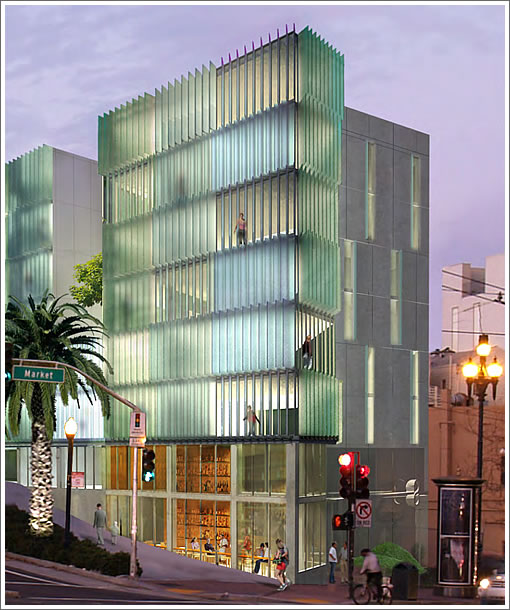
Having been conditionally approved by Planning in August with permits to build the modern 49-unit Stanley Saitowitz | Natoma Architects designed building at 8 Octavia filed that month, the project was on hold for minor design revisions for four months.

Out of hold with the paperwork being rechecked, the building permit for 8 Octavia should soon be issued with shoring and preparation of the site for construction to soon commence, the permits for which were filed last month.
Once again, the development will yield 13 one-bedrooms, 33 two-bedrooms and 3 three-bedrooms with an average unit size of 952 square feet over 25 parking spaces and ground floor retail on the corner of Market and Octavia:

∙ The 8 Octavia Scoop: Rendered And Ready To Rise If Approved [SocketSite]
Good news. I was worrying about what was happening after the Cannon banners that had gone up on the fence were taken down recently.
Anyone have any idea what’s going on with the rest of the narrow parcels along the east side of Octavia Boulevard? There were some very interesting proposals from the design competition a few years back. It’s a shame that even in this market there doesn’t seem to be any movement on them. Octavia Boulevard won’t really begin to show its potential until more of those parcels are developed.
I’m really interested to see whether this project matches its rendering, especially that dusk image.
Holy crap getting into SF is going to be a nightmare because of construction for the next year or two!
Bay Bridge, GG Bridge/Doyle Dr., and now Octavia Blvd/ Central Freeway. No freeway will be saved !
No, it won’t “match” the rendering. A rendering is a rendering.
A building is a building. Big difference. Light changes. Every single day. Day in and day out.
And so, what if it doesn’t match the rendering? Then what? We have it torn down?
I didn’t mean a precise match. How about this: “I’m really interested to see how close this project matches its rendering, especially that dusk image.”
Yes, lighting changes though it is pretty common to experience the skies depicted.
Glad to see this project moving forward.
I’d happily live in one of these units, no question.
^ hope you have a good set of ear-plugs
Finally! I like this building, but I’ve always thought it’s too short for the location.
@midcentfan. Be careful what you wish for. A Saitowitz interior can be difficult – or even impossible – to live in. They can be very cold and severe. Look at the interior shots of 1234 Howard. I like clean, modern design, but, in that case, it goes too far.
I think this looks cool, but honeslty, how would you keep all those glass panes clean? With this much heavy traffic, the amount of soot everywhere is pretty nuts. It’s hard enough to keep a single large flat surface clean, much less lots of small ones.
Anyway, looks great. Hope it matches the rendering.
I wonder how it will look from market street.
@rubber_chicken I was thinking the same thing… right now, the Market side looks weak. Seems a strange choice to face the retail towards Octavia vs Market.
As of a couple days ago, excavation of the site has begun.
Seems out of scale, but all the new buildings do as far as a sense of S.F. surrounded by lovely peaks and ridges; down to earth, what an intersection for traffic this will be! What about visibility for cars & pedestrians negotiating the intersections? And I have to type Giants?!
UPDATE: 8 Octavia Topped Out, On Track For Summer Completion.