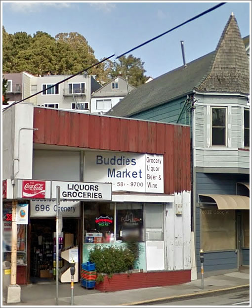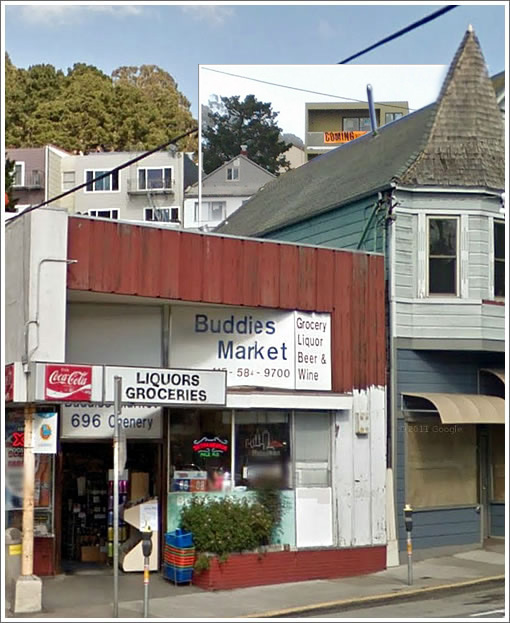
A tipster delivers another perspective on the newly “remodeled” 15 Surrey. Above, the view from down on Chenery in Glen Park Village before; below, the composite view after:

According to our tipster, “this is also a more accurate representation of the color” of the remodeled building compared to its listing photos.
UPDATE: A plugged-in reader with mad Photoshop skills has attempted to adjust for the differences in angles and focal lengths in the the before and after photos we had to work with, since updated above.
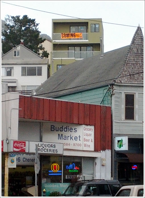
The untouched “after” photo for additional color on 15 Surrey’s new rear facade:

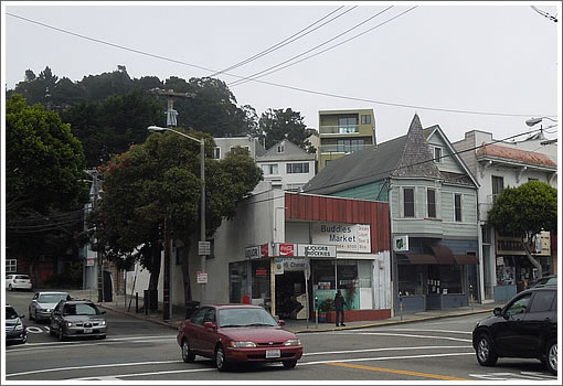
UPDATE: From another plugged-in reader who, for the record, likes the house: “As its slow work day for me, and I needed a burrito, I went and took these pictures.”

∙ A “Remodeled” 15 Surrey Street Returns Five Times As Large [SocketSite]
Yep, it’s pretty ugly. But those aren’t the same view.. You can’t even see 15 in the first picture.
Agreed. While the house is not the best – these pictures are really misleading.
Something on the hill is higher up? *gasp*
Definitely not a fair comparison, not the same camera position or focal length. I did a quick composite in Photoshop, will send it to the editor.
If there is any neighborhood in The City that could use higher density, Glen Park has to be at the top of the list. It is very well served by transit, having a BART station, light rail, multiple bus lines and a freeway onramp.
I am glad that this got built and look forward to more like it. Infill is our best hope, since the NIMBYs routinely block, delay or downsize any more serious efforts at densification.
I think Buddies Market should re-paint the front of the store.
I agree with [NoeValleyJim’s] sentiment and have zero problem with this particular house being built. But in terms of “density,” I doubt it moves the needle. This will just be a richer family taking up three times as much space as a poorer family previously took. It’s not like it’s a multi-unit building.
I think I’d be happy if Buddy’s just finished the painting job they started. Love how the red top just sort of peters out on the right side.
picture 1 was probably taken from the the Google Street view here:
http://goo.gl/maps/qwCRW
picture [3] seems to come from further away down Diamond Street.
But anyone can see these are different angles based on the house to the left that shows bigger as well. I do not see any attempt at deceit.
As anon1 said in the previous thread, it’s only a matter of time before the rest of the street gets transformed as well. If this sells close to asking, the incentive to copycat this redo will be huge.
I approve.
UPDATE: Kudos to Dan Clark and his mad Photoshop skills, a composite “after” which attempts to adjust for the differences in angles and focal lengths in the before and after photos we had to work with has since been added above. Cheers.
Who cares? If you’re life is personally ruined by the after pic, then you really need to get out more.
Why are people so obsessed with the notion that nothing should ever change ever?
I generally come down on giving the homeowner leeway, but a 4 story, 3400 SF monster home towering over its neighbors up on a ridge seems to be exactly why there are limits on rebuilding a house.
Honestly, if it fits within the zoning requirements, folks should be able to do what they want with their property.
But what’s galling is that the process is so arbitrary that other people can’t get their modest remodels through, just because of a meddling neighbor or an overly-opinionated city planner.
I’m surprised more people are not howling because this adds a garage and therefore CARS. The car haters are usually out in force to deny others the ability to have off street parking, even though many of the haters have cars and garages of their own.
Buddies Market has extended their lease and will finish the re-paint and re-model soon – So Says some one at the last Glen Park Association Meeting.
I think we can all agree that the developer didn’t do themselves any favors with the paint color they chose. It looks pretty much like puke green to me.
But yeah, I support the project and the larger massing. This is a landlocked city, and the only direction to go is up. Property owners should be able to expand to the heights for which their parcel is zoned, if they want to. Things change, views are not a right. Get over it.
You know a neighborhood is family friendly when an Association Meeting has “will the local grocery finish its paint job?” on its agenda 😉
As its slow work day for me, and I needed a burrito, I went and took these pictures:
http://www.flickr.com/photos/50198110@N00/sets/72157631196764010/with/7840033872/
For the record: I like the house.
SurreyLife, it’s people like you that make me love this website. You are the man on the ground today.
tipster, i think they probably didn’t have a ladder handy and couldn’t paint the white any higher than they could reach and then, well, kinda forgot to finish.
I like the house as well. I have never been bothered by houses of all different heights and styles in one neighborhood.
I drove by Surrey today and at street level you really don’t see the 3rd floor. It’s set back so no complaints from me. A great addition to the neigborhood.
It would be interesting if they painted the Village-face that same foggy grey-blue.
I’m fine with the height but damn that’s an ugly back of the building and it sticks out like a sore green thumb.
“… damn that’s an ugly back of the building …”
True though SF and in particular this part of town is loaded with ugly rear facades. From a distance SF hillsides look like Brazilian favelas.
Like the streetscapes that present a wall of garage doors there isn’t much that can be done about except to embrace the uglieness.
Well, I don’t see how the new rear facade is ugly; it’s just new.
The little peaked roof house (from a different era) is not exactly a design award winner. It’s just an ordinary little peaked roof house. In time, that will probably be remodeled and changed as well, adjusting upward to the allowable height limit and the desire of higher value to the owner, based on the changing market conditions.
Should we start discussing how “ugly” that little Buddies market is next to the old Victorian? Buddies market is not much more than a little stucco box with a cheap aluminum storefront. In time that will probably change as well.
Guys guys guys. Shhhh. I am on the balcony outside 15 Surrey with my blackberry. The view up here is awesome. I can see Buddies market down there and the bad news is that they are going to need a new roof soon too.
Anyway.
I don’t think the massing is inappropriate, but I wish there was some chardonnay left over from the broker’s open house. It’s starting to get cold out here. I think I just heard a key in the front door. More recon later.
^^^LOL Best post in a while.
I’m struggling with this one but when do soccermoms talk about “massing” ever?
With the weather we’ve had yesterday, I think soccermom should have switched to hot cocoa under a goose down blanket. Late August? Really?
They have valet tonight…
http://www.flickr.com/photos/50198110@N00/7847911296/
More Goodness from 15 Surrey – Construction Defects
http://www.flickr.com/photos/50198110@N00/7848018704/
That’s not a “construction defect”. The railing installation is not complete.
It’s fine if you dislike the project, but stop outright lying.
That is reprehensible behavior, Surreylife at 6:25. I am sure the seller, if he/she even acquiesced to photography, which I highly doubt, wouldn’t care to see you mistakenly commenting on your photos. Where do begin to think such behavior is appropriate? This is a prime example of where the editor should apply his commentary to the viper pit he’s crafted, and doesn’t, because it is negative and that’s what he’s after.
[Editor’s Note: Or perhaps it’s because futurist had already corrected and reprimanded SurreyLife, perhaps even informing any others that might have misunderstood the signs rather than simply whining.]
“simply whining”? Please. Nobody made the point about sharing the photo itself until I did. Check yourself, snake master. Your bias is ruining your own sure.
FWIW I also saw the error in SurreyLife’s conclusion but futurist beat me to the correction.
I think it is better that the editor leave the wrong statements and the corrections intact because it lets readers draw their own conclusions. Mine is that SurreyLife has an axe to grind about this property.
I partly agree with MOD; the part about an axe to grind by Surreylife. Maybe yes, maybe no.
But I would like to see viewers here be careful about strong, damaging and untrue statements regarding particular design and construction details, which they may zero knowledge about.
It’s one thing to not like the color of a building or a glass garage door, it’s another thing to call something erroneously a “construction defect”.
Not cool.
I am sorry I pissed in everyone’s Cheerios. You are right, I have no fscking clue if that was a defect or not. I posted it to be incendiary and inflammatory. Guess it worked.
The more proper caption should be. “On the first night of the open house, for brokers I guess, it amused the hell out of me to see these cheaply and hastily posted signs on the balcony in the back.”
My imagination immediately went to a picture of some blond Prada wearing high-heeled realtor chick with her hair pulled back so tight that she doesn’t need botox pinwheeling off the balcony with a wine glass in her hand.
This didn’t happen, so I guess the signs did their job….